
Groople brand and messaging guidelines.
Groople is a travel booking brand built on upfront pricing, flexible booking options and easy-to-use planning tools. This document covers the brand messaging, problem statement, archetype, tone of voice and customer personas, then the identity system: logo, mark, colors, typography, iconography, social, photography and patterns.
Messaging.
The headline, brand promise, problem statement, archetype, tone of voice and the two customer personas.
Headline, subheadline and brand promise.
The three lines every Groople touchpoint starts from. The headline and subheadline appear together on banners, social headers and photography overlays.
Travel Made for You
Because Confusion Doesn’t Belong in Travel.
At Groople, we believe travel should be as clear as the journey ahead. That’s why we’re committed to providing upfront pricing, flexible booking options, and easy-to-use tools that make planning simple and stress-free. With Groople, what you see is what you get: no surprises, just seamless adventures.
Problem, product and result.
The problem Groople exists to solve, what the product does about it, and the outcome for the customer.
Travelers and organizers struggle with hidden fees, unclear pricing, and inflexible policies, turning trip planning into a stressful experience.
Groople simplifies the process with upfront pricing, flexible options, and user-friendly tools, guiding customers every step of the way.
From booking to traveling, Groople empowers customers with confidence and clarity, turning stressful planning into seamless, enjoyable journeys.
The Sage.
Groople speaks as a guide that knows the ground. The archetype sets three jobs for every piece of communication.
Groople is your trusted guide, navigating the complexities of travel planning with clarity, knowledge, and transparency.
Teach
Planning a trip shouldn’t feel like rocket science. We simplify every step so you can travel smarter, not harder.
Inspire Confidence
With Groople, you’re always in control. We empower you to make informed decisions about your journey.
Be a Resource
From flexible policies to loyalty rewards, Groople is your ultimate resource for stress-free travel.
Confident, approachable, empowering, witty.
Four traits, each with a line written in the voice it describes.
The individual traveler and the group organizer.
Two representative customers, with the goals, pain points and message written for each.
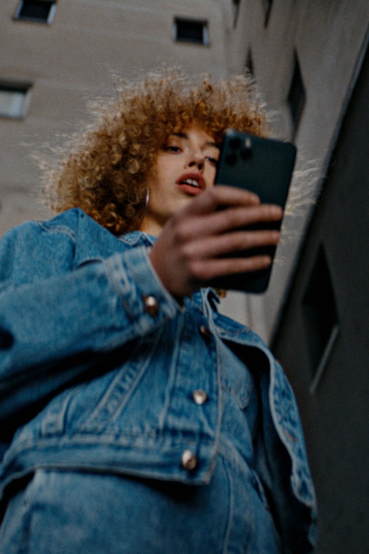
Sarah Brooks
Age 28 · Marketing Specialist · Austin, TX
Travel style: Solo adventurer and occasional business traveler
Goals
- Explore new destinations without the hassle of complex planning.
- Keep travel expenses predictable and within budget.
- Book trips quickly and with confidence, knowing that fees and policies are transparent.
Pain points
- Hidden fees when booking online.
- Juggling multiple platforms to organize trip details.
- Uncertainty about cancellation policies when plans change.
Messaging
Groople simplifies solo travel, providing the tools and transparency you need to book confidently and focus on the adventure ahead.

Kenji Takahashi
Age 40 · University Travel Coordinator · San Francisco, CA
Travel style: Planner for student and faculty trips
Goals
- Efficiently manage group travel logistics for academic conferences, field research, and team-building events.
- Stay within strict university budgets.
- Simplify communication and planning across diverse group needs, from professors to undergraduates.
Pain points
- Coordinating travel details for large groups, including room assignments and transportation.
- Frustration with hidden costs and inflexible booking policies complicating approval processes.
- Managing last-minute changes.
Messaging
Groople takes the complexity out of group travel, empowering planners like Kenji to create seamless and stress-free trips for every traveler.
Brand Identity.
Logo, mark, additional marks, colors, typography, iconography, social, photography and patterns.
The groople wordmark.
The logo is the centerpiece of the brand identity, acting as the primary visual representation of who Groople is and what it stands for. It sets the tone for recognition and consistency across all touchpoints, from digital platforms to printed materials.
A well-designed logo is the first step in building a cohesive and memorable brand presence.
The g mark.
The mark is a simplified symbol that carries the brand in a compact, versatile form. It complements the primary logo and can be used on its own where a more minimal or flexible design is required.

Whether it’s an icon for social media or a watermark, the mark ensures the brand is instantly recognizable.
The g mark with the travel icon ring.
Additional marks are alternate logos or sub-marks that give the brand flexibility across mediums. They keep visual consistency while adapting to different contexts, such as horizontal layouts, compact spaces, or monochromatic designs.
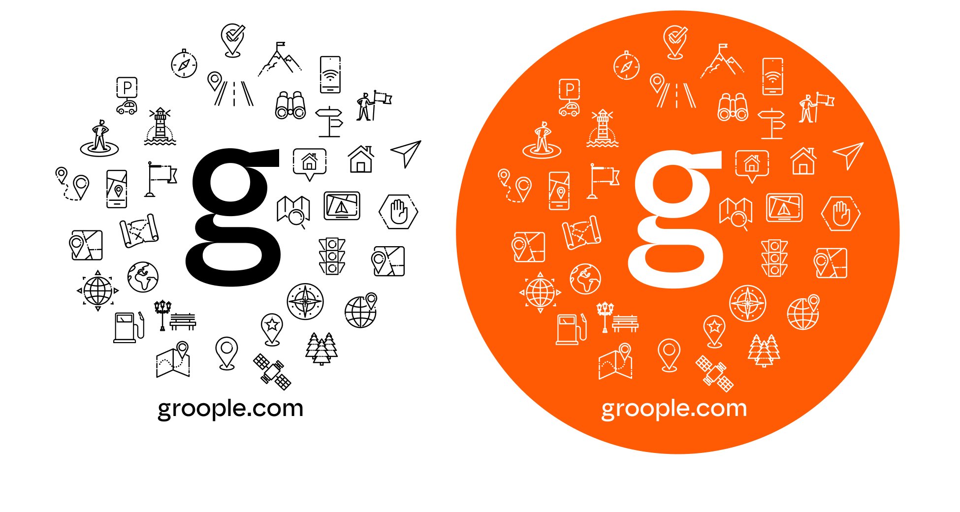
They ensure the brand remains cohesive, no matter where or how it appears.
Bright Orange, Charcoal Grey, Aqua Green and supporting colors.
The palette communicates the brand’s personality and keeps every visual material consistent, so the audience associates these colors with Groople. Each color plays a distinct role in a balanced, recognizable identity.
CMYK 0 79 100 0
RGB 255 91 5
CMYK 81 66 57 57
RGB 36 48 55
CMYK 92 52 55 33
RGB 7 80 86
Used for banner backgrounds
CMYK 16 7 10 0
RGB 211 221 222
CMYK 0 0 0 0
RGB 255 255 255
CMYK 0 0 0 100
RGB 0 0 0
Safiro and Archivo.
Typography is the visual voice of the brand. These two typefaces are used across all written communications, from headlines to body text, to give Groople a cohesive and professional appearance.

Safiro was chosen for its modern and elegant design, bringing a sense of clarity and sophistication to Groople’s brand identity. Its clean, structured forms ensure readability across all communication channels while conveying a professional and approachable tone. Its distinctive character adds confidence and reliability, reflecting Groople’s commitment to transparency and ease of use in travel planning.

Archivo was selected for its versatility and bold presence, ideal for headlines and supporting body copy. Its modern, practical aesthetic adds credibility and strength to Groople’s messaging across a variety of touchpoints. Its clean, geometric style complements Safiro’s elegance, creating a pairing that reflects Groople’s values of transparency, trust, and user-focused design.
Together, Safiro and Archivo build a cohesive visual identity that supports Groople’s mission to simplify and elevate the travel experience.
Line icons for travel.
Custom icons visually represent key ideas and functions, improving communication while keeping a cohesive look. They are drawn to match the brand’s style and sit alongside the other visual elements.
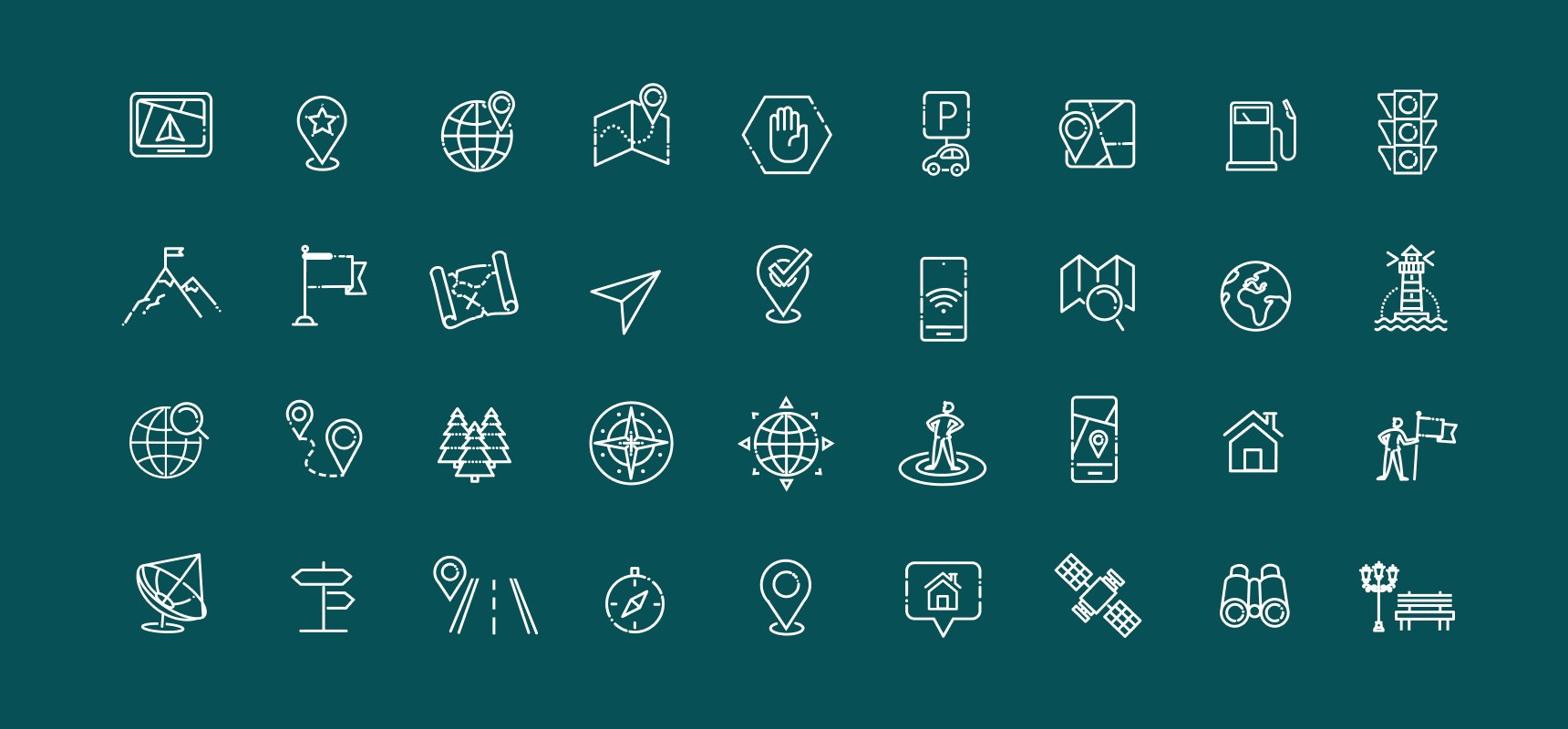
They add clarity and polish to the brand’s materials, whether on a website, app, or printed collateral.
Wide, natural travel photography with brand messaging.
Photography tells the brand’s story through high-quality, authentic visuals. Whether the subject is a place, people or a moment, the style and tone should match the brand.
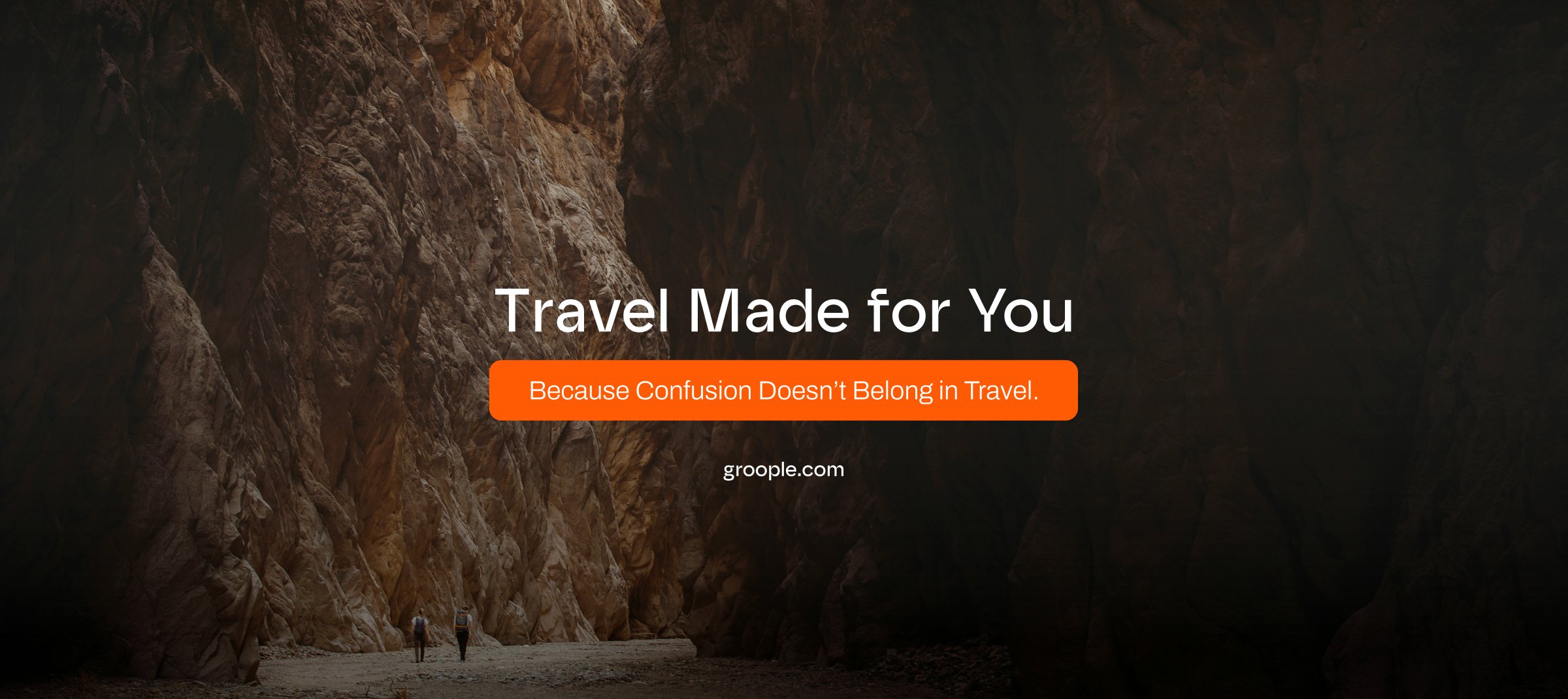

A strong photographic approach strengthens the brand’s personality and creates an emotional connection with the audience.
The topographic line pattern.
Patterns are repeating visual elements that add depth, texture, and dimension to the identity. They work as design accents across materials, from packaging to digital backgrounds.

Patterns help create a cohesive and recognizable look while reinforcing the brand’s visual style.
LinkedIn page and website applications.
Social visuals extend the brand identity onto digital platforms. These examples keep posts, headers and ads cohesive with Groople’s messaging and visual tone.
Consistency across social media helps build trust and recognition with the audience.