
The Coin Jar.
To you it is spare change. To a mother in need it is a lifeline.
The brand guidelines for The Coin Jar, a faith-driven nonprofit that gives single mothers a grant for one specific bill. This page covers the brand, the mark, colour, typography, the jar device, photography, voice and the brand in use.
The brand.
A jar on a kitchen counter is where most saving actually starts. The whole identity comes from that object: plain, honest, and filling one coin at a time.
Why a jar.
The Coin Jar was founded in December 2024 by Amber Altarabulsi, a single mother who had spent a long time being one unexpected bill away from trouble.
The name is not a metaphor we invented in a workshop. It is the actual object: the jar on the counter that people drop change into without ceremony, and that turns nothing much into something real if it is left alone long enough.
Everything in this book comes back to that. The mark is a jar drawn by hand, not a logo built from perfect curves. The colour is kitchen-table green and the gold of coins. The tone is what a neighbour sounds like, not what a foundation sounds like.
Four values.
Four things we will not trade away. These are decision rules, not a poster. If a piece of work breaks one of them it does not ship, however good it looks.
Dignity first
A woman asking for help is not a case file. We never ask for more than we need, we never make her explain herself twice, and nothing she tells us appears in our marketing.
Show the arithmetic
Every number we publish can be traced to a grant, a receipt or a session. If we cannot show the working, we do not print the figure.
Small and repeatable
We would rather cover one bill this month, reliably, than promise a transformation. The jar fills a coin at a time and so do we.
Faith, quietly
Faith is why the work exists. It is not a condition of receiving help and it is never used as leverage.
The mark.
One mark, drawn by hand rather than ruled. It is never redrawn, recoloured outside the palette, or set on a busy photograph.
The jar mark.
The jar is drawn with a wavering line on purpose. It is the difference between an organisation that looks like a bank and one that looks like a person who has been where you are.
There is no second logo. No icon set, no alternate crest, no seal. When something needs a mark, it gets this one.
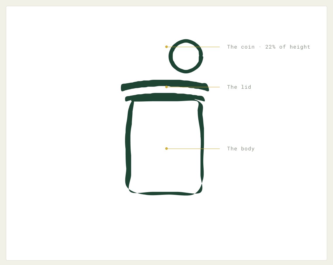
Sits above the lid, never touching it. It is the only element allowed to leave the jar.
Two strokes, uneven. Do not straighten them.
Open at the top so it can be filled. The base is heavier than the sides.
The logo system.
Every one of these ships as an SVG. Pick the one that fits the space rather than scaling or rearranging the parts yourself. The spacing between the mark and the wordmark is fixed.
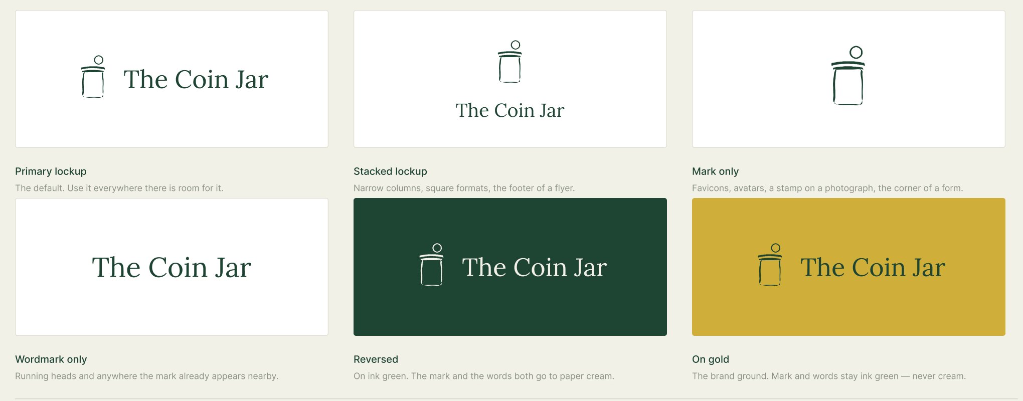
The default. Use it everywhere there is room for it.
Narrow columns, square formats, the footer of a flyer.
Favicons, avatars, a stamp on a photograph, the corner of a form.
Running heads and anywhere the mark already appears nearby.
On ink green. The mark and the words both go to paper cream.
The brand ground. Mark and words stay ink green, never cream.
Clear space and minimum size.
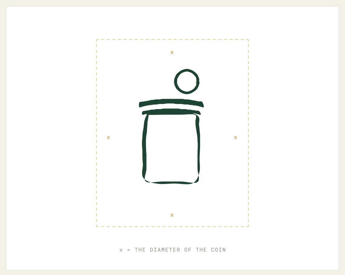
Clear space is measured in x, where x is the diameter of the coin. Keep at least 1x free on every side. Nothing else sits inside that boundary, including page edges, photographs and other logos.
24 px tall for the mark alone, 32 px for the lockup.
8 mm tall for the mark alone, 12 mm for the lockup.
A single coin may stand in for the jar at 16 px.
Misuse.
None of these are hypothetical. Every one of them turns up the first time a mark is handed to somebody in a hurry. If a file will not do what you need, ask for a new file rather than editing this one.
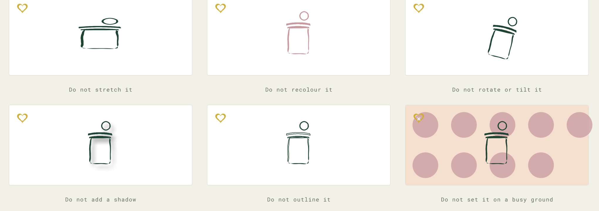
Do not stretch it.
Do not recolour it.
Do not rotate or tilt it.
Do not add a shadow.
Do not outline it.
Do not set it on a busy ground.
Colour.
Deep green for what we say, gold for what changes, and a lot of paper in between. The palette is mostly restraint.
The palette.
Gold is the brand colour and green is the reading colour. The violet, blush and sage are not decoration. They are the half of this brand that makes it feel like it was made for mothers rather than for a bank.
RGB 169, 113, 79
Paper warm has been retired because it read as a nothing colour. Violet took its place.
Proportion.
On a cover, a divider or an advertisement, gold is the page and green is the type. On a content page it flips: paper is the page, green is the type, and gold is the one detail that moves.
#CFAF39
#F2F1E8
#1E4433
#A9714F
Never put gold type on a gold ground, and never run two grounds against each other on the same screen.
Typography.
Lora carries the voice, Inter carries the detail, Roboto Mono carries the numbers. Three faces, no exceptions.
The three typefaces.
All three are free, on Google Fonts, and already loaded by the website. That matters more than taste: a volunteer making a flyer on a borrowed laptop can install them in a minute.
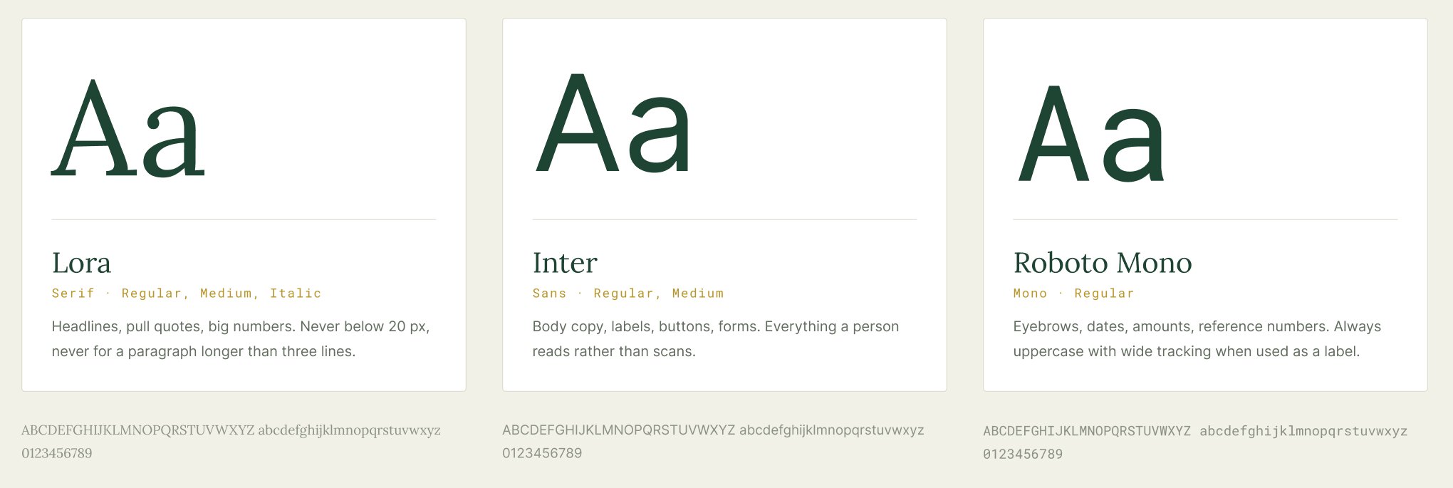
Headlines, pull quotes, big numbers. Never below 20 px, never for a paragraph longer than three lines.
Body copy, labels, buttons, forms. Everything a person reads rather than scans.
Eyebrows, dates, amounts, reference numbers. Always uppercase with wide tracking when used as a label.
The type scale.
Pick from this list rather than inventing a size. If none of them fits, the layout is usually the problem.
Body copy sits between 60 and 75 characters a line. Lora headlines may run wider; Inter paragraphs may not.
Sentence case everywhere except mono labels, which are uppercase with 16 to 18 per cent tracking. Never set a headline in all caps.
The jar.
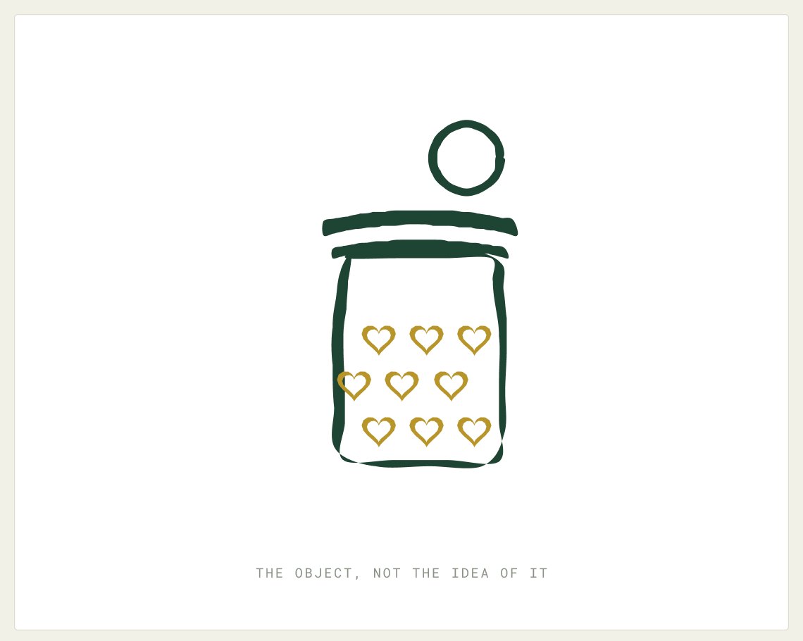
Our one signature device. It fills as the number does, and it is the only chart we need on most pages.
The jar as a chart.
Wherever a number is going up (a grant fund, a savings goal, a budget with something left in it), the jar fills with hearts, not coins. It is the only proprietary visual we have.
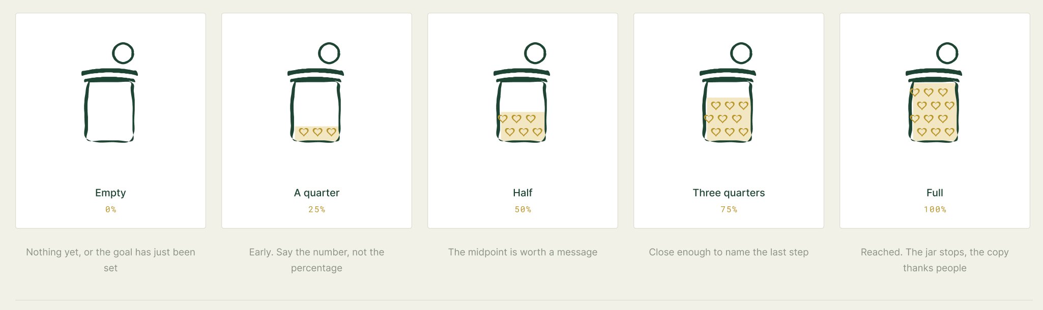
Nothing yet, or the goal has just been set.
Early. Say the number, not the percentage.
The midpoint is worth a message.
Close enough to name the last step.
Reached. The jar stops, the copy thanks people.
Hearts, not coins
The jar is full of what people gave, and what they gave was care. Coins count; hearts mean something. Always gold, never red.
Never animate it past the truth
If the jar is a quarter full, it fills a quarter and stops. No overshoot, no bounce.
One jar to a screen
Two jars competing for attention makes both of them decoration.
Photography.
Real rooms, real hands, no stock-photo joy. What we never show matters more than what we do.
Photography direction.
Photography is documentary, never uplifting. Ordinary light, ordinary rooms, and nobody performing gratitude. If a picture would look at home in a bank advertisement, it is the wrong picture.

Hands and change
Hands counting coins on a worn kitchen table. Late-afternoon window light from one side. No face in frame. Muted greens, cream, wood.
At the table, working
A woman at a laptop in an ordinary room, shot over the shoulder so she is not identifiable. Daylight. Never an office or a co-working space.
The bill, the keys, the jar
Overhead still life on a plain surface: an unpaid utility bill, a set of car keys, a jar of change. Soft single shadow. Nothing tidied for the camera.
The car in the driveway
A modest car mid-repair, or a driveway on an overcast morning. Documentary distance. This is what most of our grants are actually for.
Available light. Ordinary homes. Backs, hands, shoulders and objects rather than faces. Clothes and rooms that look lived in. Colour that already sits inside the palette, or is graded gently toward it.
No identifiable recipient, ever: no client, no client’s child, and no photograph of the founder or her family used to stand in for a beneficiary. No outstretched palms, no cheque-handover shots, no crying, no staged delight. No heavy filters and no stock smiles.
Three photo treatments.
Three treatments, and no fourth. Which one you reach for depends on whether the picture is carrying the page or supporting it.
As shot
Documentary, ungraded beyond a gentle warm lift. This is the default, and most pictures should stay here.
Gold monochrome
The whole image dropped to one gold tone. For a full-bleed campaign moment or a divider, never for a face, and never twice in one piece.
Stamped
A caption bar in ink green with the mark in the corner. Use it when the picture needs a date, a place or a fact attached to it.
Never crop a face out to make a picture usable. If it needed a face, it was the wrong picture. And never run a photograph behind type: the caption bar exists so you do not have to.
Voice.
Plain, warm and specific. We never make a woman feel like a case, and we never oversell what a grant can do.
Four voice principles.
Like a neighbour who has read the letter and knows what to do next. Not like a foundation, and never like a brochure.
Plain before warm
Warmth that gets in the way of the instruction is not kindness. Say the thing, then be kind about it.
Specific before big
“We paid a $340 electric bill in March” does more than “we transform lives”. Numbers we can show beat adjectives we cannot.
Her words, not our forms
We say bills, rent, car, groceries. We do not say beneficiary, intervention, wraparound, or unbanked.
Never oversell the help
A grant is $500 to $2,000 and it covers a bill. Saying it changes everything sets somebody up to be disappointed.
Say this, not this.
Six pairs. The left column is how The Coin Jar talks. The right column is the version to avoid.
We can cover one bill, once, up to $2,000.
We provide comprehensive financial empowerment.
Tell us what is due and when.
Please complete the needs-assessment intake.
Nothing you write here goes anywhere else.
Your data is processed in line with our policy.
You do not have to explain yourself twice.
Applicants must substantiate their circumstances.
A coach will sit down with you. It is free.
Access our wraparound advisory ecosystem.
$1,240 of $2,000 raised.
62% funded, help us close the gap!
Words and boilerplate.
The boilerplate below is approved. Paste it whole rather than paraphrasing it. The wording has been checked against what we can actually deliver.
bill · rent · groceries · car repair · a mother · a household · spare change · a coach · a grant · free · once · no judgement
beneficiary · intervention · wraparound · the underserved · empower · transform · hand-up not hand-out · deserving · case · utilise
The Coin Jar is a faith-driven nonprofit founded in 2024 by a single mother who had been one unexpected bill away from trouble. We give single mothers grants of $500 to $2,000 for a specific bill, alongside free coaching and job-readiness support. To you it is spare change. To a mother in need it is a lifeline.
In use.
The website, the application packet, the giving page and the printed flyer, each built from the same handful of parts.
Site, packet, social and print.
Nothing here is bespoke. Every piece below is built from the mark, three faces, two colours and a jar, which is why a volunteer can make one that looks like the rest.
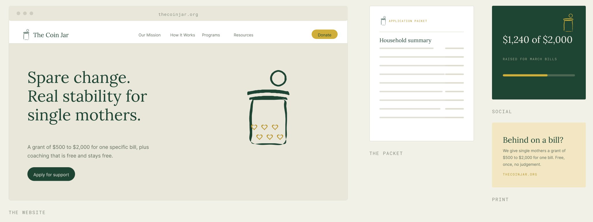
Spare change. Real stability for single mothers.
The application packet opens on a household summary.
$1,240 of $2,000 raised for March bills.
Behind on a bill? A grant of $500 to $2,000 for one bill. Free, once, no judgement.
Advertising.
One sentence, one number, one thing to do. Gold is the ground for almost every unit. An advert has to work at a glance.
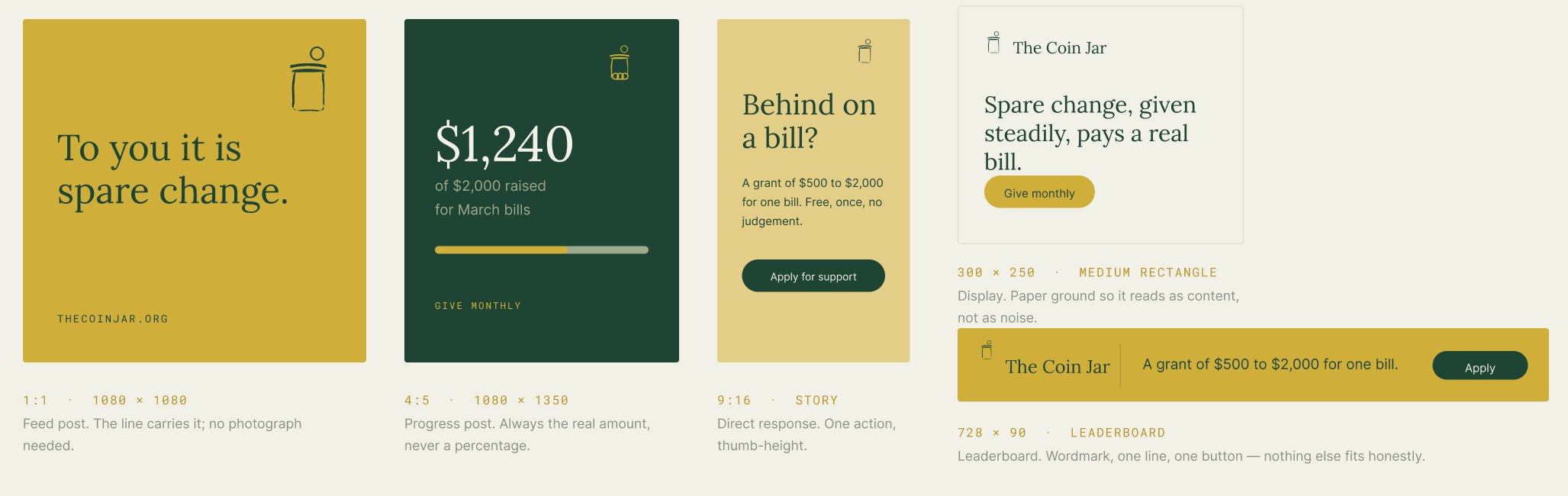
Feed post. The line carries it; no photograph needed.
Progress post. Always the real amount, never a percentage.
Direct response. One action, thumb-height.
Display. Paper ground so it reads as content, not as noise.
Wordmark, one line, one button. Nothing else fits honestly.
One sentence, one action
If an advert needs two calls to action it needs to be two adverts. Cut until one thing is left.
Never a stock smile
No stretched-out hands, no crying, no photograph of a child. The line does the work.
Always the real number
$1,240 of $2,000, not “nearly there”. Ads are where honesty is easiest to lose.
The website.
Screens from thecoinjar.org. Paper ground, one gold detail a screen, Lora for the sentence that matters and Inter for everything that explains it.
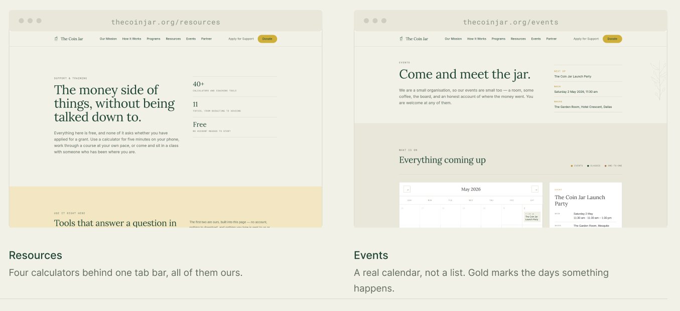
Gold is one button and one band. Everything else is paper and green.
Four calculators behind one tab bar, all of them ours.
A real calendar, not a list. Gold marks the days something happens.
One gold thing a screen
A button, a band, a filled jar. Two gold elements on one screen and neither of them means anything.
Rules, not boxes
Sections are separated by a hairline and space, not by cards. Cards are for things you can click.
Lora only for the sentence that matters
Every screen has one Lora line. Everything that explains it is Inter.
The Jar Room.
The board’s side of the brand. Same three faces, same two colours, but denser, because the people reading it are working, not deciding whether to give.
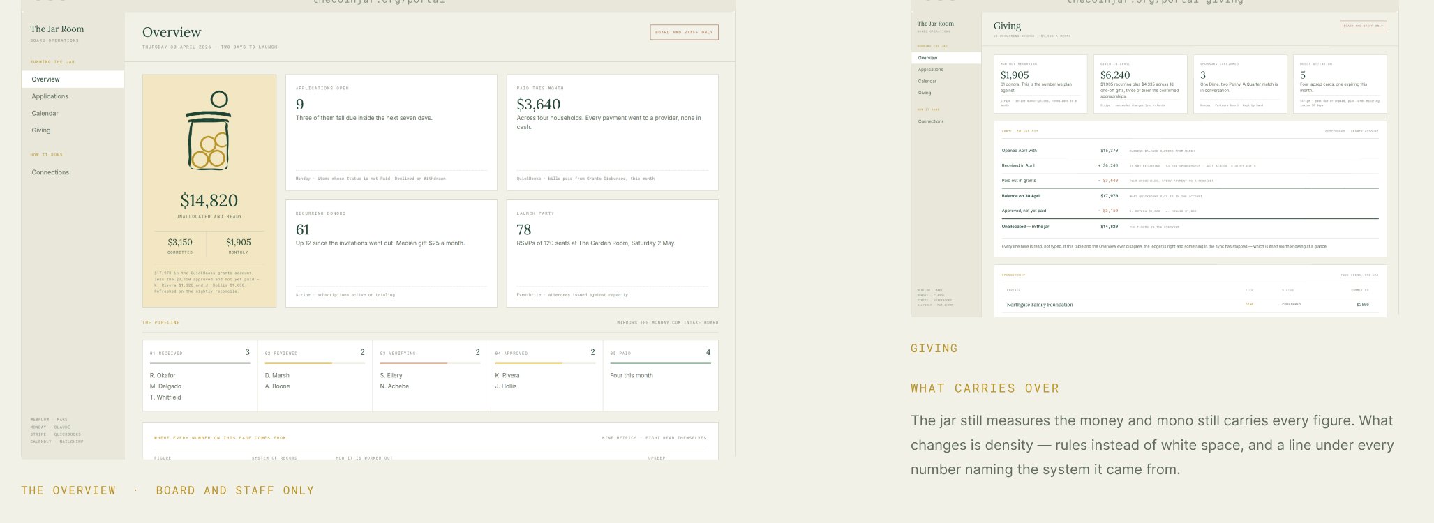
The jar still measures the money and mono still carries every figure. What changes is density: rules instead of white space, and a line under every number naming the system it came from.
Keep it simple, and keep it true.
If something is not in this book, the test is whether it would embarrass a mother who came to us for help. That question has settled almost every argument so far.