
TLF⁶. The Lyons Family.
The holding brand for what the Lyons family builds and gives next. This document covers the strategy, the name, the pillars and values, the messaging, the identity system, motion and applications.
Strategy Overview.
The record, the philosophy, the personality, the tensions.
The record.
Two founders and their four children. The name counts every one of them.
The year the founders started a company from the house, with one client, no salary and four kids under five.
Neither founder's parents went to college. He started at a community college in Gainesville; she graduated Texas Wesleyan in 1984. Both of them got there first.
Students covered by the company they grew from a single university client to more than five hundred.
Texas Tech renames its accounting school in recognition of the family's giving. Her trustee work at Texas Wesleyan shaped the decision.
Two firsts.
Neither founder's parents had been to college. They each got there first, separately, and the brand starts with both of those facts rather than one.
North Central Texas College, then Texas Tech. BBA in accounting, 1980. Audited at Ernst & Whinney, moved into insurance underwriting, and founded a student-health company from the house in 1998.
First-generation student · BBA Accounting, Texas Tech '80 · Licensed CPA · Founder, student health · 2022 Distinguished Alumnus
Texas Wesleyan, class of 1984, and first in her family too. Managing Partner in real estate, and a sitting Trustee on the Texas Wesleyan Board, where she watched scholarships change outcomes before the family ever wrote one.
First-generation student · Texas Wesleyan University '84 · Managing Partner, Real Estate · Trustee, Texas Wesleyan
His record explains why a stranger should take the name seriously. Hers explains where the giving points.
Make it carry you.
His parents sent him to college with a little money and one piece of advice: make it carry you as far as it can go. Neither his parents nor hers had been to college. That shared origin is the story. He still quotes the advice, and they are both still following it.
Carry it as far as it can go.
Both sets of parents gave what little they had and expected it to stretch. The name inherits the expectation.
Listen first.
His theory in business was simply to listen to the client. It held up for 25+ years, and it is the right instruction for anyone writing under this name.
Look down the road.
He likes to say he looks down the road to see what is changing. He trained as an accountant, and he is comfortable waiting.
Give it back.
The family calls the gift an investment in students rather than a contribution, and is careful about the distinction.
Brand personality.
Grounded.
Plain words about real places. The copy can sound like Texas without putting on an accent.
Deliberate.
Decisions in this family take years on purpose. The writing can afford the same patience, and it never needs to sound like it wants something from the reader.
Generous.
When the family talks about the gift, they talk about students. The copy follows their lead and keeps dollar figures out of it.
Quietly confident.
More than twenty-five years of steady work sit behind every claim, which is why the claims can stay small. Understatement reads as strength here.
Narrative tensions.
Private vs. personable.
The site should feel warm without listing what the family owns. Careful structure handles this better than vagueness would. Each part of the portfolio gets its own room and its own door.
Legacy vs. what's next.
The founder is leaving a company he started in 1998, and the temptation is to write a tribute. Resist it. TLF⁶ is what the family is building now, and the copy should face that direction.
The company vs. the man.
For 25+ years the founder's name, email, and reputation all lived inside the company he founded. This brand gives the family its own address, in every sense, without disowning the record.
One name vs. many ventures.
The family name sits above ventures that have little to do with each other. It has to be roomy enough for all of them, and it should never read like a table of contents.
The Name.
What TLF⁶ stands for, and how the name extends.
TLF⁶.
The Lyons Family. Six of them.
The Lyons Family
The front-facing name. Spelled out wherever there is room for it, and wherever a reader meets the brand for the first time.
The six
Two founders and their four children. The numeral is not decoration. It is a headcount, and it is why the name cannot be shortened to TLF.
The mark is anchored to TLF⁶ regardless of where the legal entity lands. The descriptor beneath the name does the legal and functional work, so the identity does not move when the paperwork does. Forming a true foundation later is a descriptor change, not a rebrand.
Six members. Six bars in the shield. Six pillars the family intends to carry. The shield was drawn as six diagonal bars before anyone counted them. The reading came after, and it is the better reading: the number is the family, and the pillars are what the family is for.
How the name extends.
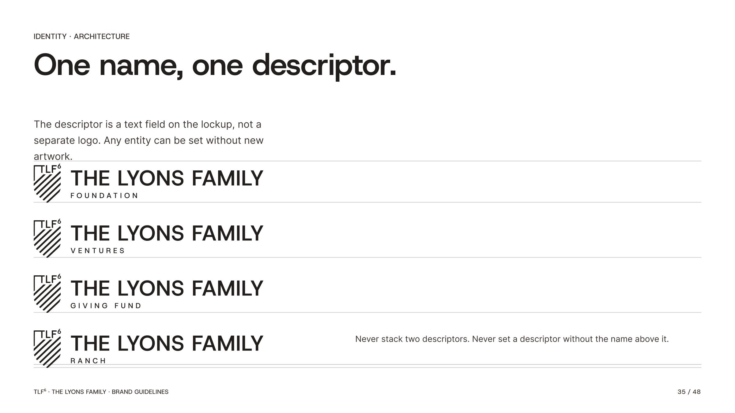
One name above, one descriptor beneath. The descriptor is a swappable field, not a fixed lockup. Letterhead, legal filings and university-facing material can each say the right thing without new artwork.
Foundation
The public face. Leads wherever the family is visible.
Ventures
Healthcare, education, advisory. The operating side.
Giving Fund
Direct, in-year generosity.
Ranch
The land, and what it stands for.
Descriptors are set in Host Grotesk Medium, upper case, tracked +280/1000 em, centred beneath the name. Any descriptor may be substituted; none may be added alongside another.
Writing the name.
The six is a superscript. TLF⁶, not TLF6. It is a keystroke rather than a graphic, which means it survives copy-and-paste, legal documents, email signatures and search indexing. Character U+2076. On macOS the glyph lives in the Emoji & Symbols panel; in Word, insert symbol 2076.
The numeral is always raised, never full-size, never hyphenated, never lower case.
The front-facing name is the family, not one member and not one entity.
Spell the name out when a descriptor is attached in running copy.
Pillars & Values.
The six pillars, IMPACT, and how the layers fit.
Six pillars.
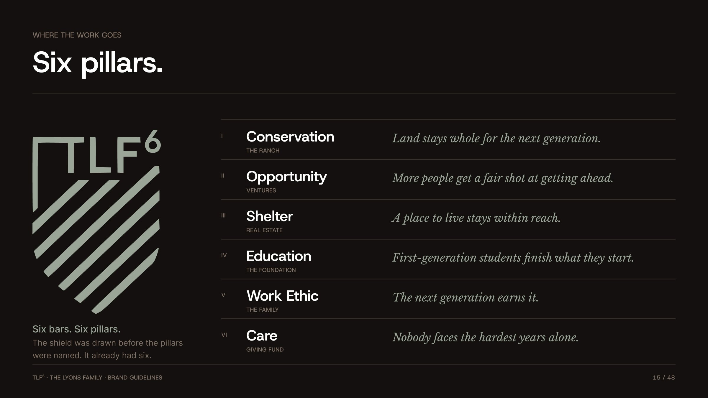
Six bars. Six pillars. The shield was drawn before the pillars were named. It already had six. Each pillar is an outcome the family is working toward. The venture beneath it is the vehicle. A pillar survives a venture being sold, closed or replaced.
Conservation
Land stays whole for the next generation.
Opportunity
More people get a fair shot at getting ahead.
Shelter
A place to live stays within reach.
Education
First-generation students finish what they start.
Work Ethic
The next generation earns it.
Care
Nobody faces the hardest years alone.
IMPACT.
The operating rules for anyone working inside this brand, family or staff. Pillars say where the work goes. These say how it is done. They double as the legacy statement, something the next generation can hold onto the way CARE did at the company.
Integrity
We do what's right, even when no one's watching. It is the same humility and character others associate with the Lyons name.
Mentorship
We invest in people as much as projects, guiding the next generation the way others once guided a first-generation student from Gainesville.
Purposeful Generosity
Giving is an investment in students and their future. The family is careful about that distinction.
Access
We open doors to education, opportunity and wellbeing for those starting with the least.
Care
Care-driven solutions come from listening first; every person and institution is treated like the most important one.
Tenacity
We take calculated risks, look down the road, and see things through.
Three layers.
What the family believes.
Carry it as far as it can go. · Listen first. · Look down the road. · Give it back.
The founders' inherited instruction. It sits underneath everything and it does not change.
How anyone inside the brand behaves.
Integrity · Mentorship · Purposeful Generosity · Access · Care · Tenacity
The operating rules. Written for family and staff alike, and durable enough to hand to a grandchild.
Where the work goes.
Conservation · Opportunity · Shelter · Education · Work Ethic · Care
Six outcomes the family funds and builds toward, one for each bar in the shield. Ventures may change beneath them. The pillars should not.
Messaging.
The manifesto, audience tiers, taglines, the site, and the privacy line.
Manifesto.
The brand in two paragraphs.
It started with two people whose parents had never been to college. He left Gainesville with a little money and an instruction: make it carry you as far as it can go. She reached Texas Wesleyan on much the same terms. The money ran out around 1980. The instruction never did.
Nobody who was there would call it luck.
TLF⁶ is The Lyons Family, named for the six of them: two founders and their four children. He built the company. She held the years it took, then made the case for where the giving should go. The name holds all of it.
None of it will be loud. It never has been. This is TLF⁶.
Audience tiers.
Public
A family holding company with two first-generation builders behind it. Enough to establish seriousness and character, with no inventory of what the family owns.
Voice: Plain and confident. Warm, but brief.
Partner
The founders' history, told plainly. One client grown into more than five hundred over 25+ years. A partner learns about the venture in front of them and nothing else.
Voice: Direct and unhurried. Reads like a person, not a firm.
Family
The full story: the six of them, the instruction his parents gave him, her case for the giving, and what the giving is for. It informs everything above it and rarely appears in print.
Voice: Personal. Written for people who already know the family.
Tagline options.
Options grouped by audience tier.
Website messaging.
Eight pages, held at eight. A combined Press & News section replaces the blog. It takes less maintenance, and it lets the brand tell its own version of stories Texas Tech and Wesleyan will also publish. There is no open funding-request portal; the cause stays narrow.
The Lyons family, at work.
The holding brand behind the family's ventures and its giving.
It started with a little money and some advice.
From a community college in Gainesville to a company serving half a million students.
Backed by someone who has built one.
Healthcare, education and advisory. Long horizons and a founder's memory of the early years.
Property the family plans to keep.
Bought carefully, held a long time, judged by what working families can afford.
Working land, looked after properly.
Agriculture, wildlife and land management, run with the family's usual patience.
The part the founders like talking about most.
Scholarships and support for first-generation students, the kind they both once were.
01 Home · 02 About · 03 Ventures · 04 Real Estate · 05 Ranch & Land · 06 Foundation · 07 Core Values · 08 Press & News
Core Values replaces the blog's role as the page that explains the family. Press & News carries anything published about them.
Lead with the Foundation.
The family office stays discreet. What is public is the giving; what is private is the holding. Every asset produced under this brand is checked against that line before it ships.
Public face
The Foundation leads. Ventures, real estate and the ranch are described, never inventoried.
The children
Minimal exposure anywhere public. No names, no images, no identifying detail without explicit sign-off.
Film & photography
Talent or personas where a face is needed. B-roll shot distant and unidentifiable.
Writing rules.
Keep it plain.
Plain words about real places and real years. Cut anything that sounds like a plaque.
Quietly confident.
State the fact and stop. The reader can do the math.
About the students.
When the subject is giving, write about students. Dollar figures stay out of the copy.
Think in years.
The brand is never in a hurry and should not sound like it. Nothing is trying to close anyone.
Identity.
The mark, the lockup system, colour, type and misuse.
Logo.
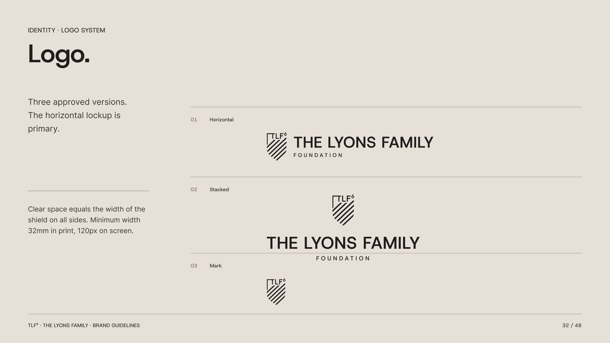
Three approved versions: horizontal, stacked and mark. The horizontal lockup is primary. Clear space equals the width of the shield on all sides. Minimum width 32mm in print, 120px on screen.
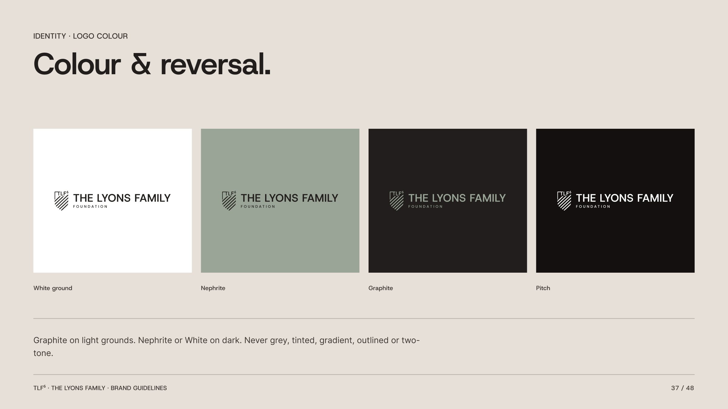
Graphite on light grounds. Nephrite or White on dark. Never grey, tinted, gradient, outlined or two-tone.
Mark anatomy and lockup construction.
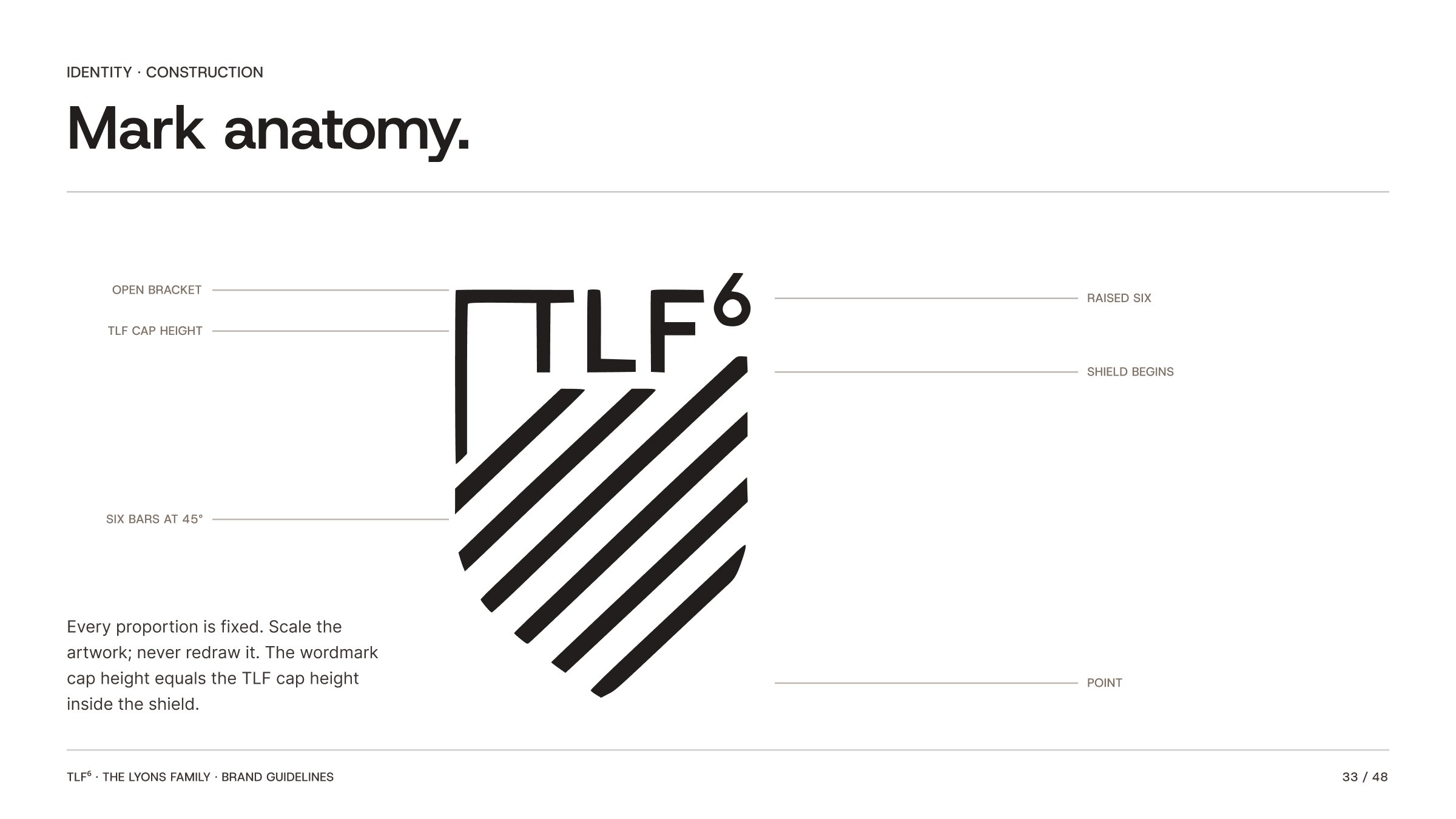
Every proportion is fixed. Scale the artwork; never redraw it. The wordmark cap height equals the TLF cap height inside the shield. Every lockup measurement derives from C, the cap height of the wordmark, and the shield is lifted 0.035 C so it reads as optically centred against the type.
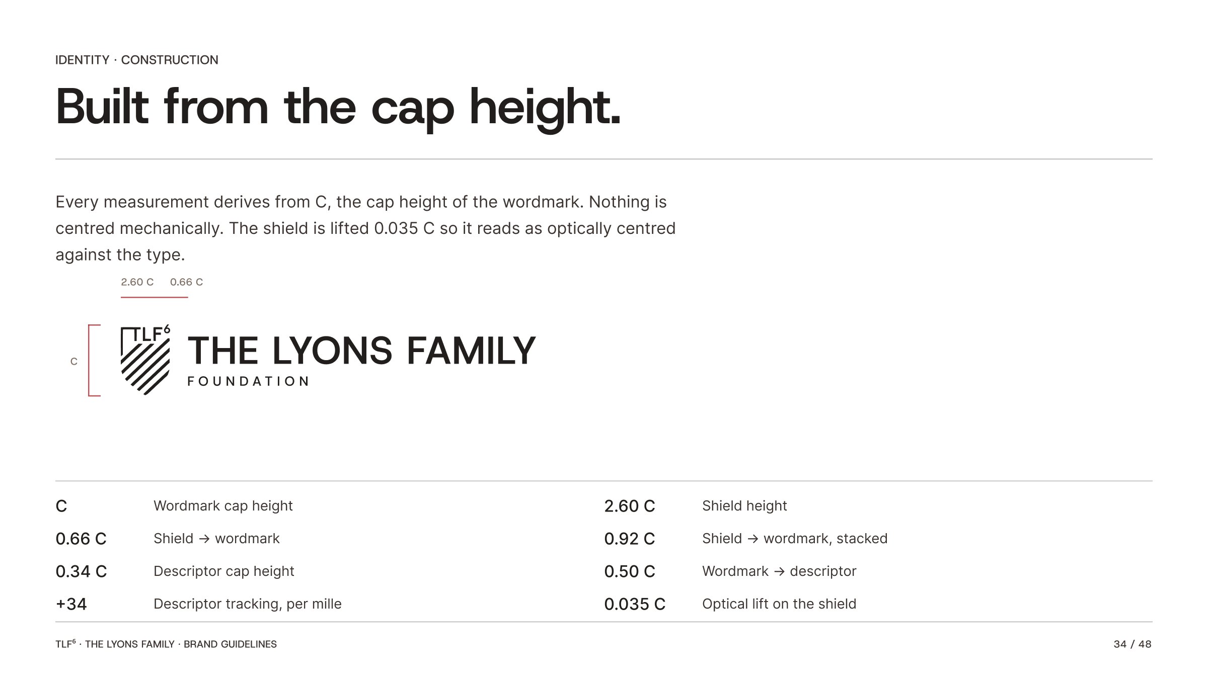
Shield height
Shield to wordmark
Shield to wordmark, stacked
Descriptor cap height
Wordmark to descriptor
Descriptor tracking, per mille
Optical lift on the shield
Wordmark cap height
Colour.
Nephrite is the working colour. The lighter sage and stone tones carry backgrounds and cards, Bronze carries secondary text, and the warm darks carry body copy. White and Black are reserved for print and the extremities of the screen.
Typography.
Host Grotesk is the primary typeface in Medium, SemiBold and Bold. Inter is secondary for text. Libre Baskerville Italic is the editorial accent.
Host Grotesk SemiBold
Make it carry you.
Inter Regular
They left Gainesville with a little money from their parents and an instruction to make it carry them as far as it could.
Libre Baskerville Italic
Nobody who was there would call it luck.
D1 54/56, tracking −1.5% · H1 28/34 · H2 20/26 · Body 13/21 · Label 10, caps +18% · Sub-brand 11, caps +28%
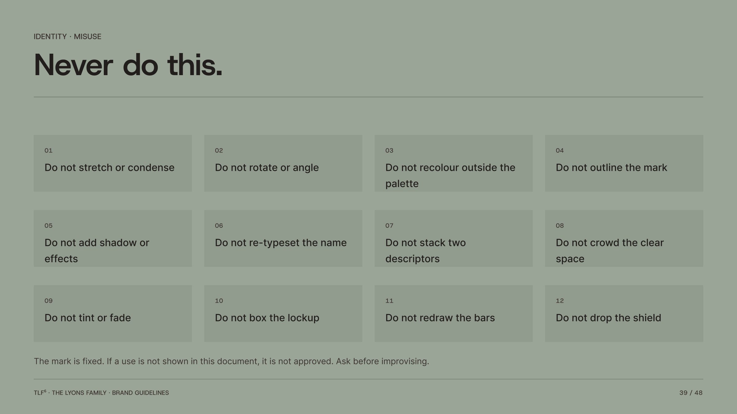
Never do this.
The mark is fixed. If a use is not shown in this document, it is not approved. Ask before improvising.
Motion.
The motion should almost disappear.
Confidence, not flash.
Motion exists to make the work feel assembled rather than animated. If a viewer notices a transition, it is too much. Nothing exceeds one second; nothing bounces; nothing overshoots.
Architectural
Elements lock into the grid as though placed by hand.
Editorial
Headline first, subhead after, body copy grouped. Never line by line.
Calm
Ease In Out on everything. Motion settles; it does not arrive.
Energetic
No bounce, no elastic, no overshoot, no spin.
Decorative
Every move has a reason, or it is removed.
Fast
Under 150ms reads as a glitch. Over 1s reads as a wait.
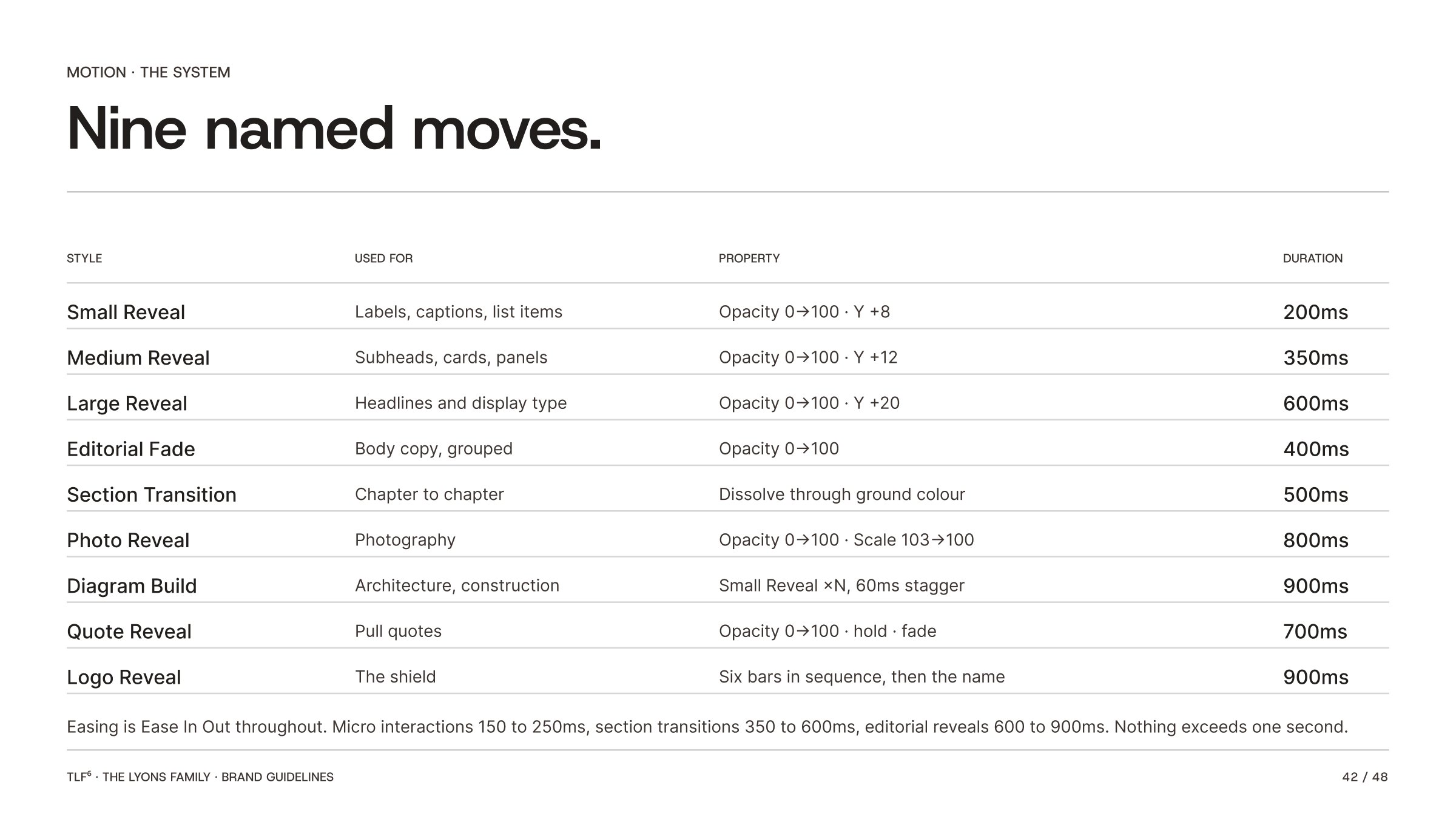
Easing is Ease In Out throughout. Micro interactions 150 to 250ms, section transitions 350 to 600ms, editorial reveals 600 to 900ms.
The Shield. Six bars reveal in sequence, bottom to top, 60ms apart. The name follows with letter spacing settling from +40 to +15. Nine hundred milliseconds, once, on the cover.
Six Pillars. Each bar in the shield lights as its pillar row arrives. The diagram assembles itself; it does not fade in whole.
IMPACT. Six letters land on the grid, then the value names, then the copy. Three groups, not eighteen elements.
Chapter opens. Ground fades to Pitch. The mark holds alone. One sentence. Then the section begins.
Applications.
Stationery, business cards, LinkedIn, and the website in situ.
Stationery, cards, LinkedIn and the website.
Mockups are temporary until brand photography is complete. Names and contact details are blurred in these examples.
Stationery
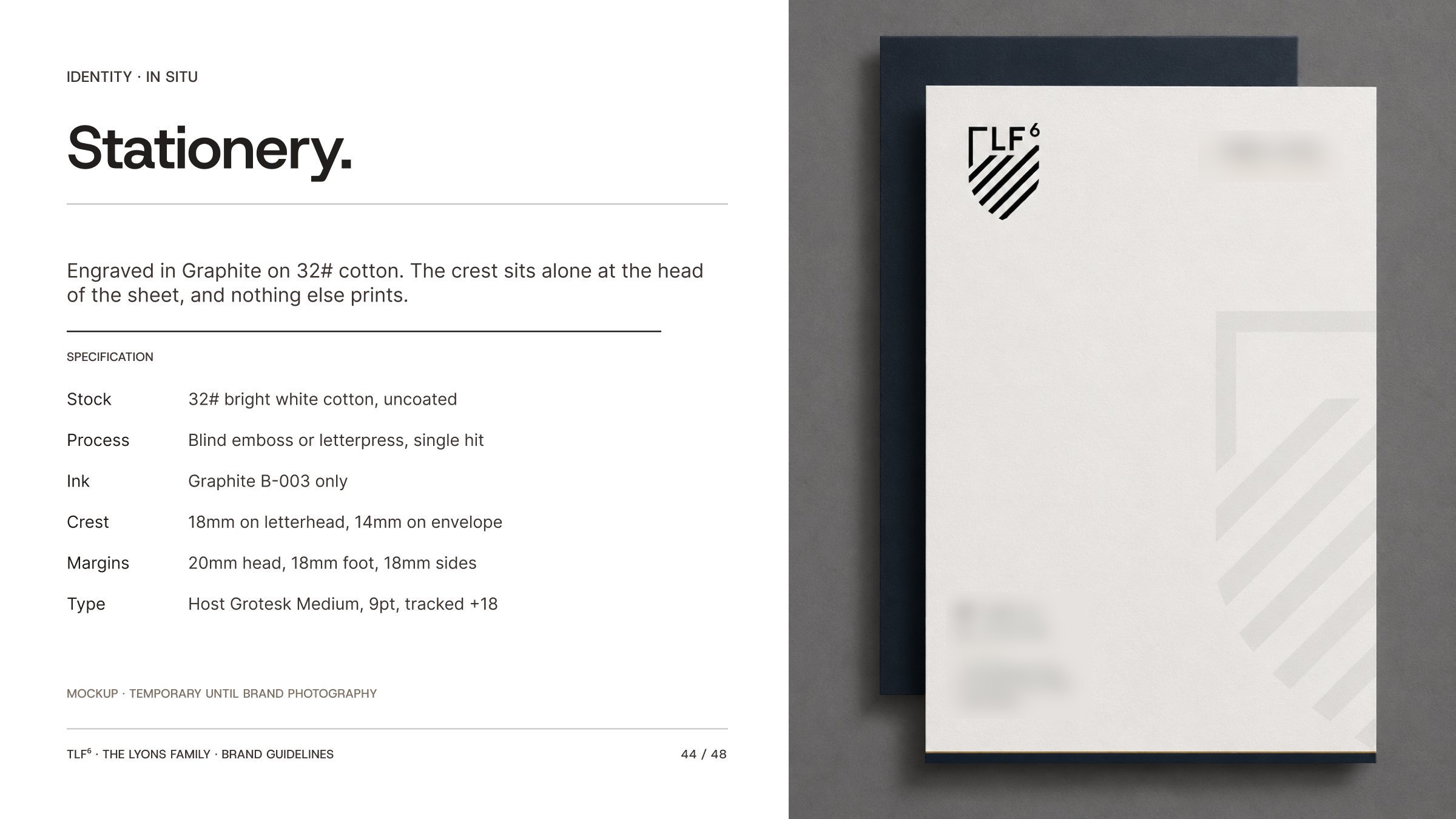
Engraved in Graphite on 32# cotton. The crest sits alone at the head of the sheet, and nothing else prints. Blind emboss or letterpress, single hit. Crest 18mm on letterhead, 14mm on envelope. Host Grotesk Medium, 9pt, tracked +18.
Business cards
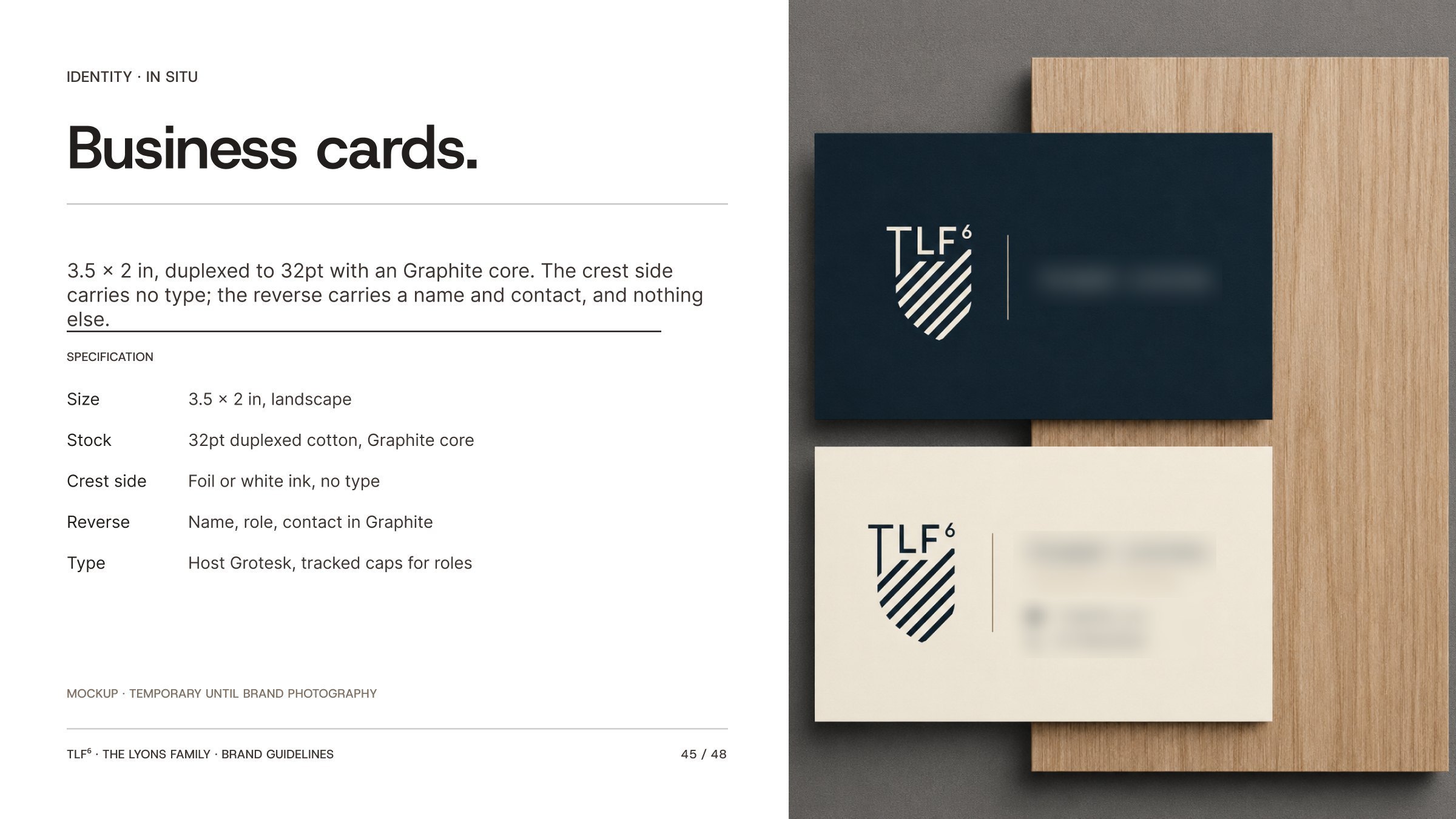
3.5 × 2 in, duplexed to 32pt with a Graphite core. The crest side carries no type; the reverse carries a name and contact, and nothing else.
Personal profiles carry the crest, never a photograph of the family. The banner runs the horizontal lockup reversed on Graphite, left aligned, with the right two thirds left clear. The avatar is the crest only, on Pitch. Headline is role first, then one credential. No taglines.
The website
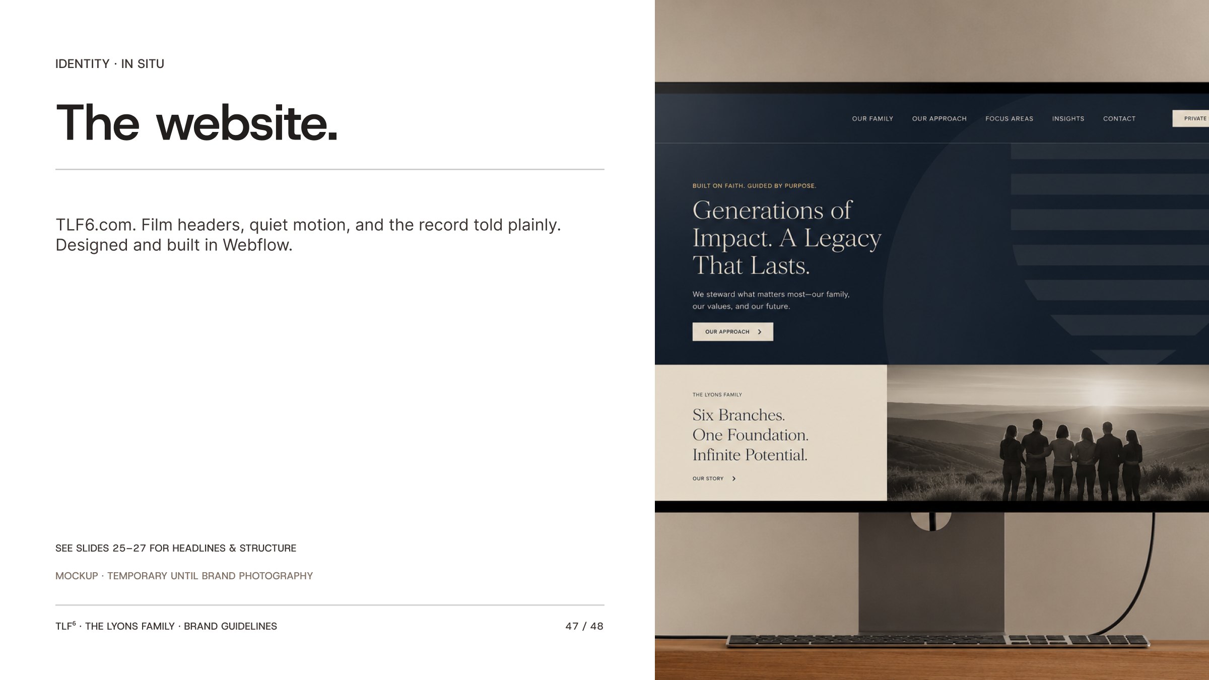
TLF6.com. Film headers, quiet motion, and the record told plainly. Designed and built in Webflow.
This is TLF⁶. Family held.