16 Imagery

Introduction
Imagery sets the atmosphere of the Good Word brand. Our photography shows the craft behind the work: real people, real sets, and the tools we use to make it. A consistent visual language keeps every touchpoint recognizable, from the website to a pitch deck.
Photography Style
Behind-the-scenes and documentary photography from Good Word productions. Moody, grounded, and focused on the people and process that bring a story to life.
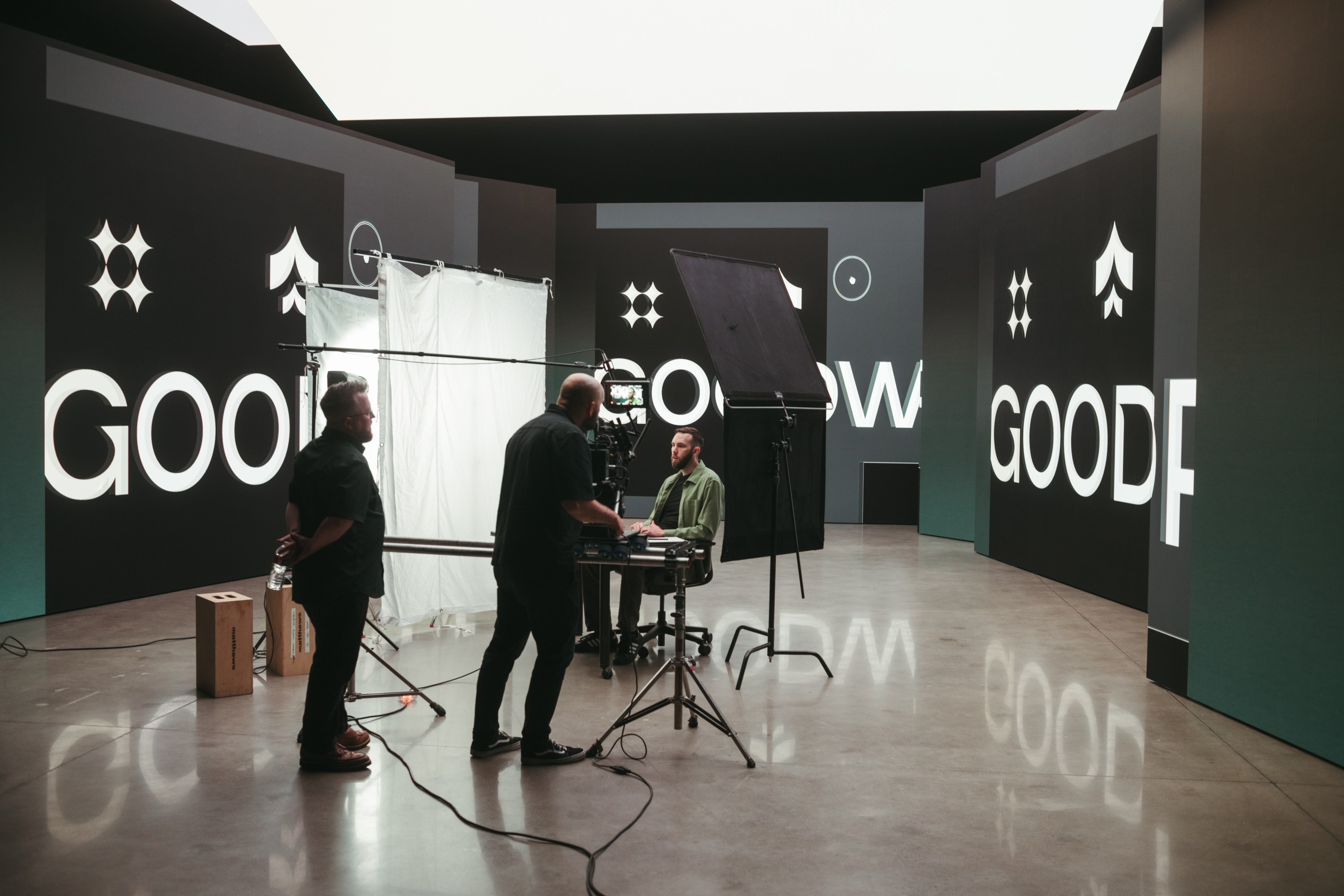

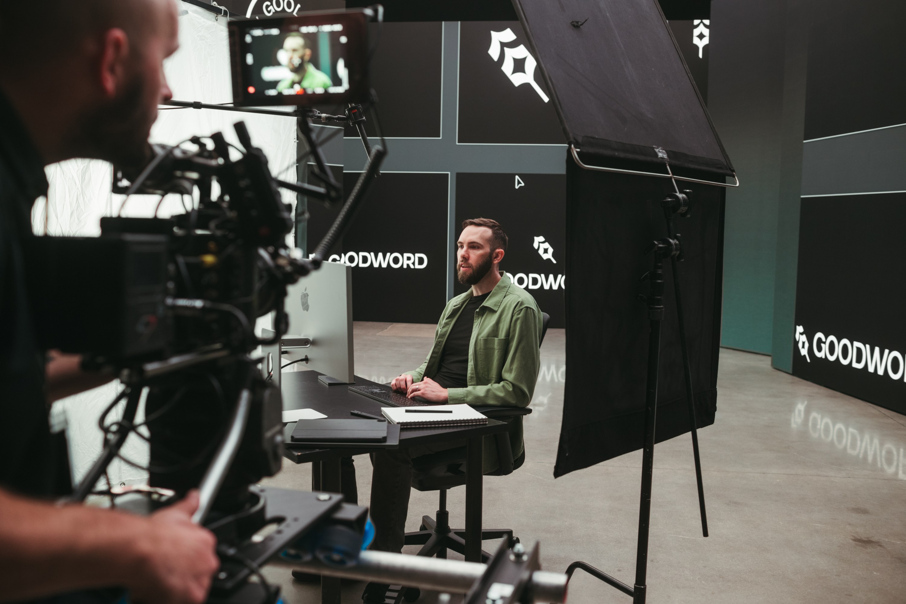
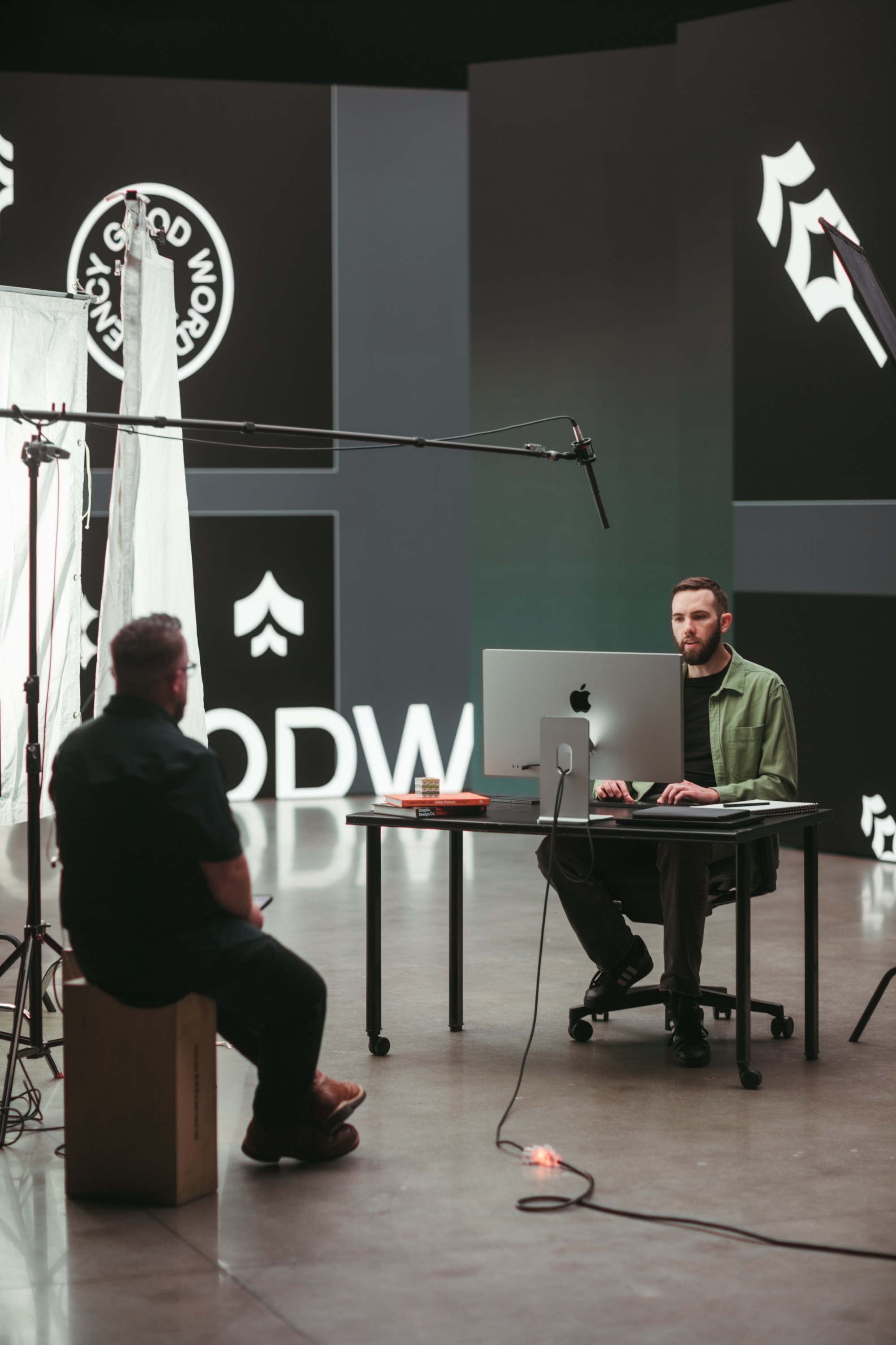
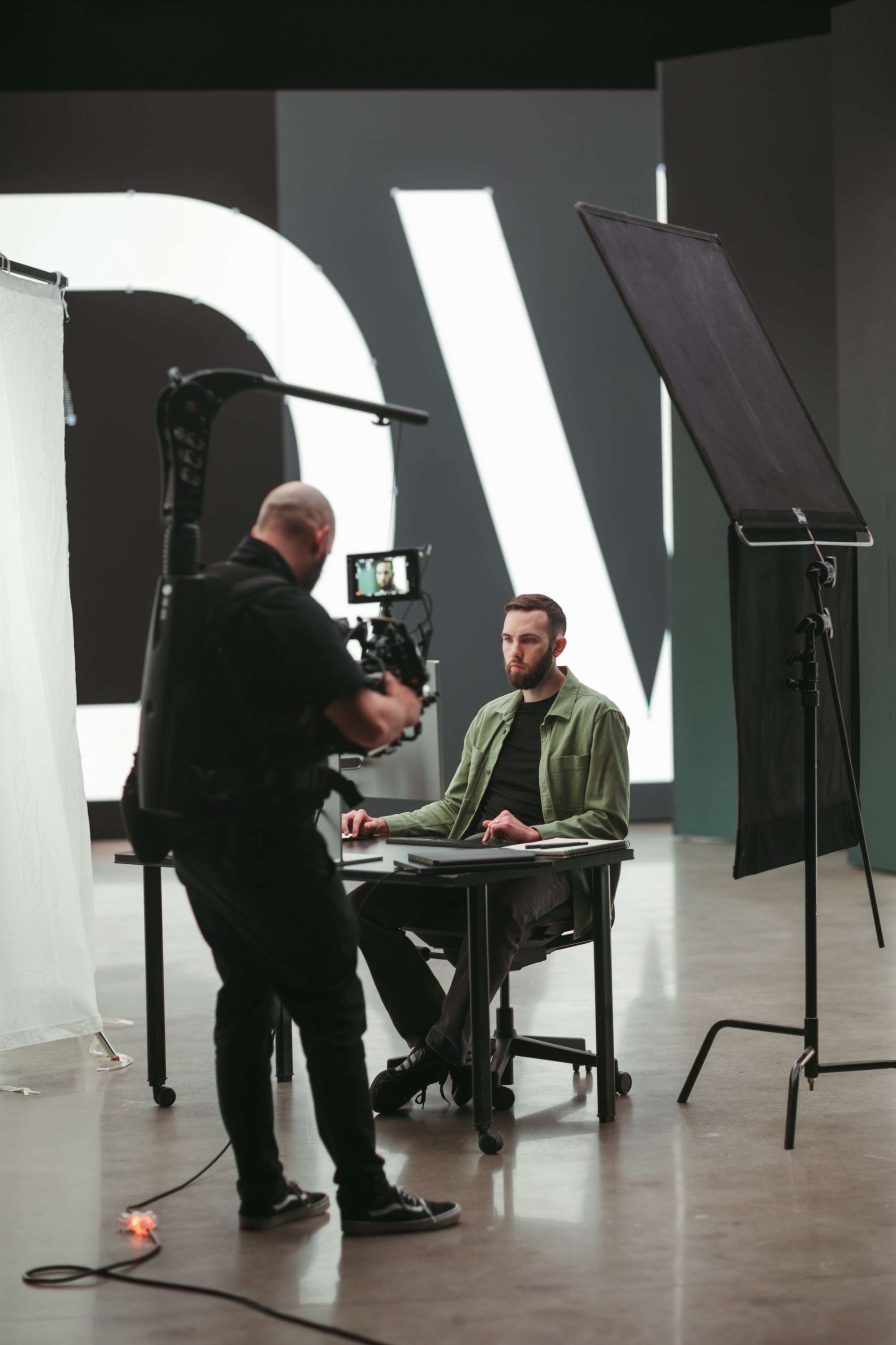
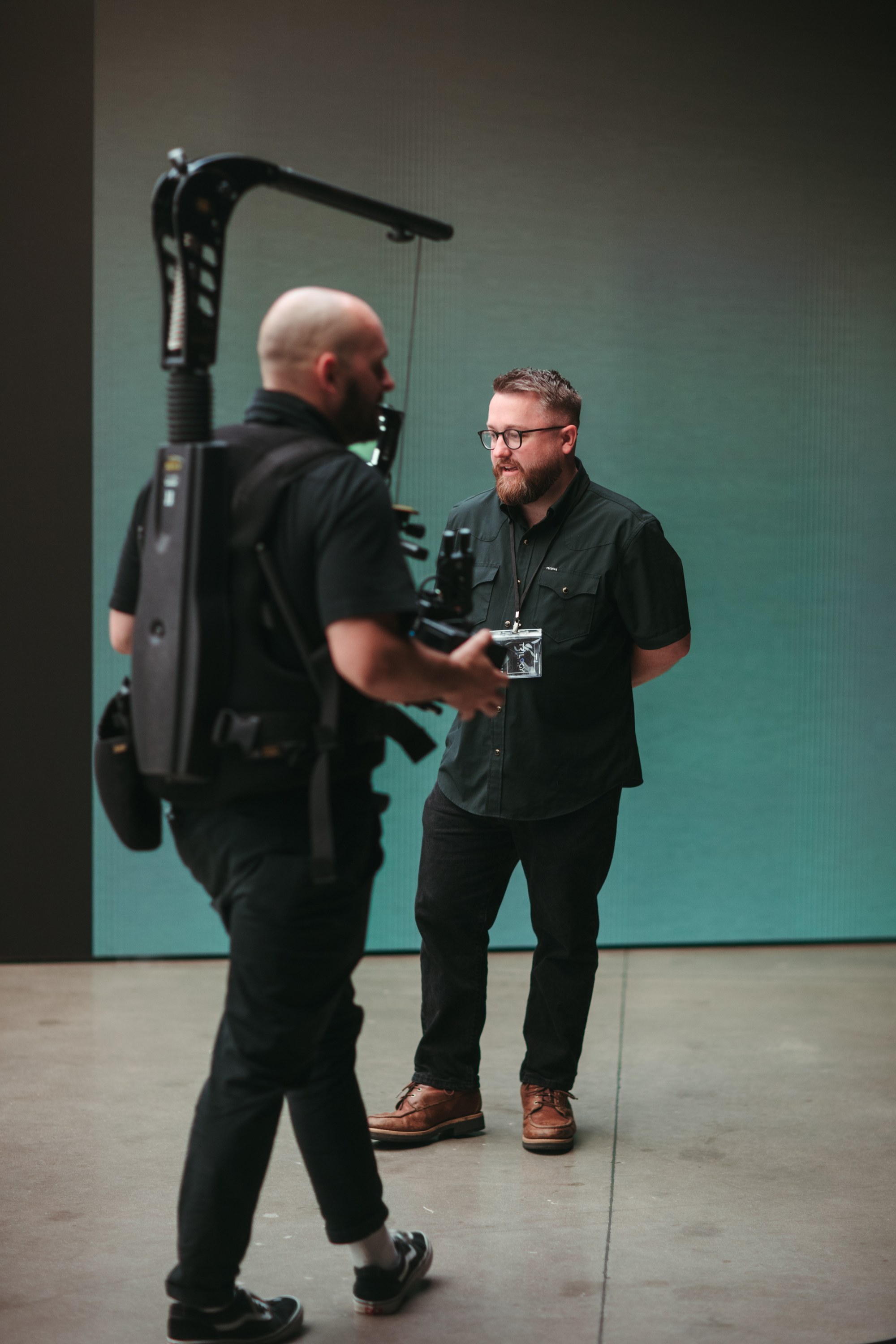
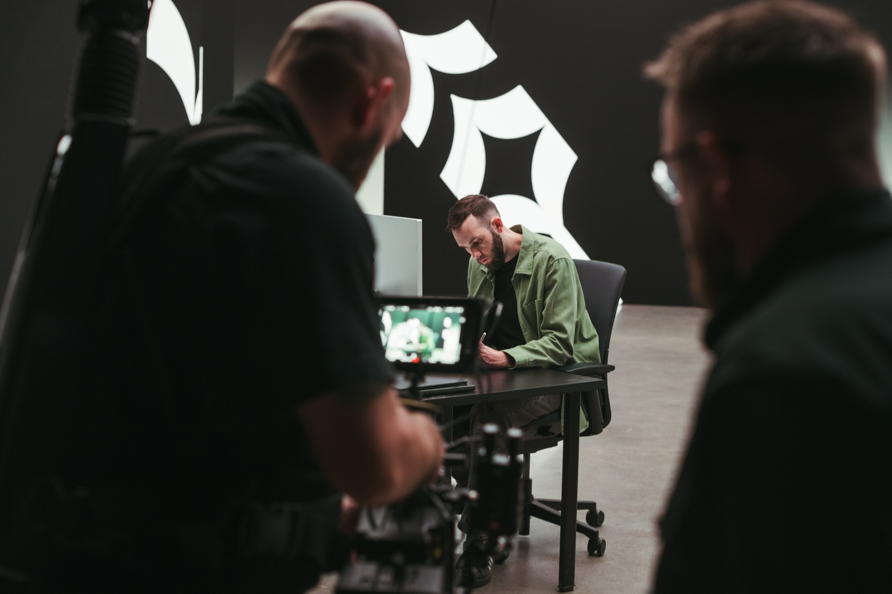
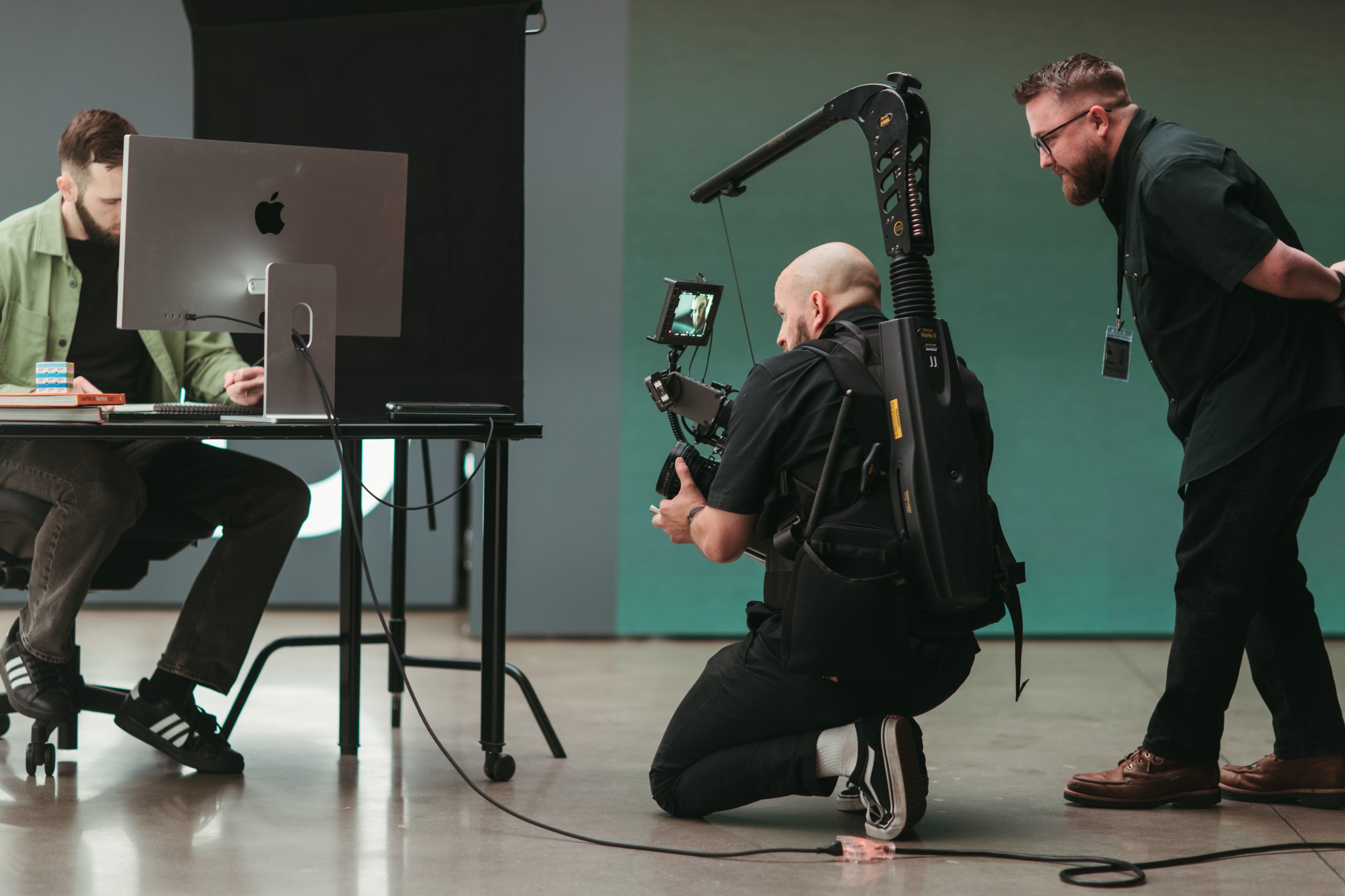
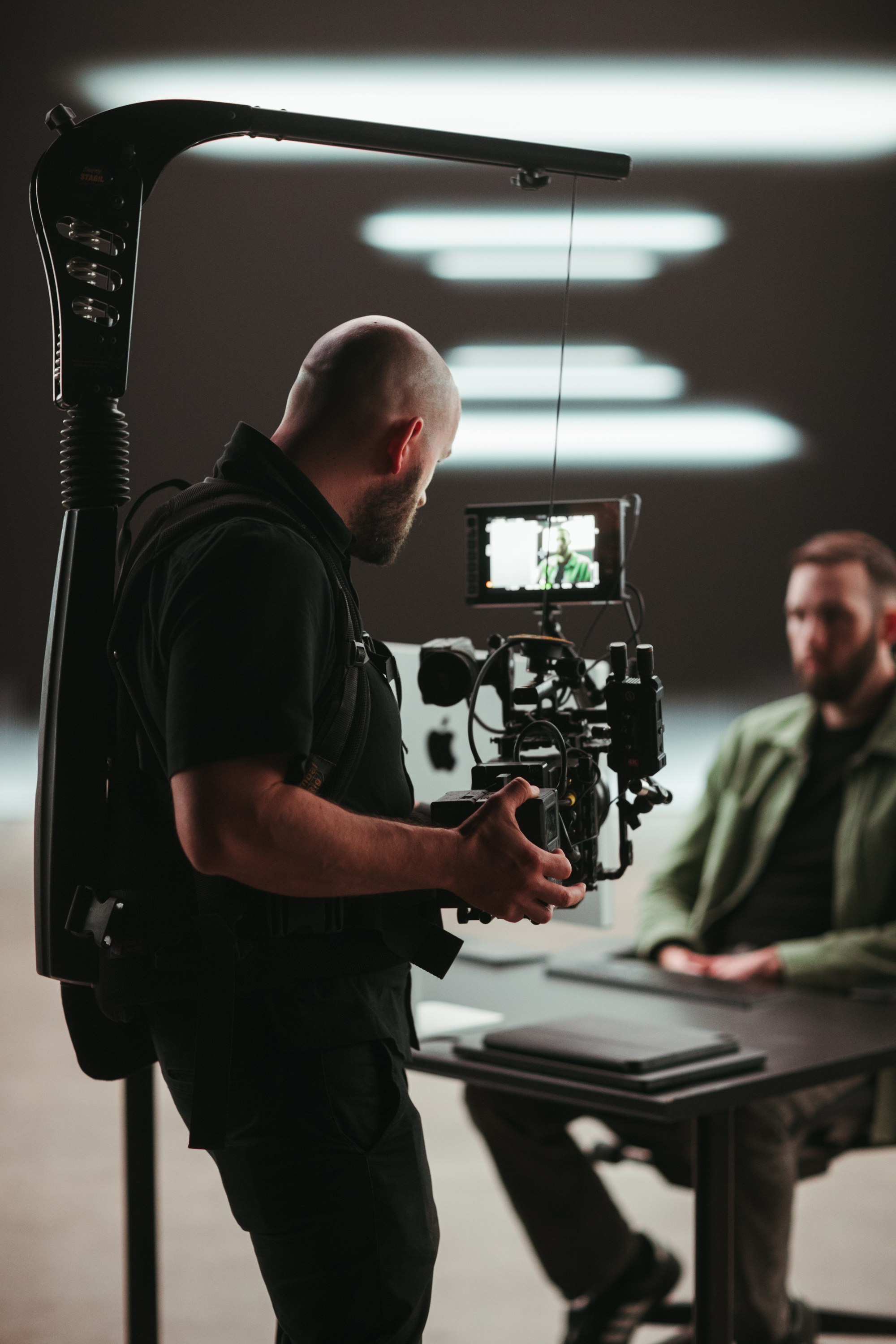
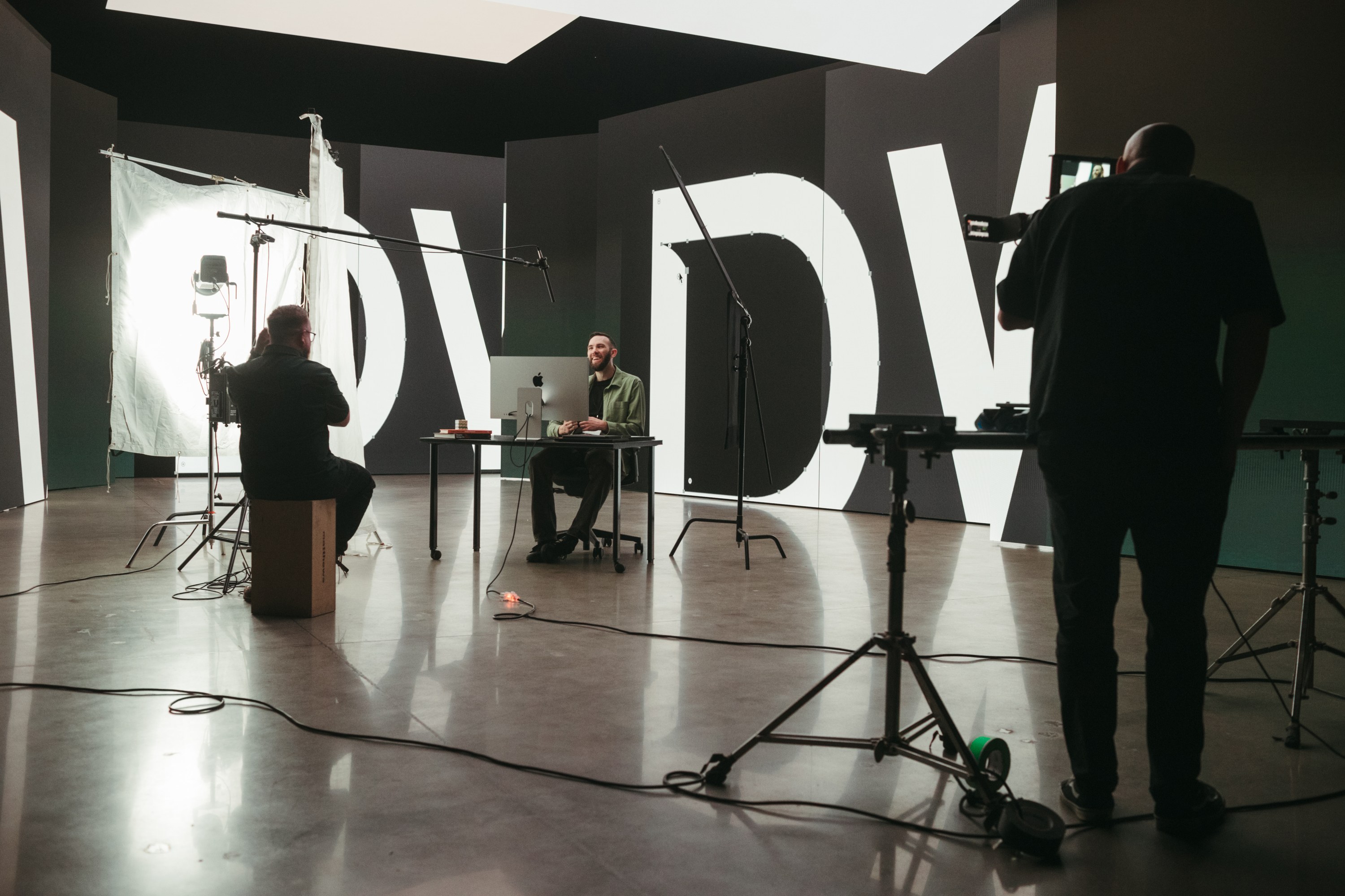
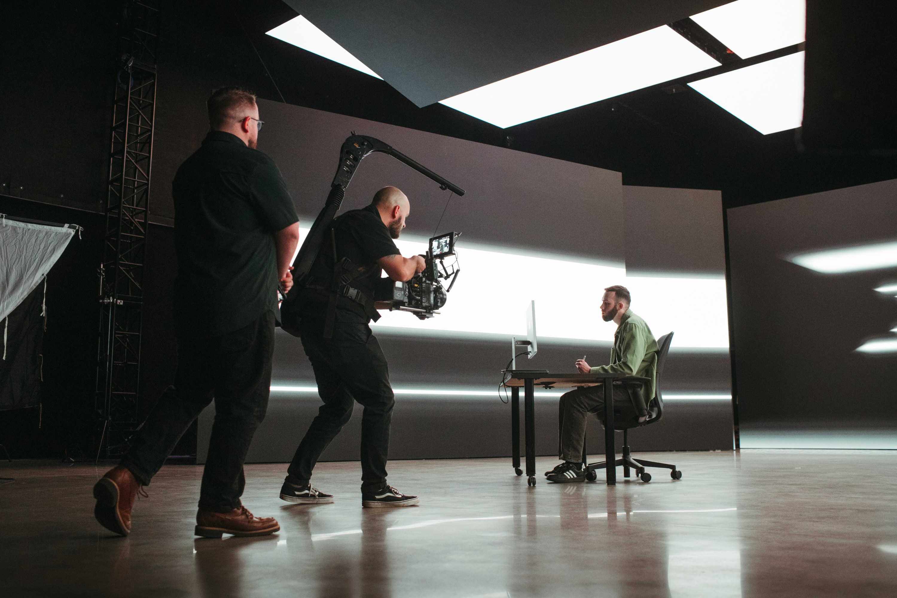
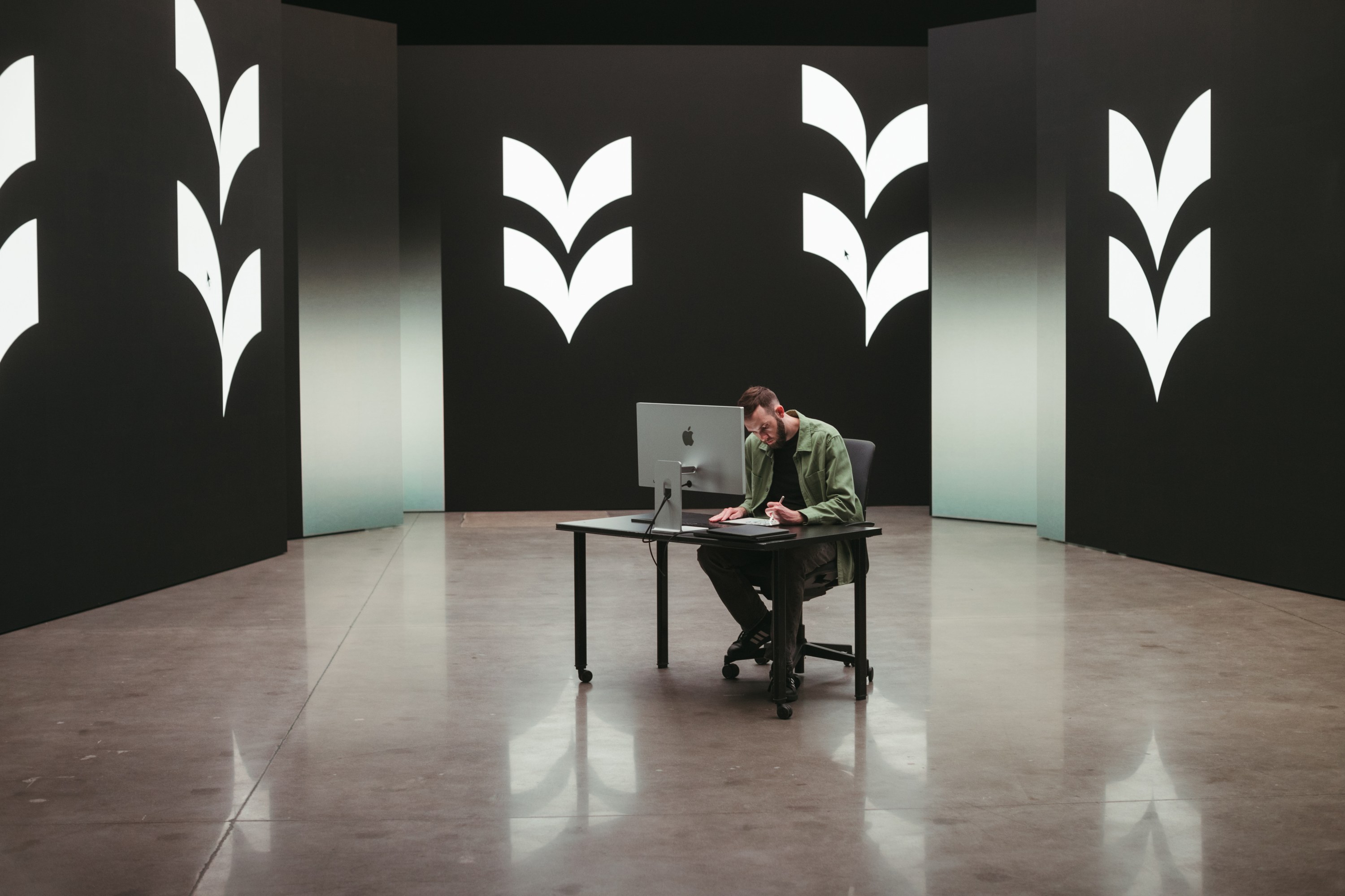
Image Principles
Four principles guide how we shoot, select, and use photography.
Real People, Real Work
Show the people behind the work doing the work. Directors, operators, writers, and clients in the middle of a real task, not posing for the camera.
Craft in Frame
Put the tools of the trade in the shot. Cameras, rigs, monitors, notebooks, and screens show how the work gets made.
Low-Key Light
Favor dark, directional light with clean shadows. The palette should sit comfortably next to Dark Green and Off White.
Brand in the Room
Let the mark, wordmark, and shape elements live in the environment on walls, sets, and apparel instead of stamping them on top of a photo.
Usage
A few rules that keep imagery consistent.
- Never crop through a face. Reframe or choose another image.
- Leave open space in the frame when a photo will carry headlines or the logo.
- Keep color natural. No heavy filters, tints, or artificial grain.
- Use approved Good Word shoots only.