
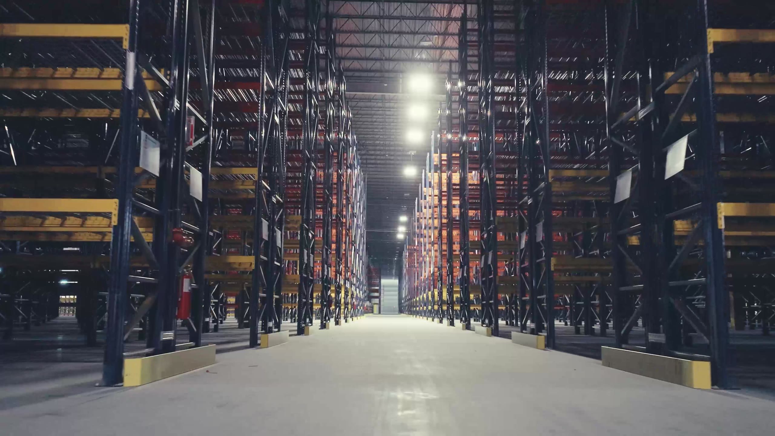
Brand, messaging, photography, social, web and video
A warehouse racking company that sells engineering judgment, given the language and the picture library to prove it.
Case scope
The Optum Group designs, supplies, and installs warehouse racking, and carries the engineering judgment that decides whether a building works. Layout, density, aisle configuration, flow, and the details that never make it into a quote. Good Word wrote the brand and messaging system that says so, directed the photography that proves it, and built the content operation that repeats it every week.
Client
The Optum Group
Sector
Warehouse racking and material handling
Services
Brand and messaging, photography direction, social content, web direction, video
Location
Fort Worth, Texas
Engagement
Twelve month partnership, 2026
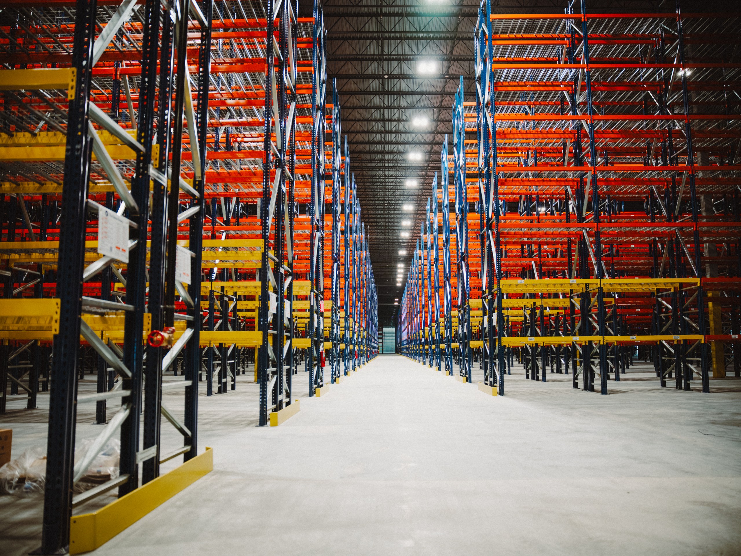
A finished install, shot down a straight aisle. Real project photography carries the brand.
Background
Optum had a live website, two owners who had run warehouse projects from every seat in the process, and a market position nobody had written down. There was no photography in circulation and no content cadence. The first version of the messaging argued the category case, that racking matters and buyers are wasting space. The client read it and said it was arguing with a buyer who had already decided to buy.
Version 0.3 stopped arguing and started positioning. Optum is the partner that gets the details right, backed by five value pillars, a plain vocabulary, a documented visual system, and a standing rule that every image in circulation is a real photograph. Forty social posts were built against that system before a single one ran.
The work
01 / Brand messaging
The first job was to stop making the category argument. Lines like paying rent on empty air put Optum in a fight with a buyer who has already decided to buy, and they say nothing about why this team is the one to call. The position we wrote instead is plain. Optum designs, supplies, and installs racking, and carries the judgment that decides whether the building works.
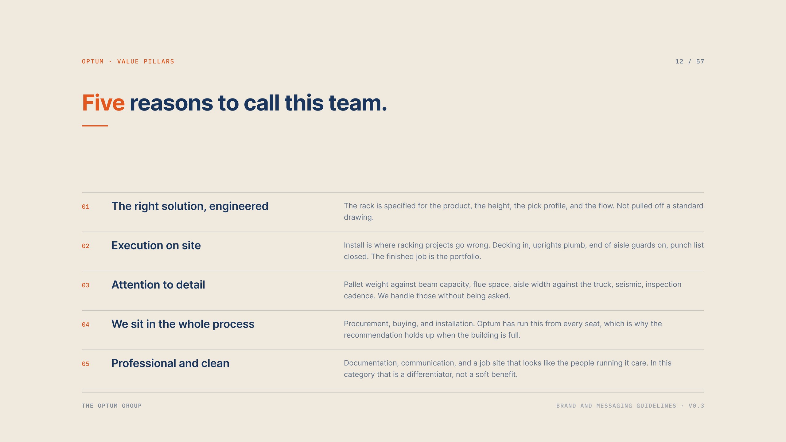
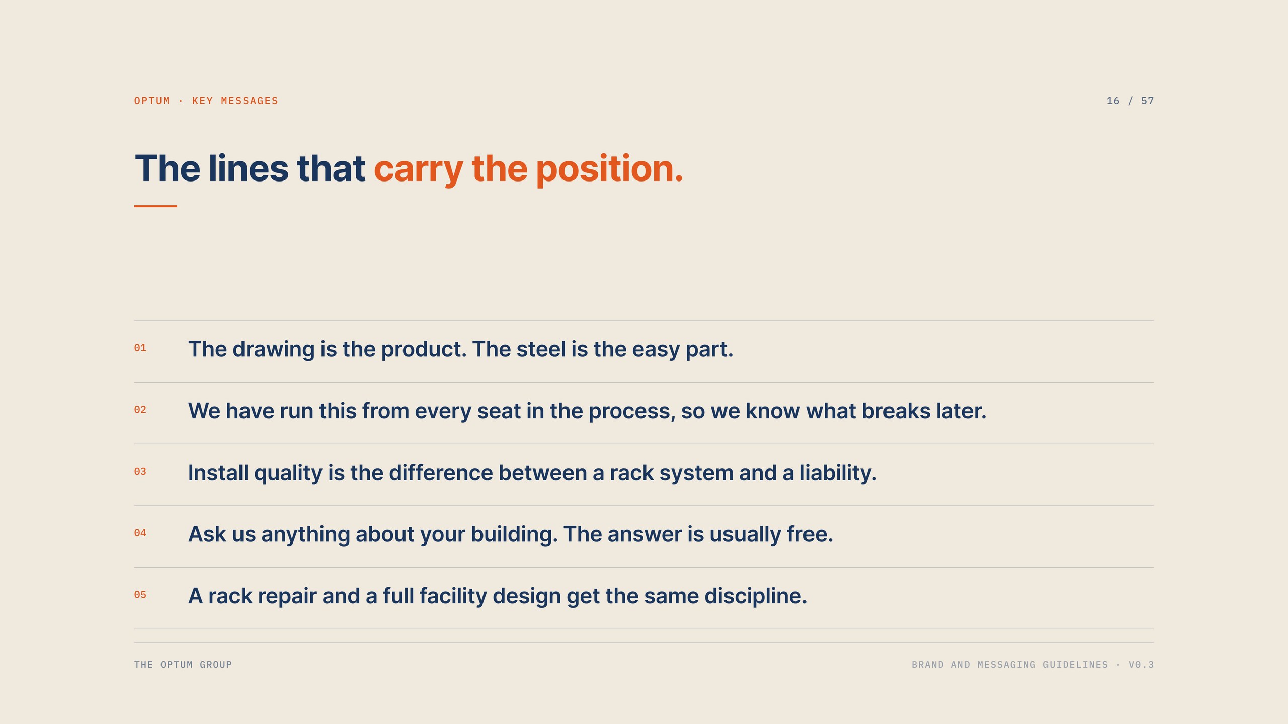
Underneath it sit five value pillars, a brand story built on a single belief, four taglines in order of preference, and five key messages the team can say out loud on a job site without anyone wincing. All of it is written to be taken verbatim, which is the only way a small team keeps a voice consistent across a year of posts.
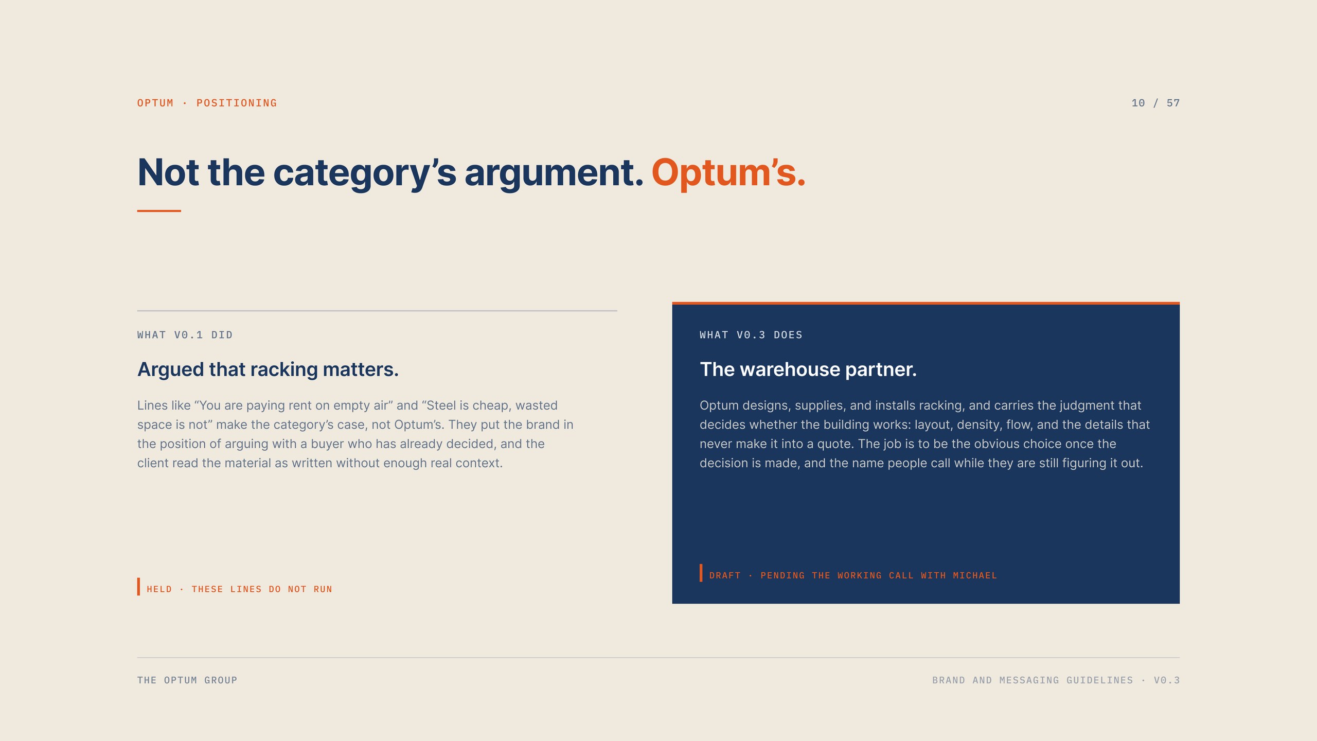
Positioning. What the first version argued, and what the brand says instead.
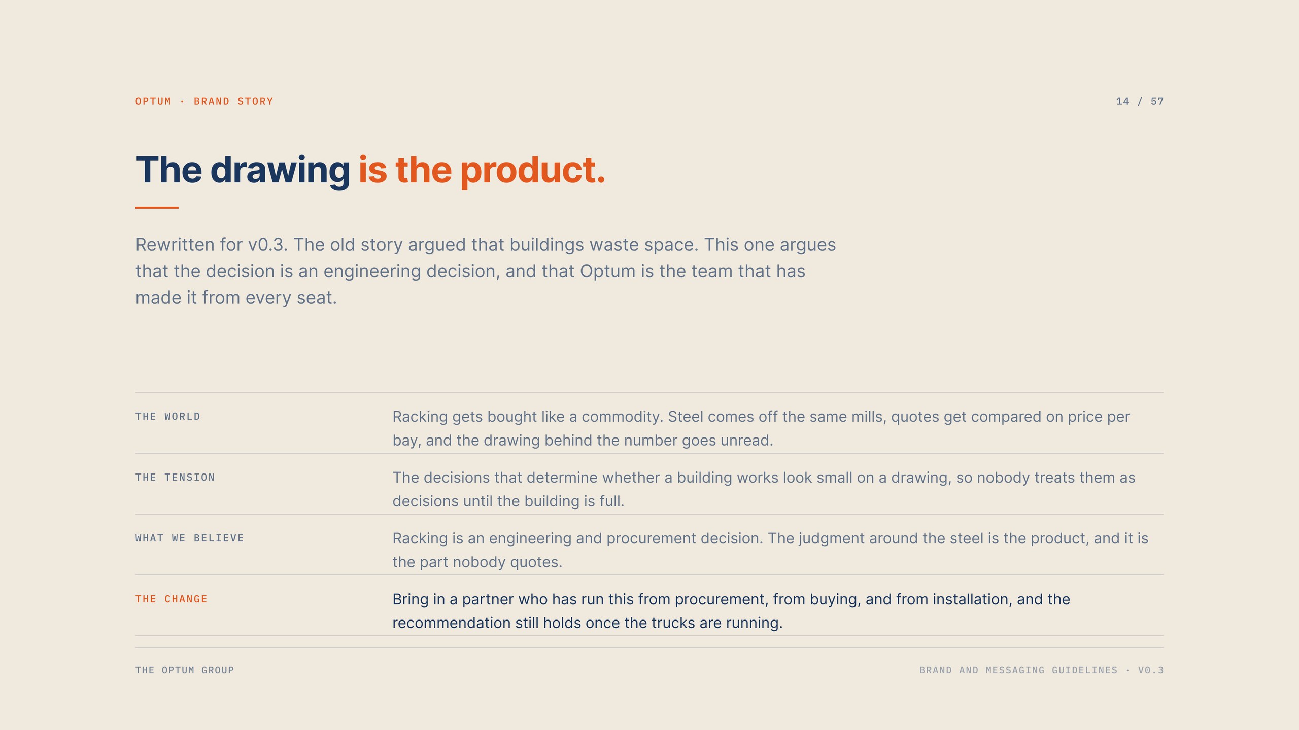
The brand story, rewritten around an engineering decision.
Five value pillars, each one a reason to call this team.
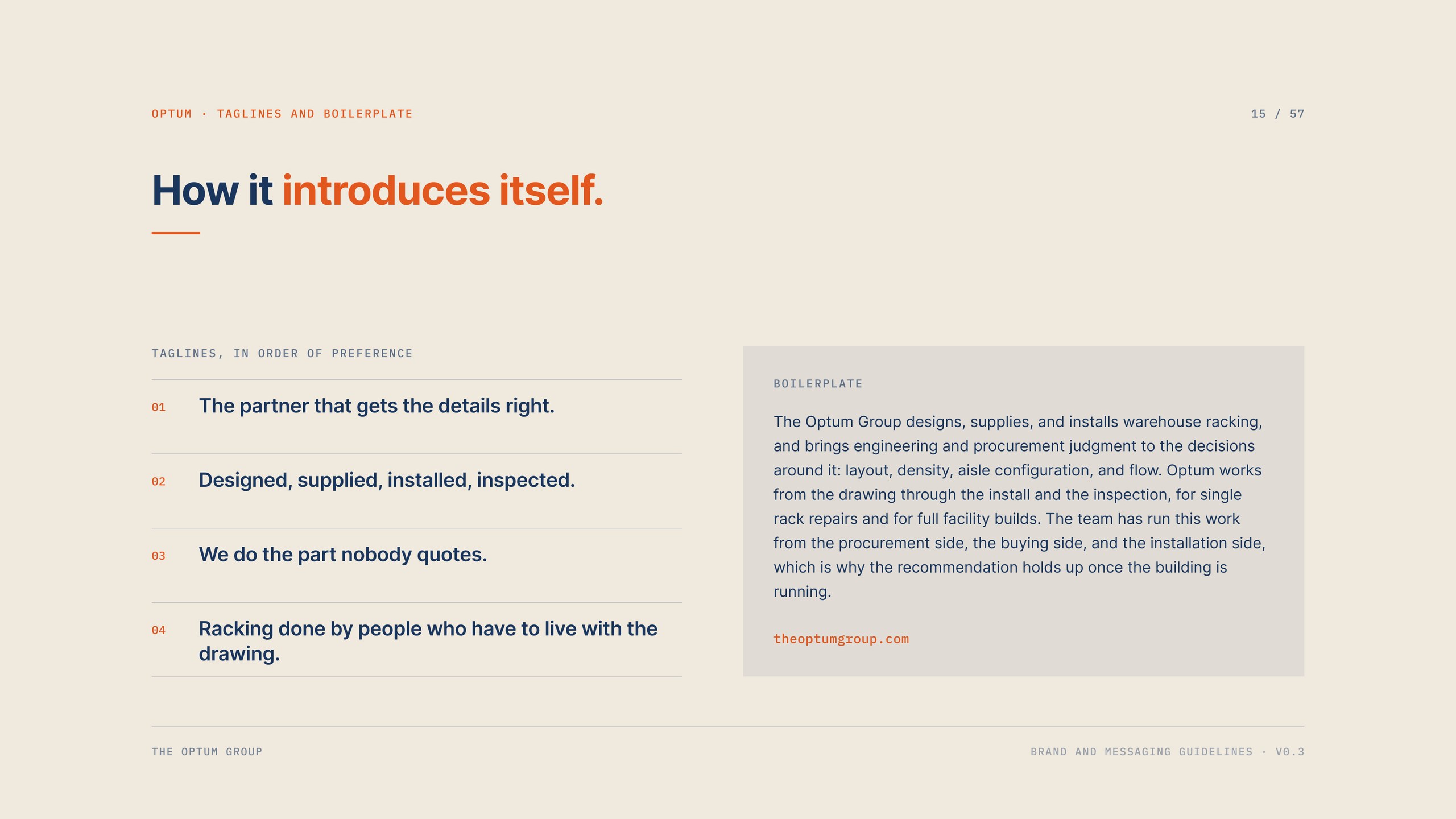
Taglines and boilerplate, in order of preference.
Five key messages, written to be said out loud.
02 / Voice and identity
Optum speaks plainly and with backbone. Short sentences, concrete claims, no hype and no throat clearing. The vocabulary section is the part the team uses most: a list of words we say, and a list we refuse. No seamless, no end to end, no trusted partner, no solutions. Every design choice gets translated into cost, capacity, or risk, because that is the language the buyer is already thinking in.
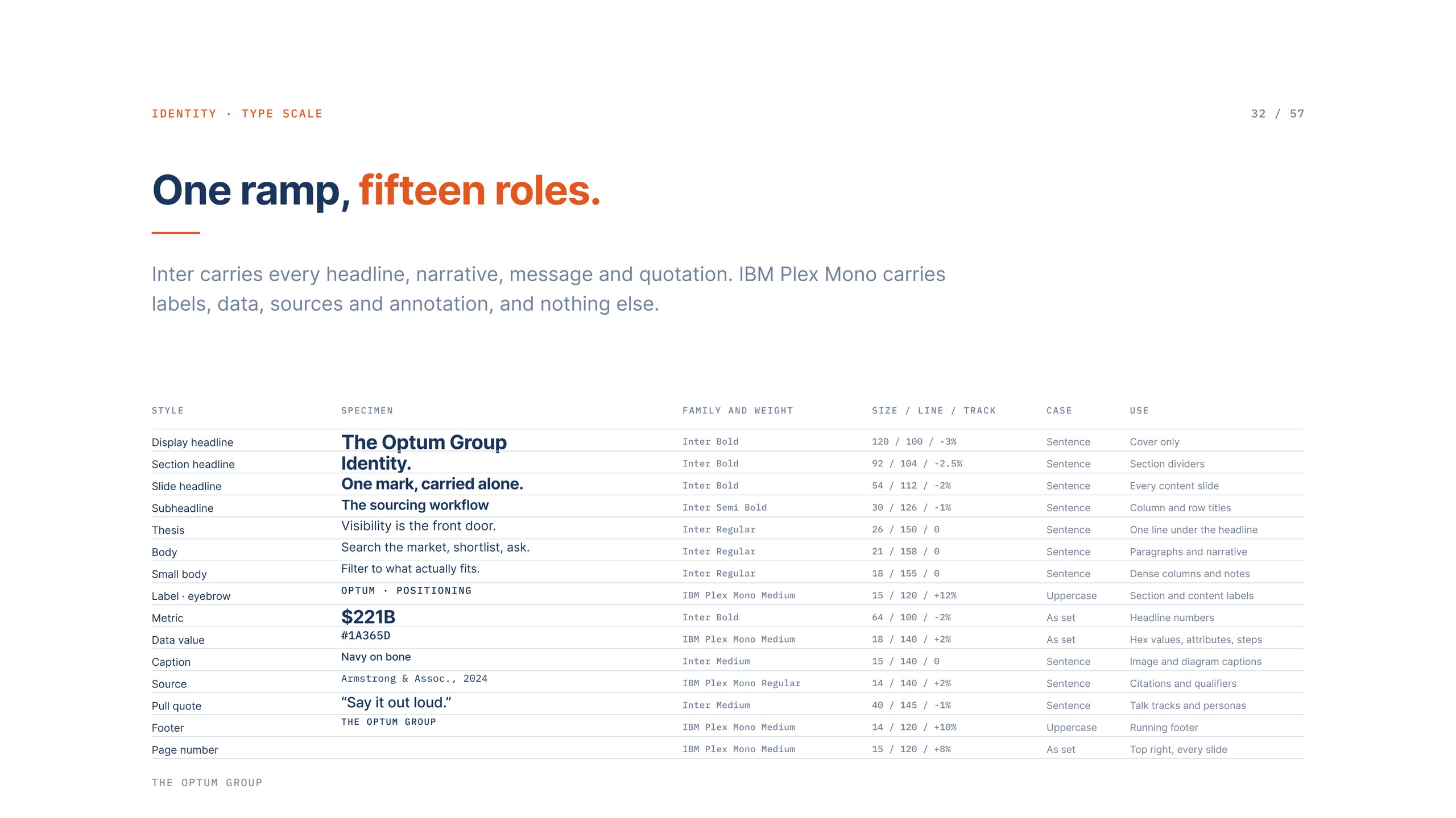
The visual system runs on colours already live on the site. Navy leads, orange is sampled from the installed racking in the photography so the accent is literally the colour of the product, and a bone ground carries the type cards. Inter does the typesetting while the site typefaces are confirmed, with IBM Plex Mono held back for labels, data, and sources. A full logo and colour redesign stays deferred until the platform work is done, so nothing here competes with that decision.
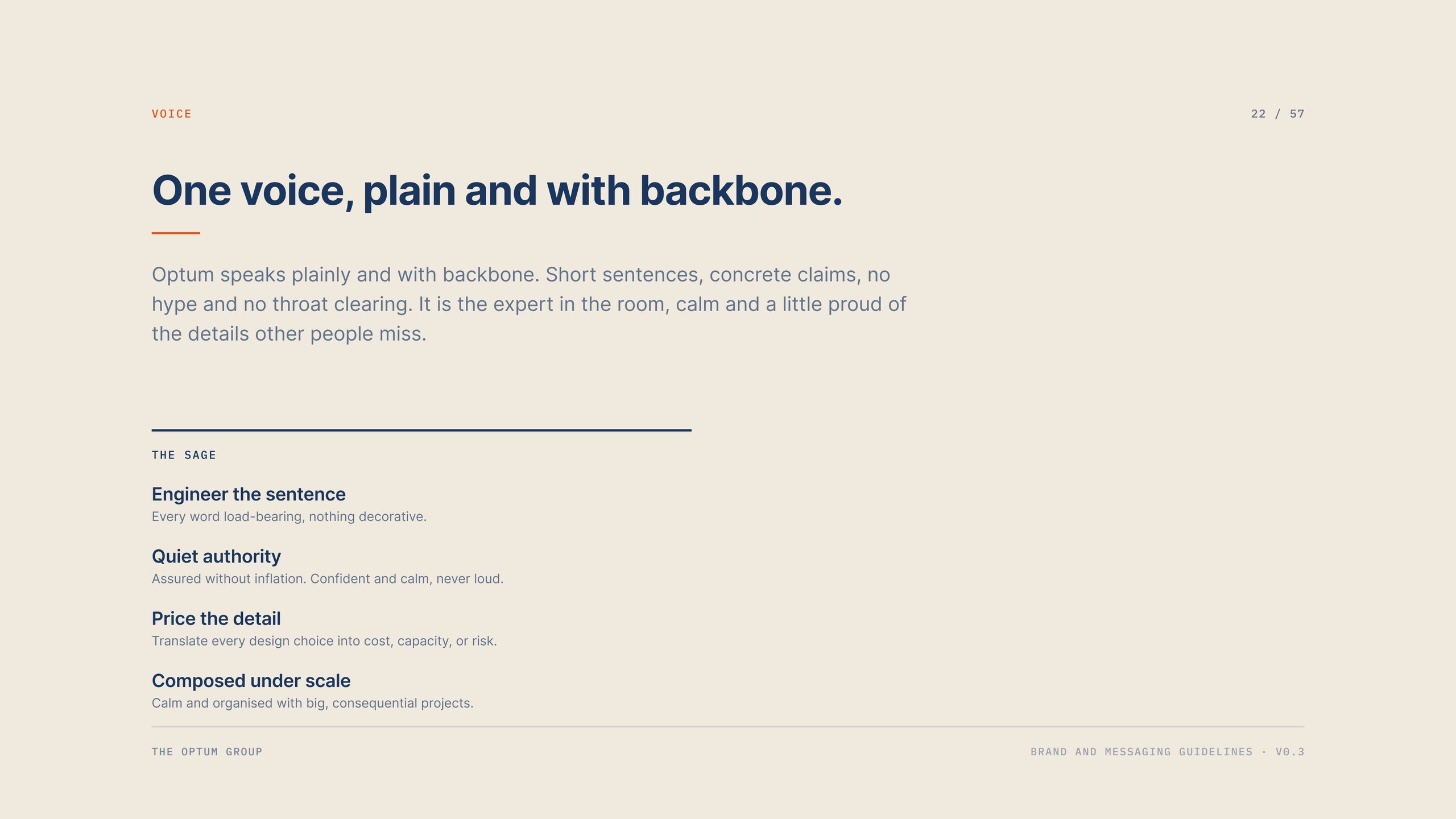
Voice. Four behaviours, held to a Sage archetype with a Ruler composure.
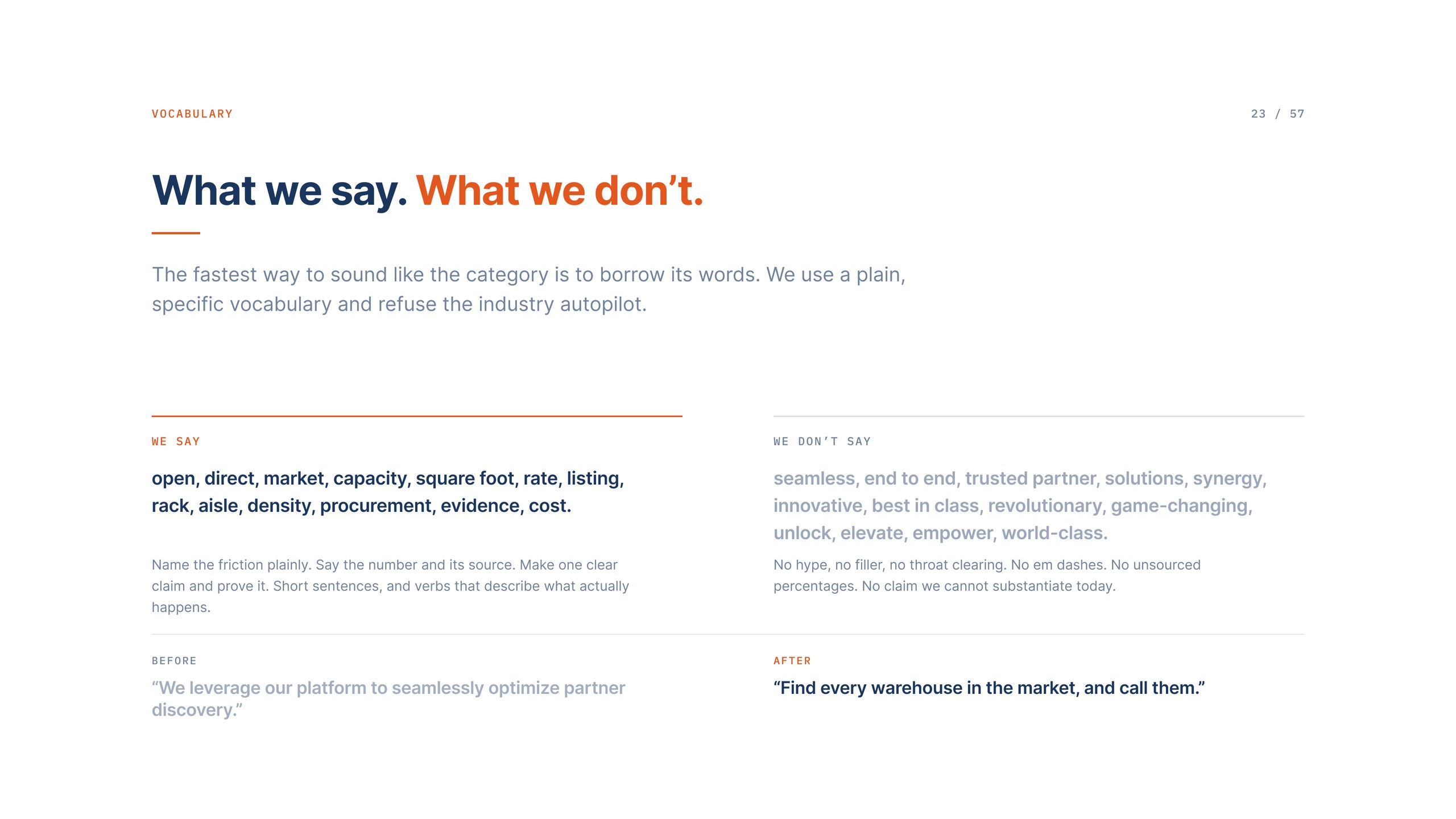
The words we use, and the words we refuse.
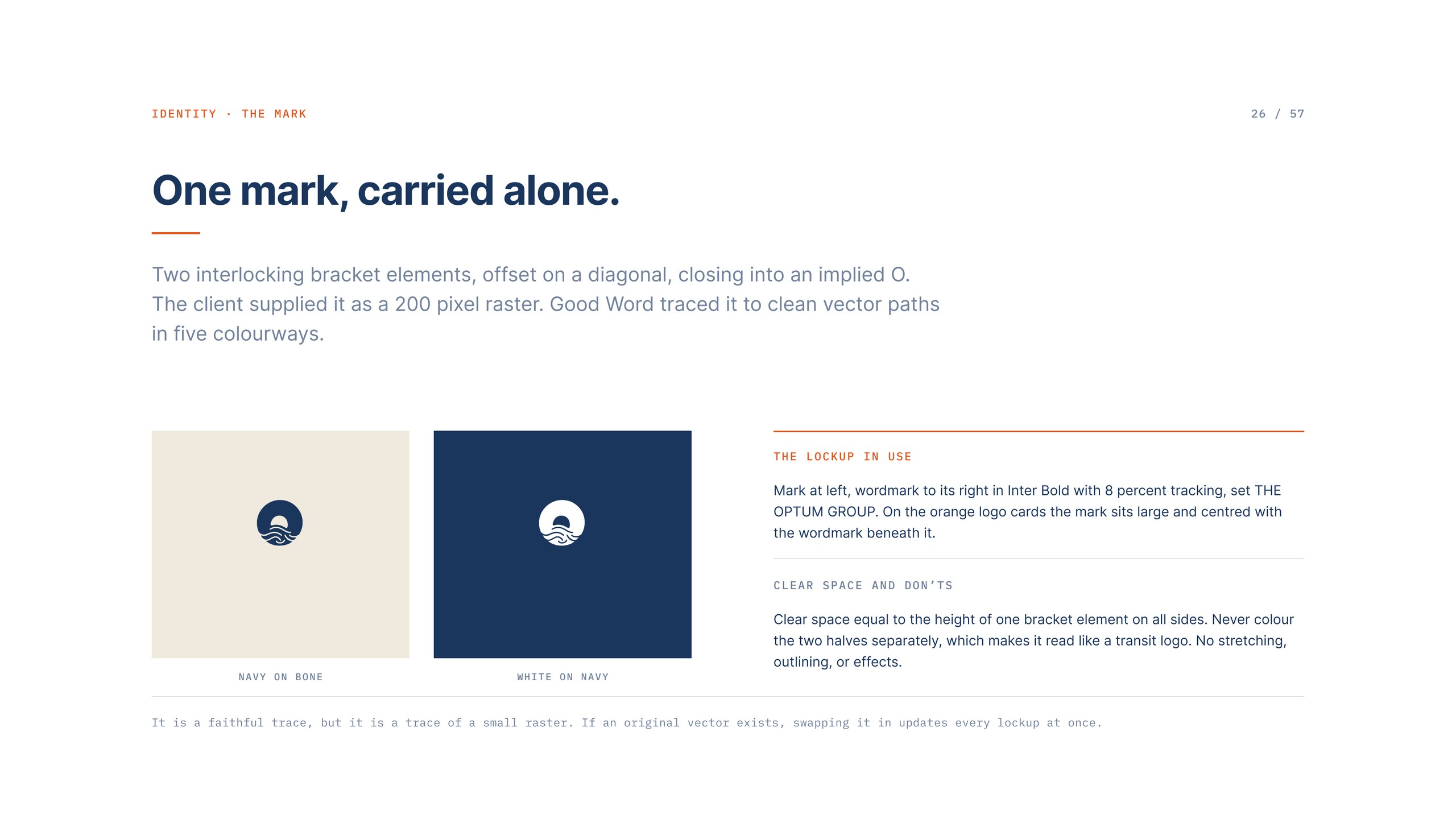
The mark, traced from a 200 pixel raster into clean vector paths.
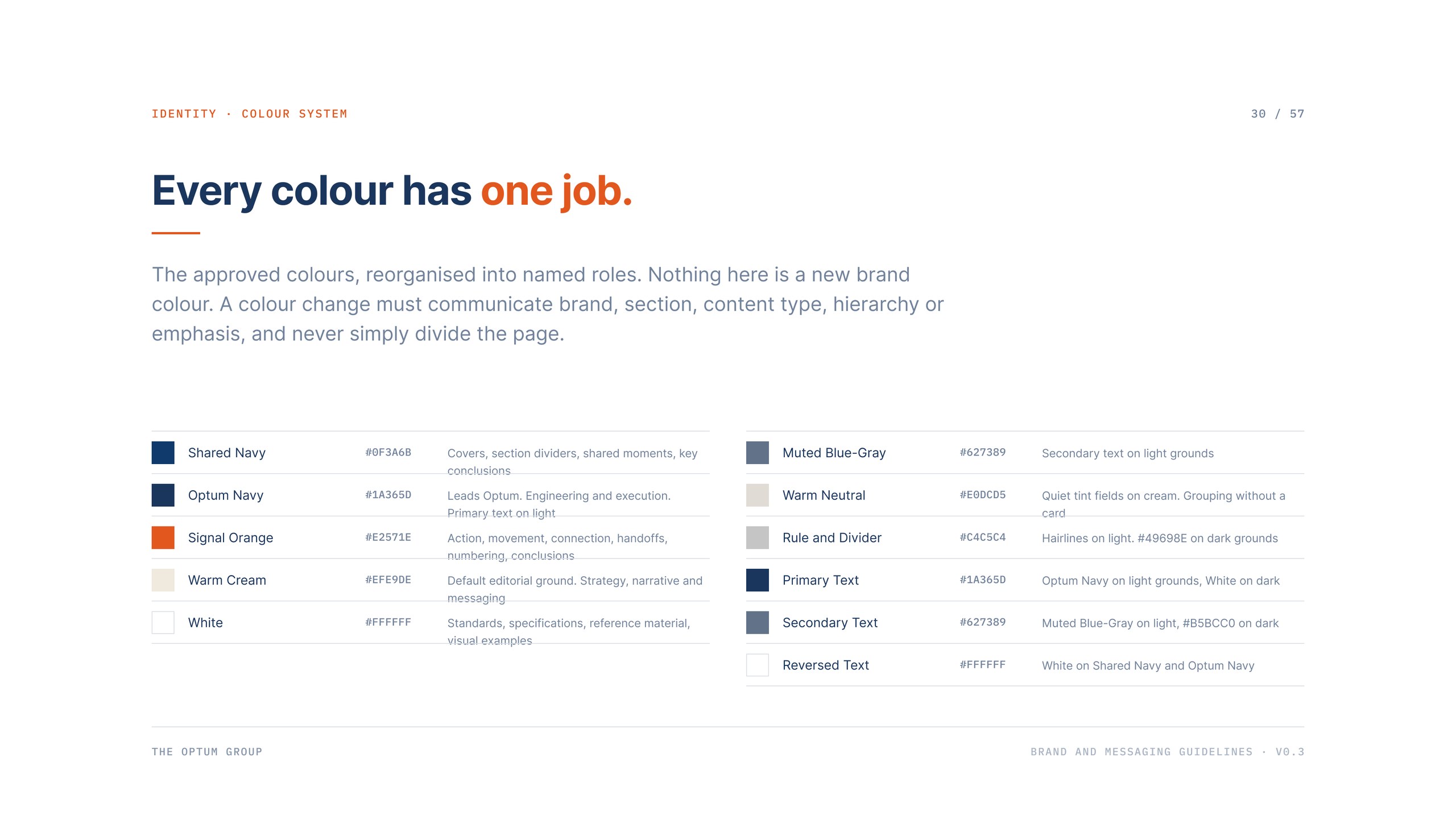
Every colour with one job, and no new brand colours added.
One type ramp, fifteen roles.
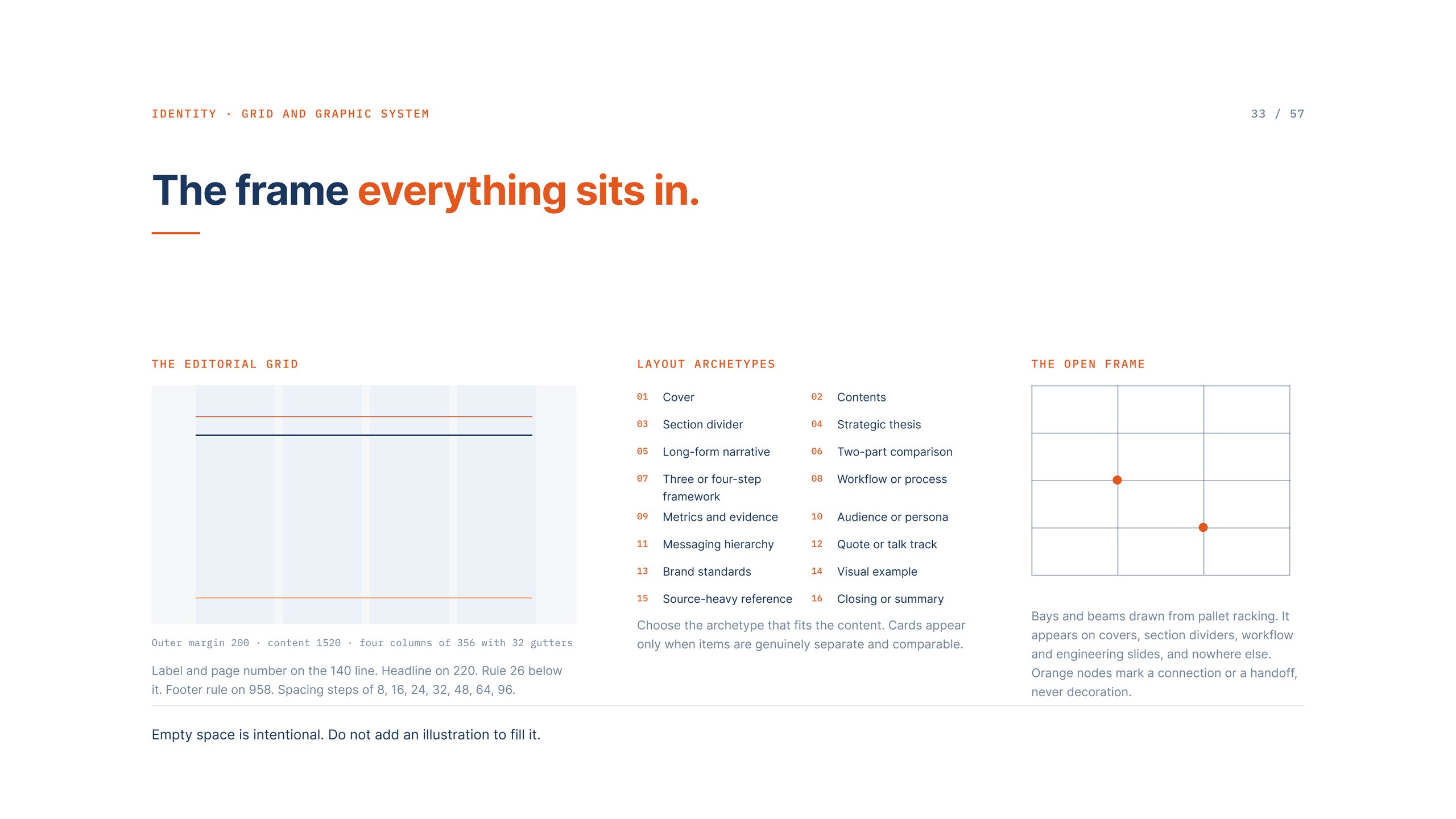
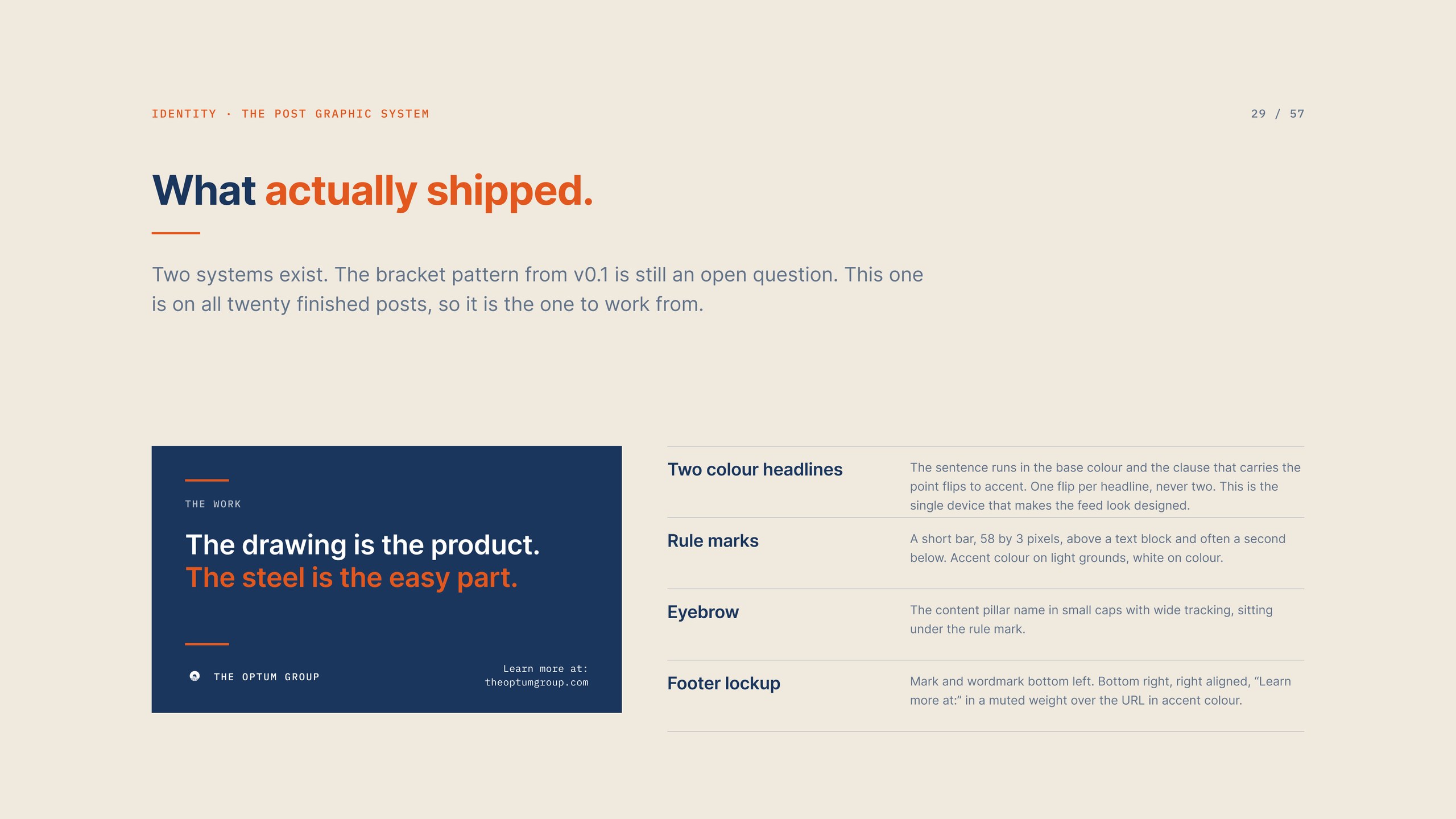
The editorial grid everything sits in.
The post graphic system, documented as it shipped.
03 / Photography
There is a standing rule on this account: no published post uses an AI generated image, in any form, including backgrounds and texture. It came from the client and it is worth repeating in his words. If we lose authenticity, the brand loses. An early ten page campaign mockup suite had been built on generated warehouse photography. It set the muted, editorial art direction and then it was retired, and none of those frames can run anywhere.
So we built the library that makes the rule cost nothing. Seventeen medium format stills of finished racking, nineteen frames pulled from the install shoot with the crew in them, and eight drone exteriors of a distribution centre. Forty four real frames, enough to refresh the content bank for months without writing a line of new copy, with a second shoot penciled for the next install.
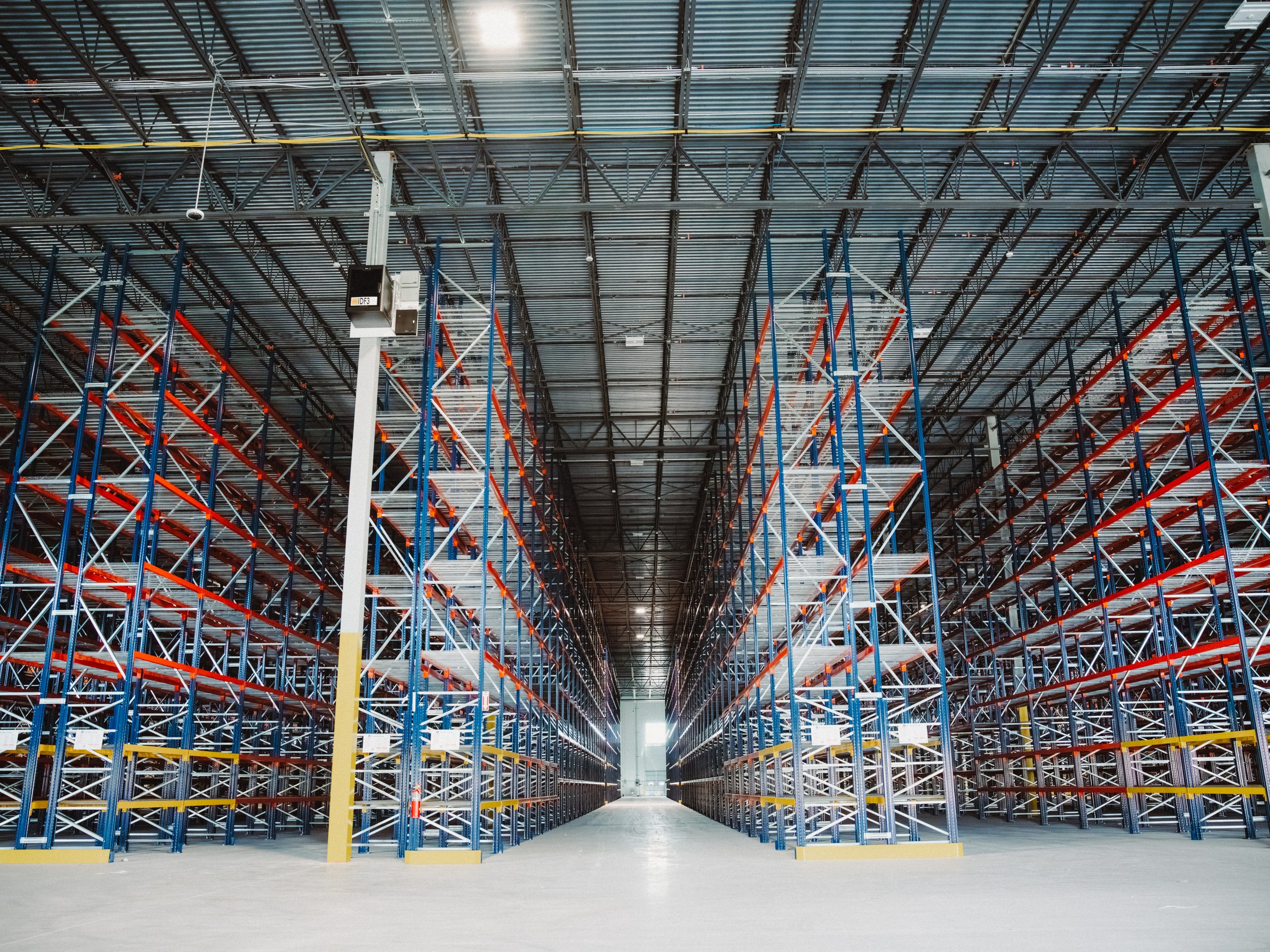
Finished racking. Uprights plumb, decking in, end of aisle guards on.
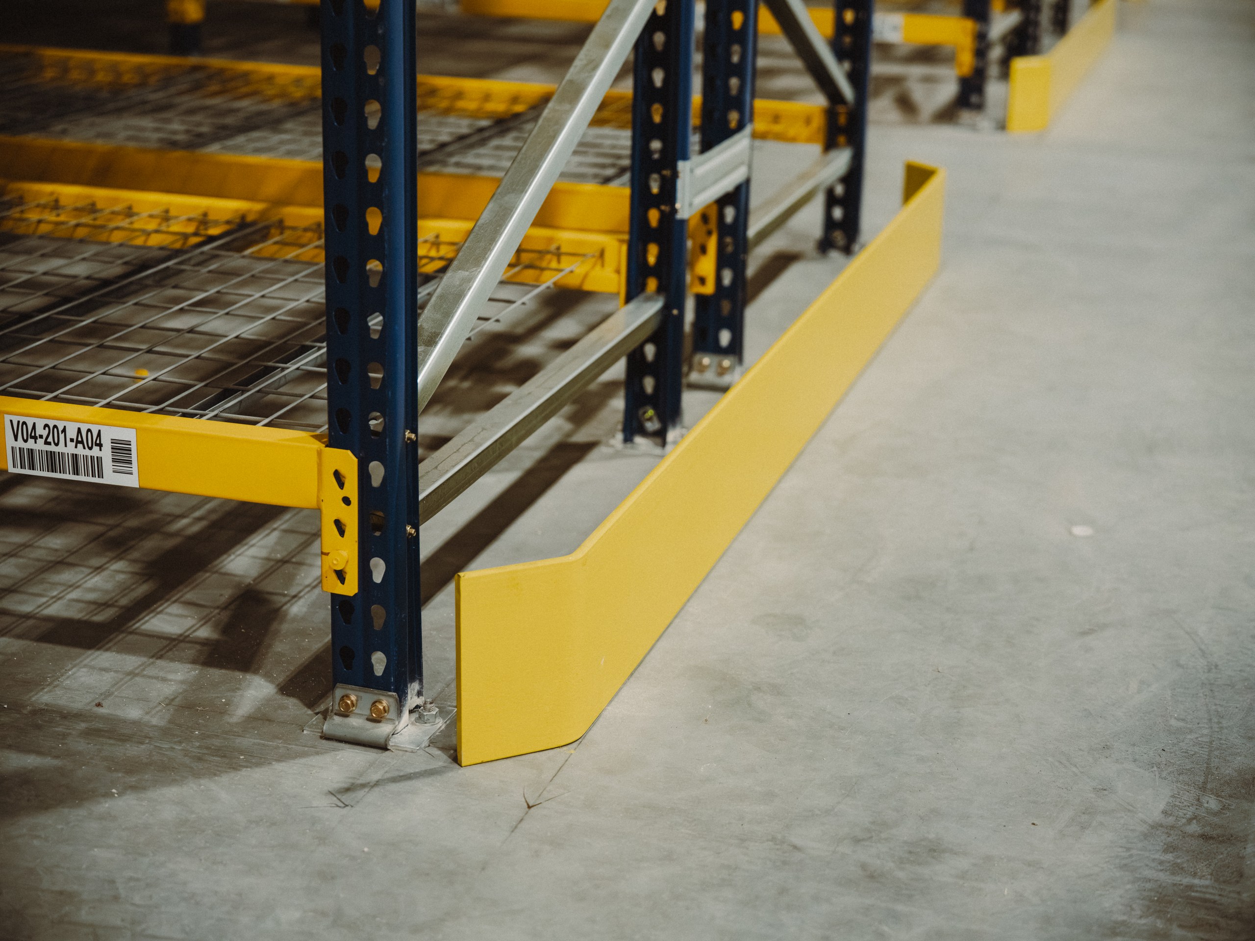
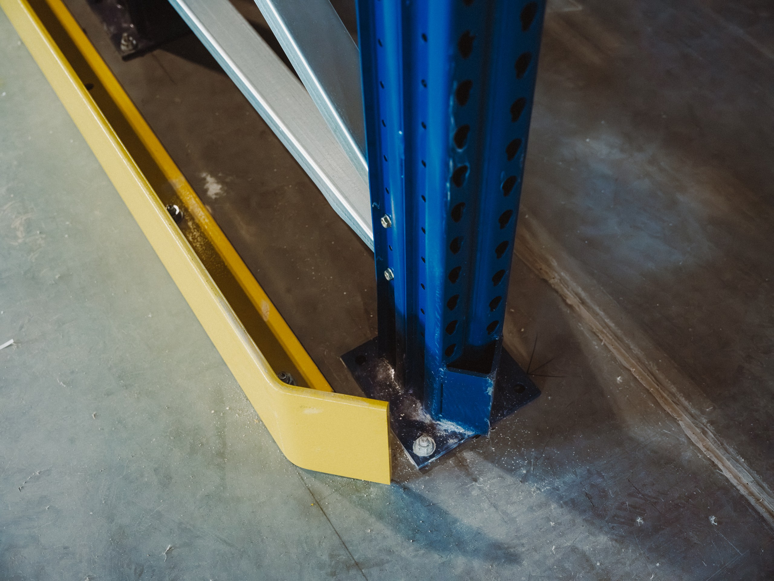
End of aisle guard. The detail series is built on frames like this.
Upright base and floor fixing, photographed the way a drawing would show it.
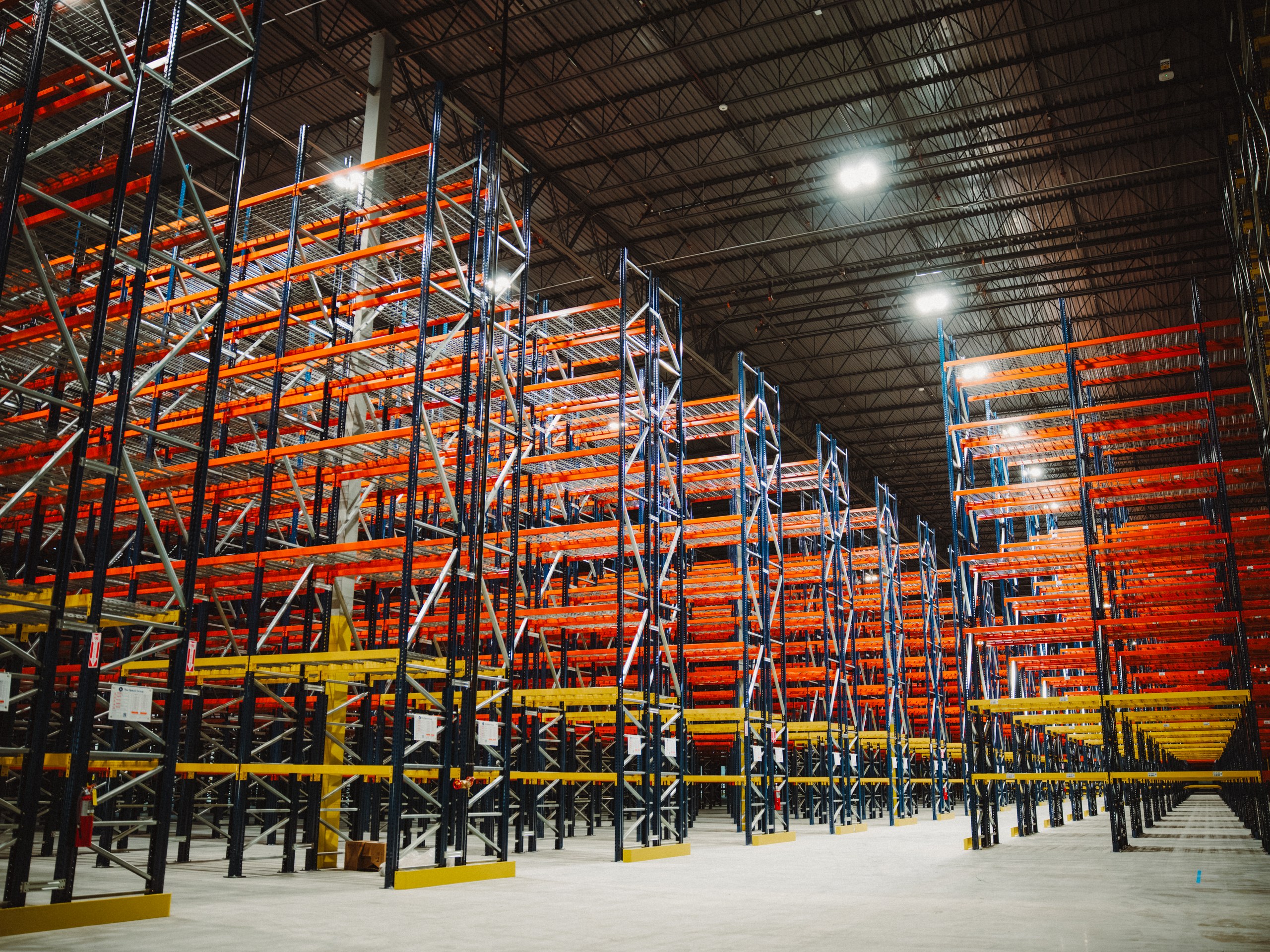
Selective pallet rack, run to the back of the building.
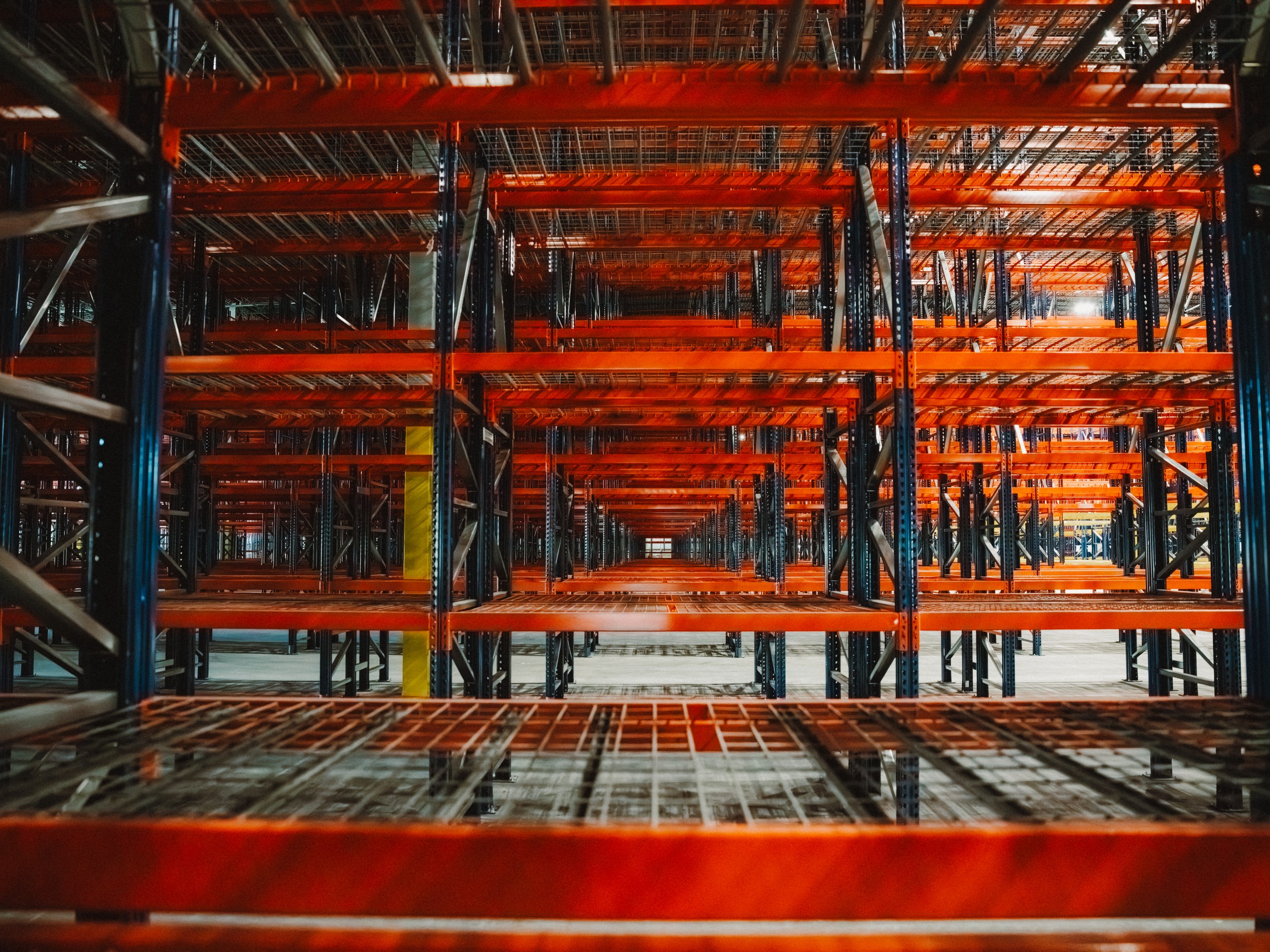
Beam levels from below, where the system reads as a structure.
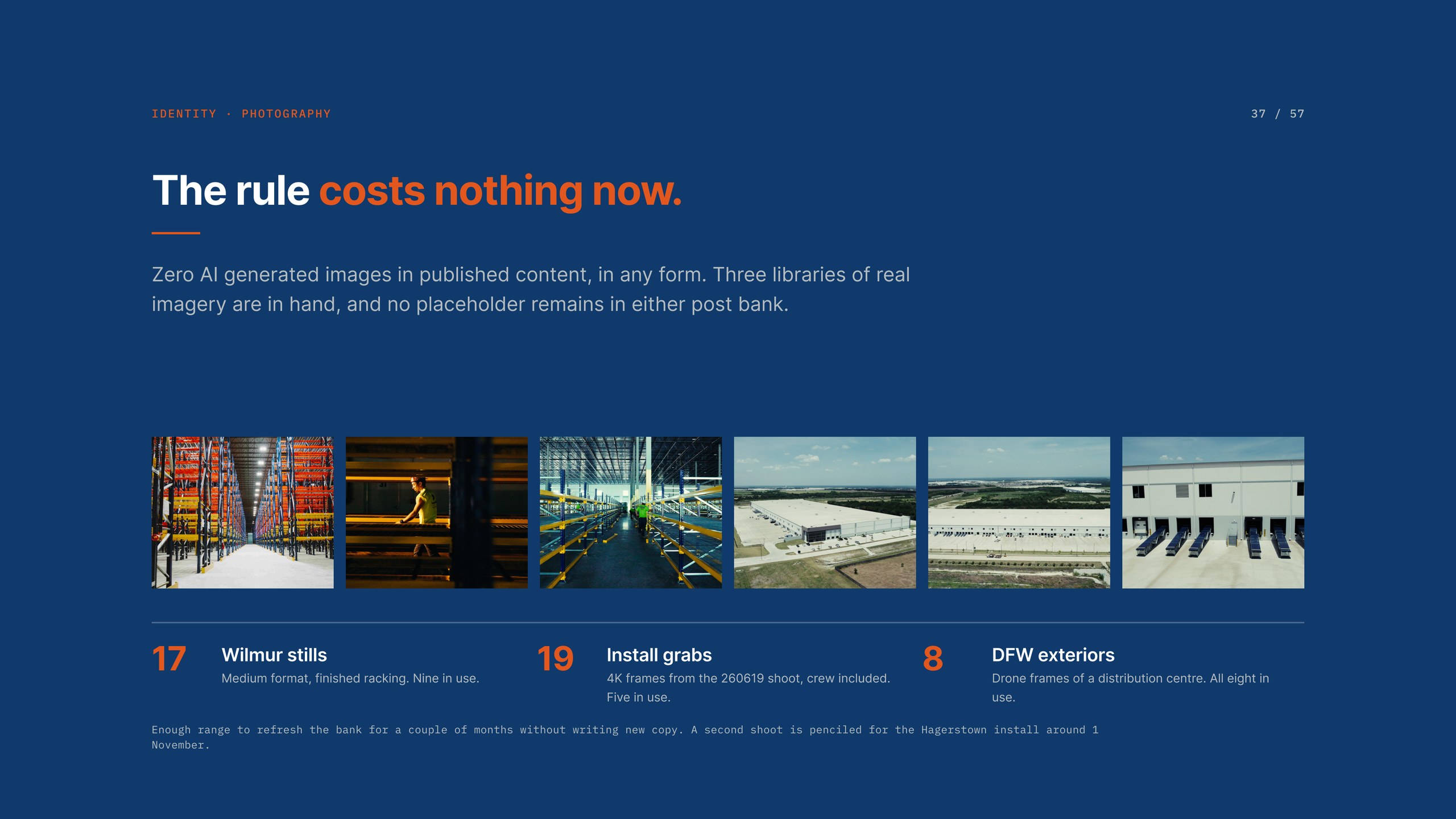
Three libraries in hand, and no placeholder left in either post bank.
04 / Social content
The scope is 48 posts a year, LinkedIn led, plus one email a week carrying the longer form. Four posts a month against five content pillars: teach the detail, the work, how to buy racking, the people, and project notes. One warehouse decision per post, explained plainly, with no pitch attached. Aisle width. Beam capacity. Flue space. Decking. Seismic. Inspection cadence.
Ten layouts rotate across the bank so that two posts in a row never share a construction, which is what stops a feed of forty from reading as a template. Captions open with a concrete statement about the photograph rather than a hook, because the first line has to earn the tap on more. Approvals happen in the Good Word client portal, not in Figma, so the client reviews a month at a time in the order it will publish.
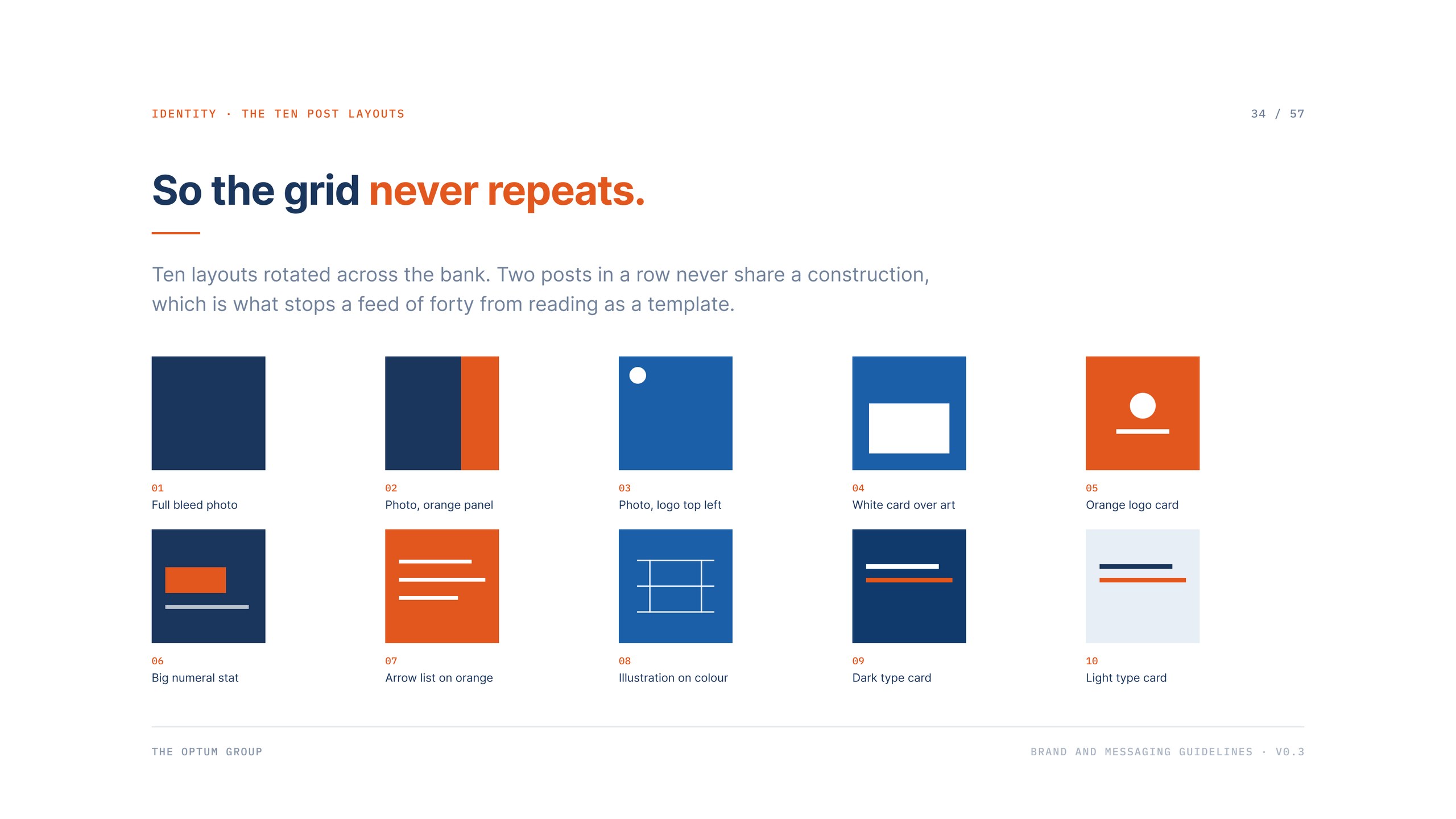
Ten layouts, rotated so the grid never repeats.
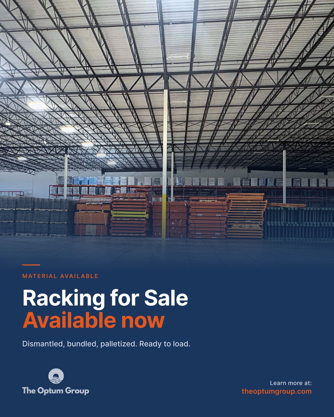
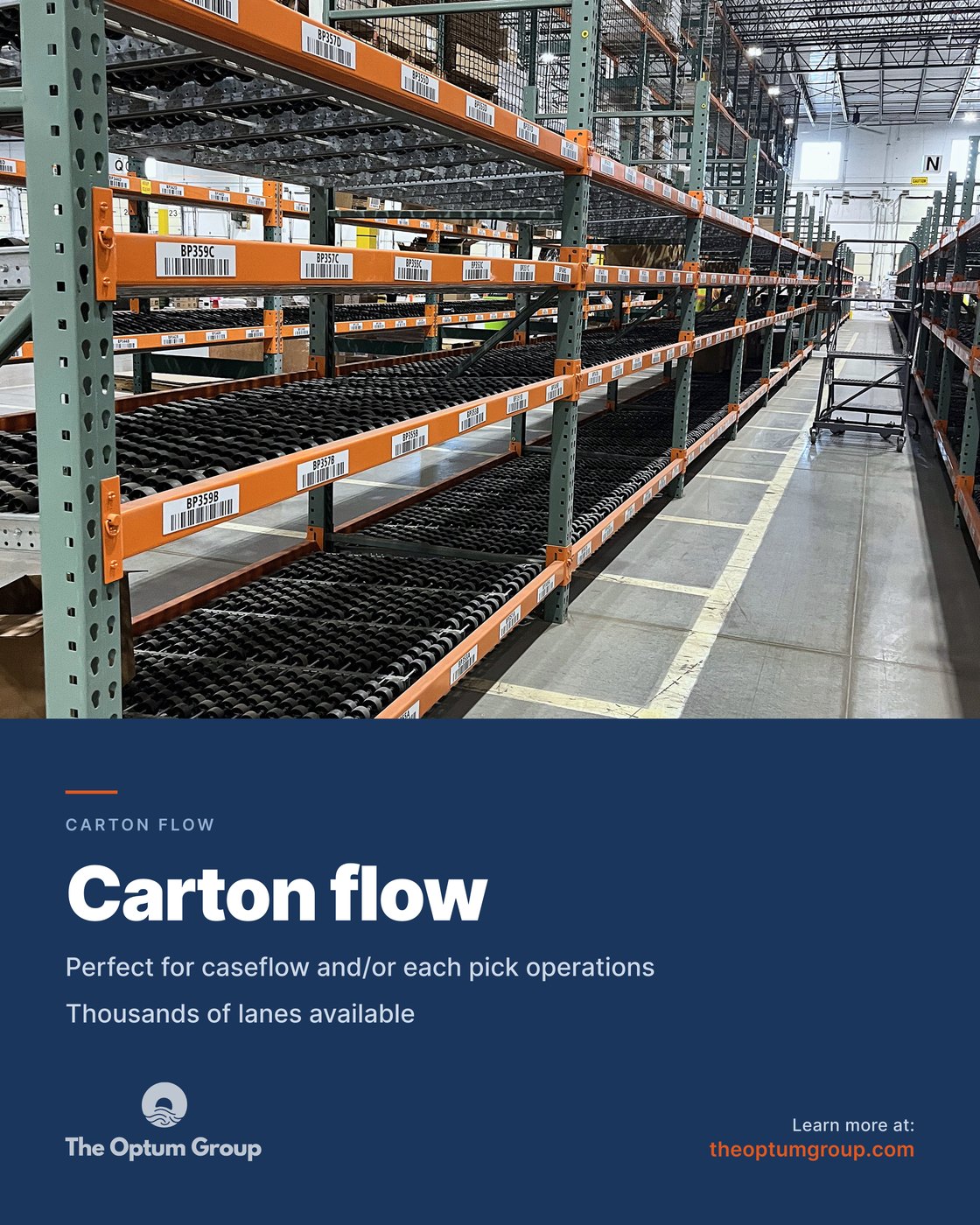
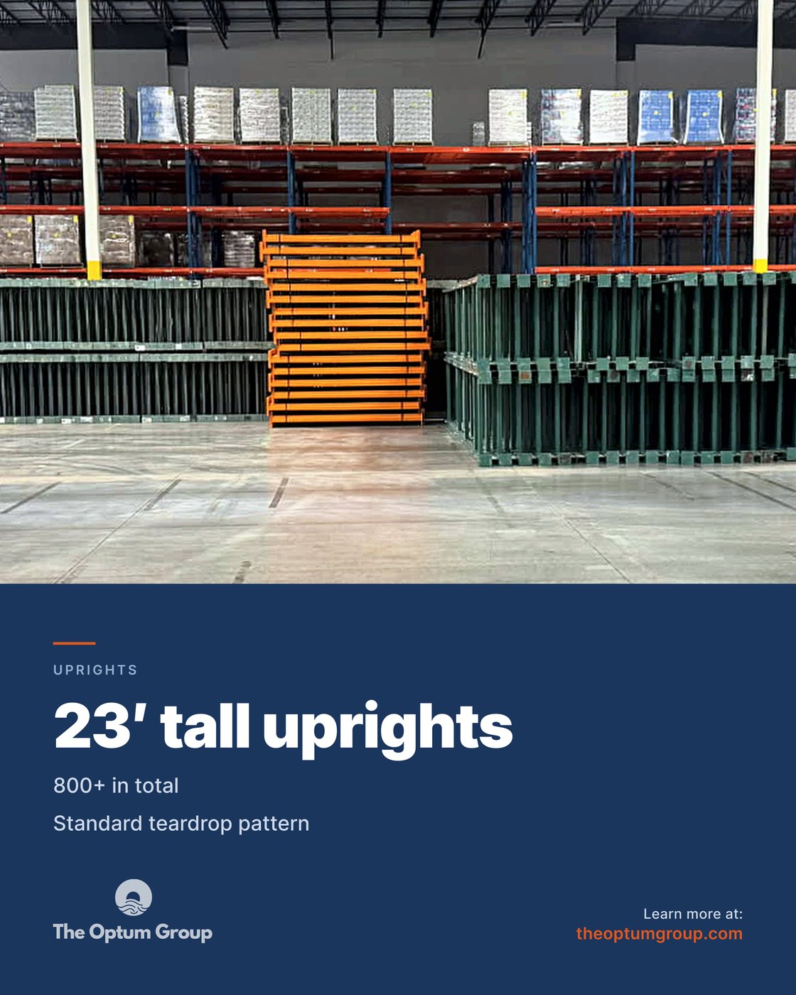
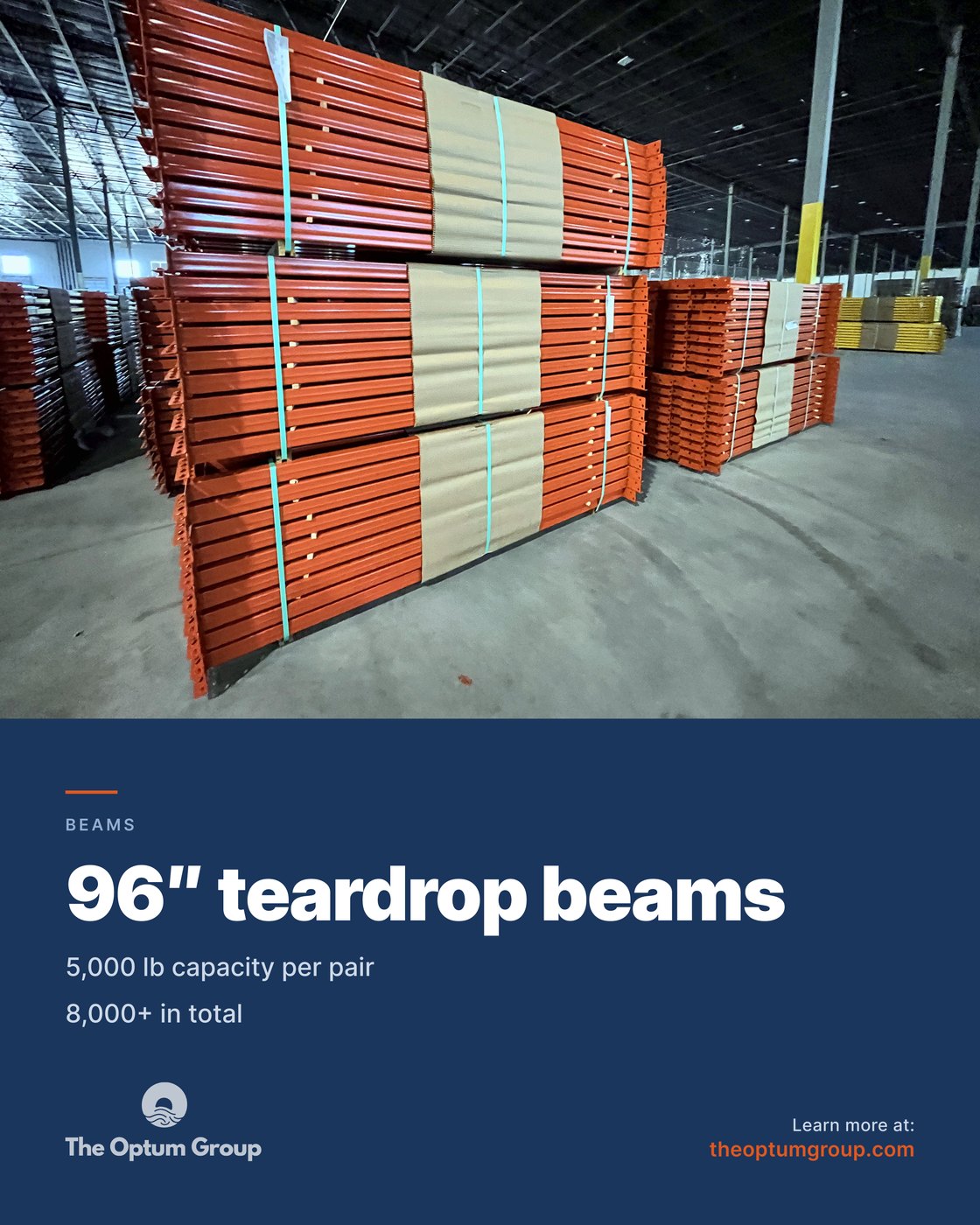
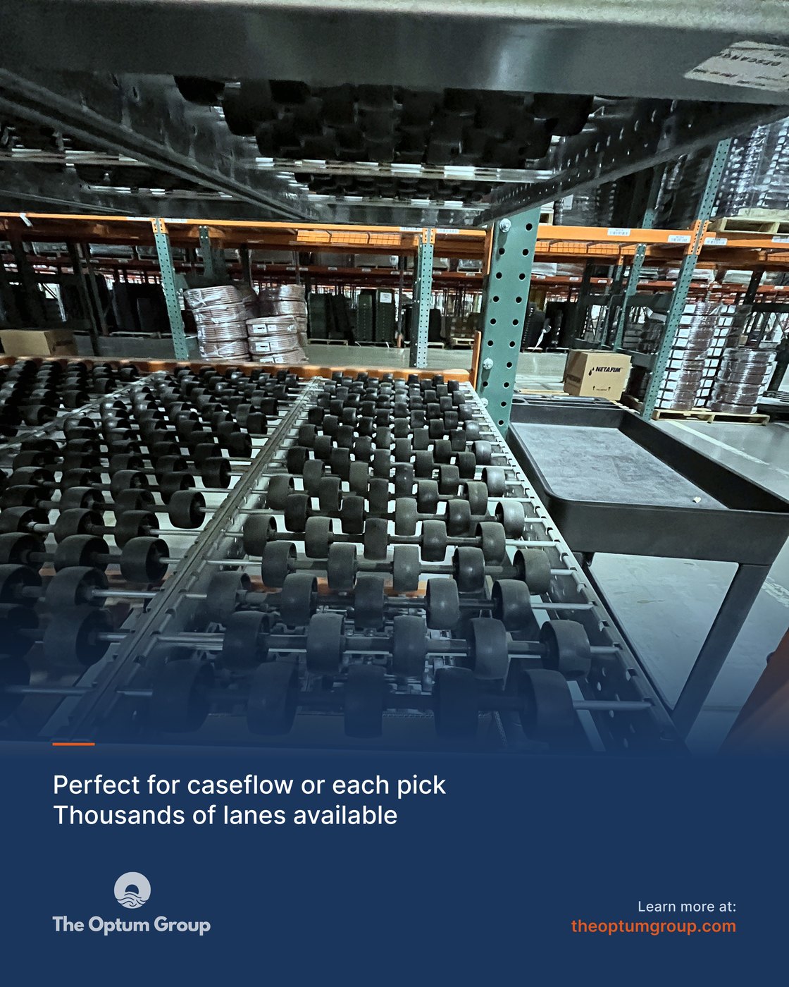
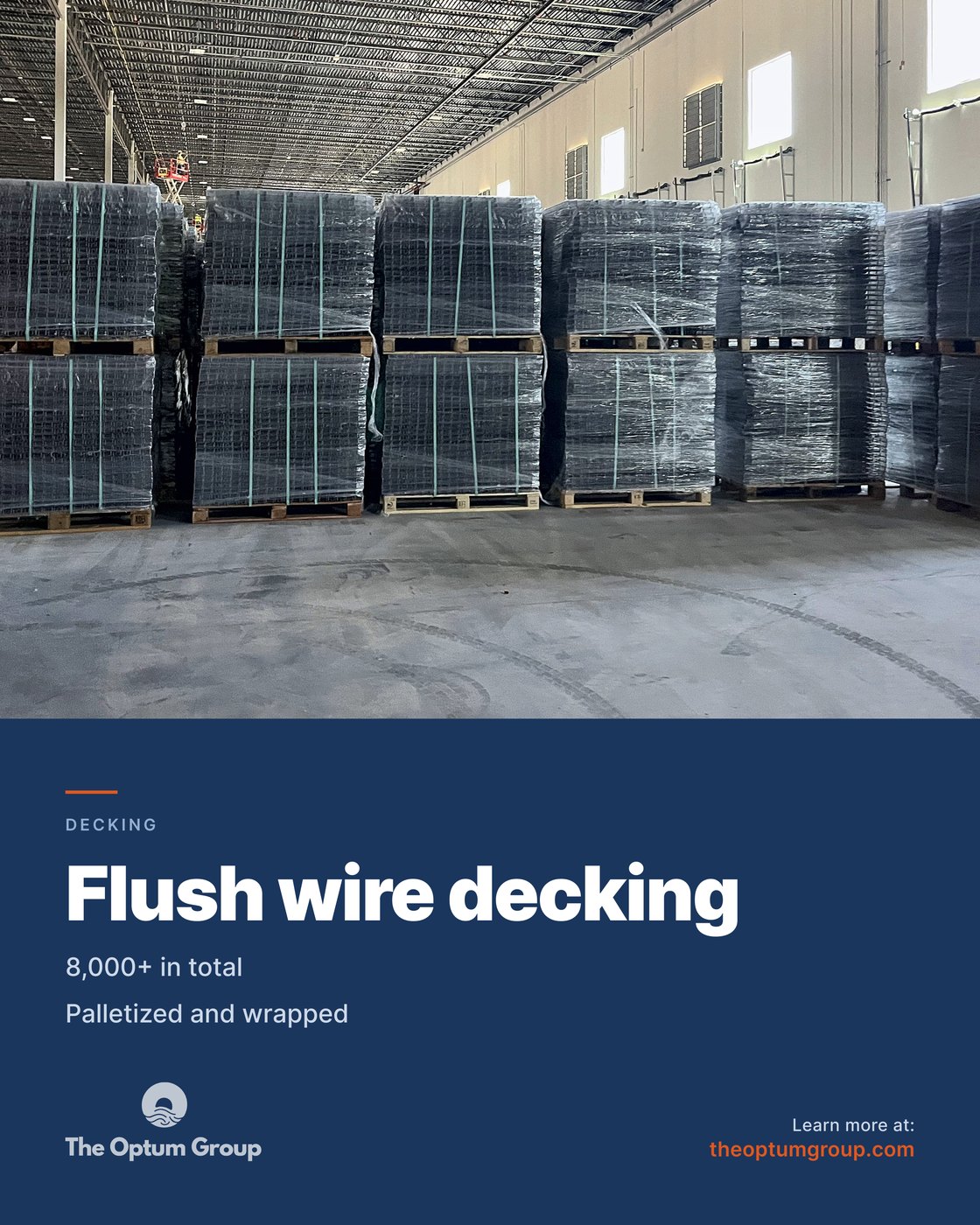
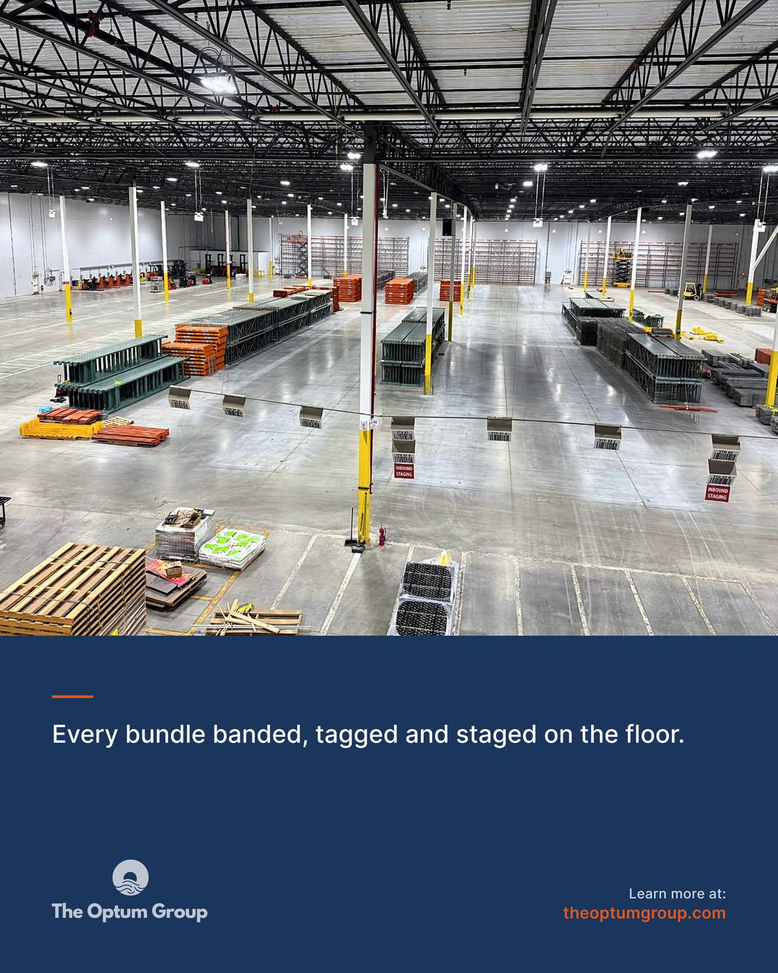
Eight from the bank. Every frame is real photography or hand built vector work, and the orange full field is rationed to about one post a month.
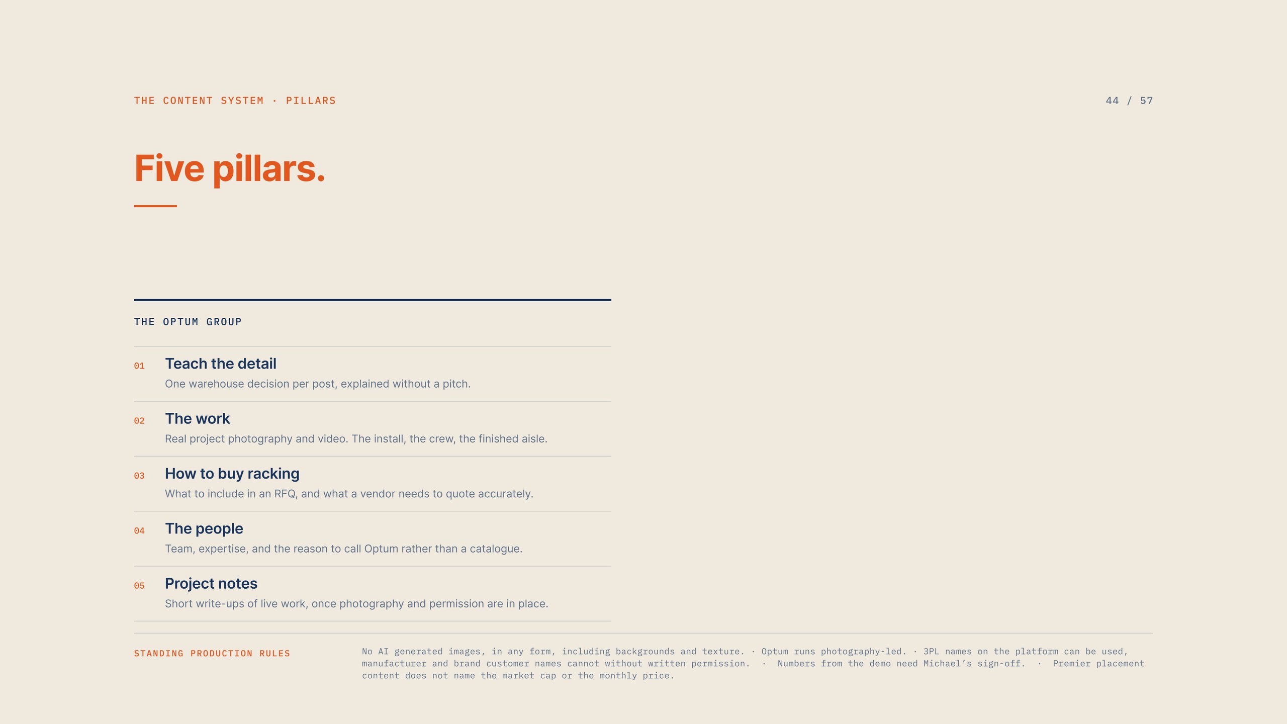
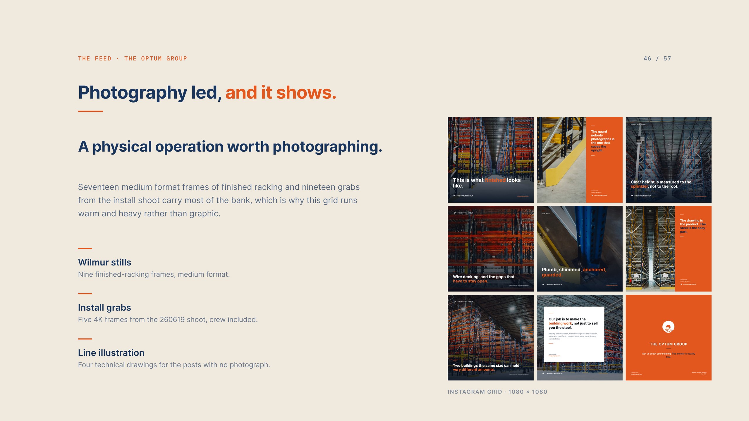
Five content pillars, and the production rules that sit under them.
The feed in the grid it actually appears in.
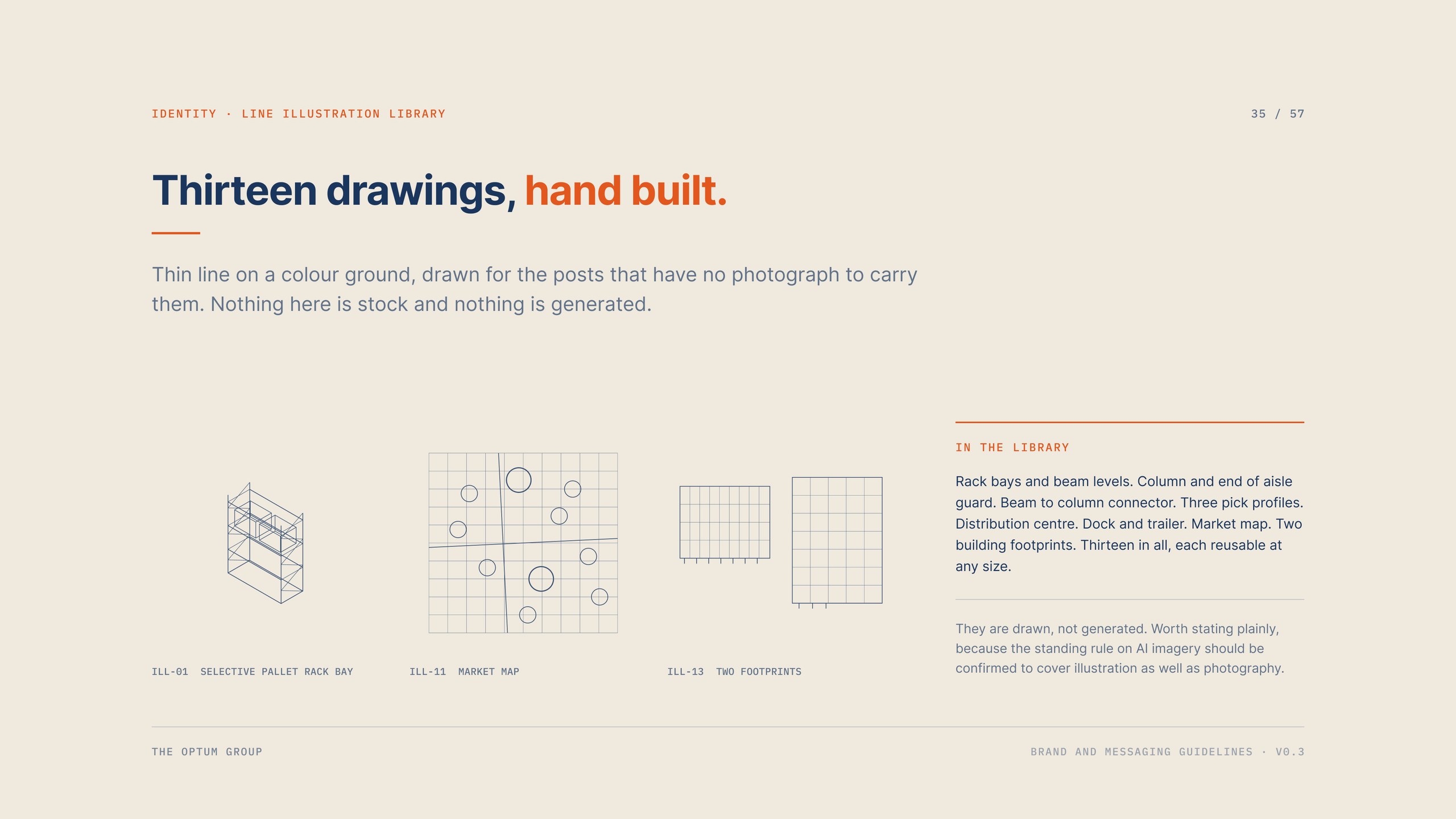
Thirteen line drawings, hand built for the posts with no photograph to carry them.
05 / Web and video
The web direction puts the position above the fold and keeps the three service areas in the order the content plan uses them: racking and installation, network design and site selection, then automation and facility design. The site was already broader than the first messaging deck treated it, and the credibility line had been sitting there unused.
Print and out of home run the same rule as the feed. A real photograph of finished work, one claim about how the work actually gets done, two concrete sentences, then the mark and the URL. The film running behind the header of this page is cut from the same install footage that feeds the social bank, which is the point of shooting once and using it everywhere.
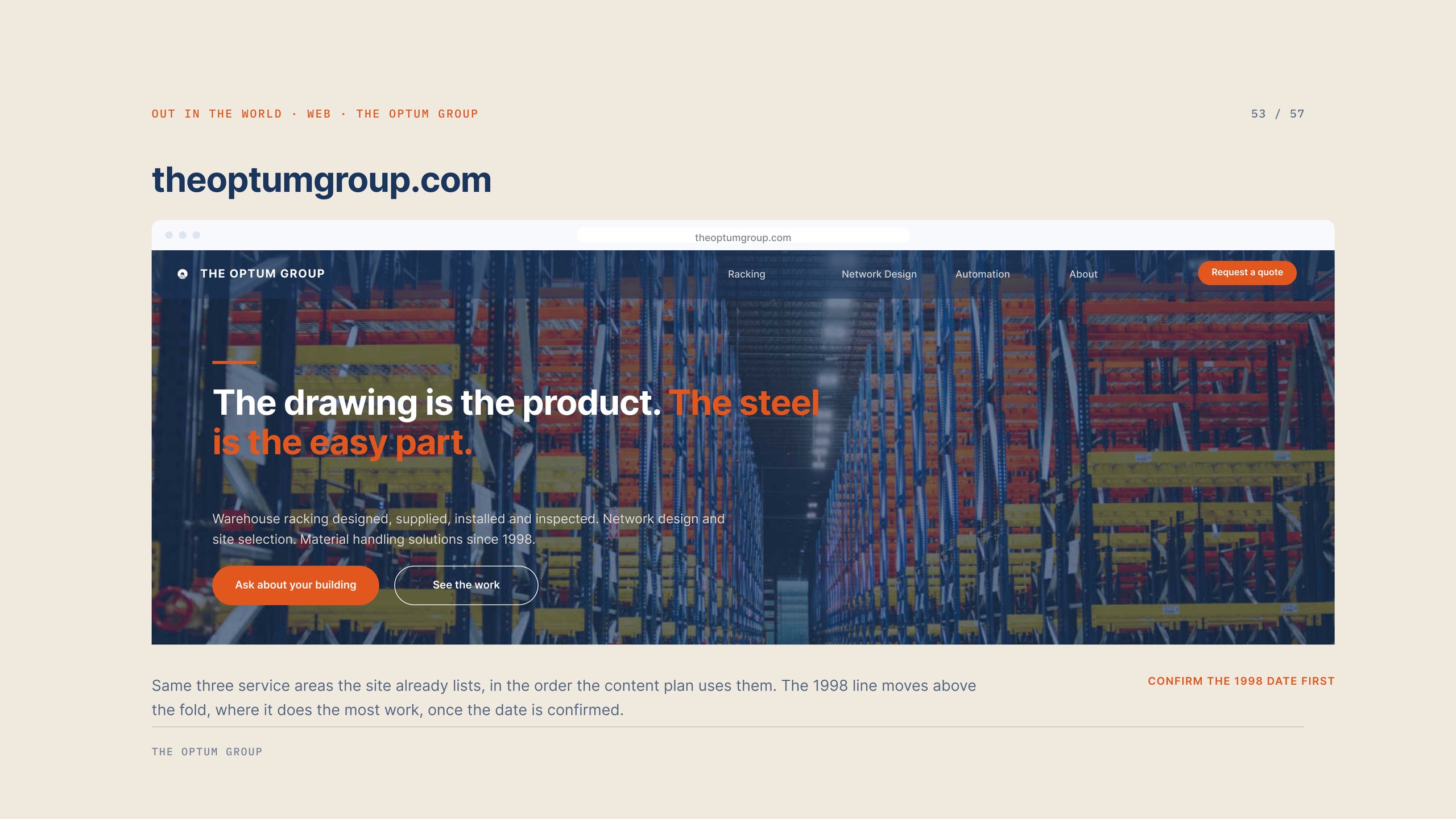
Web direction. The position above the fold, service areas in plan order.
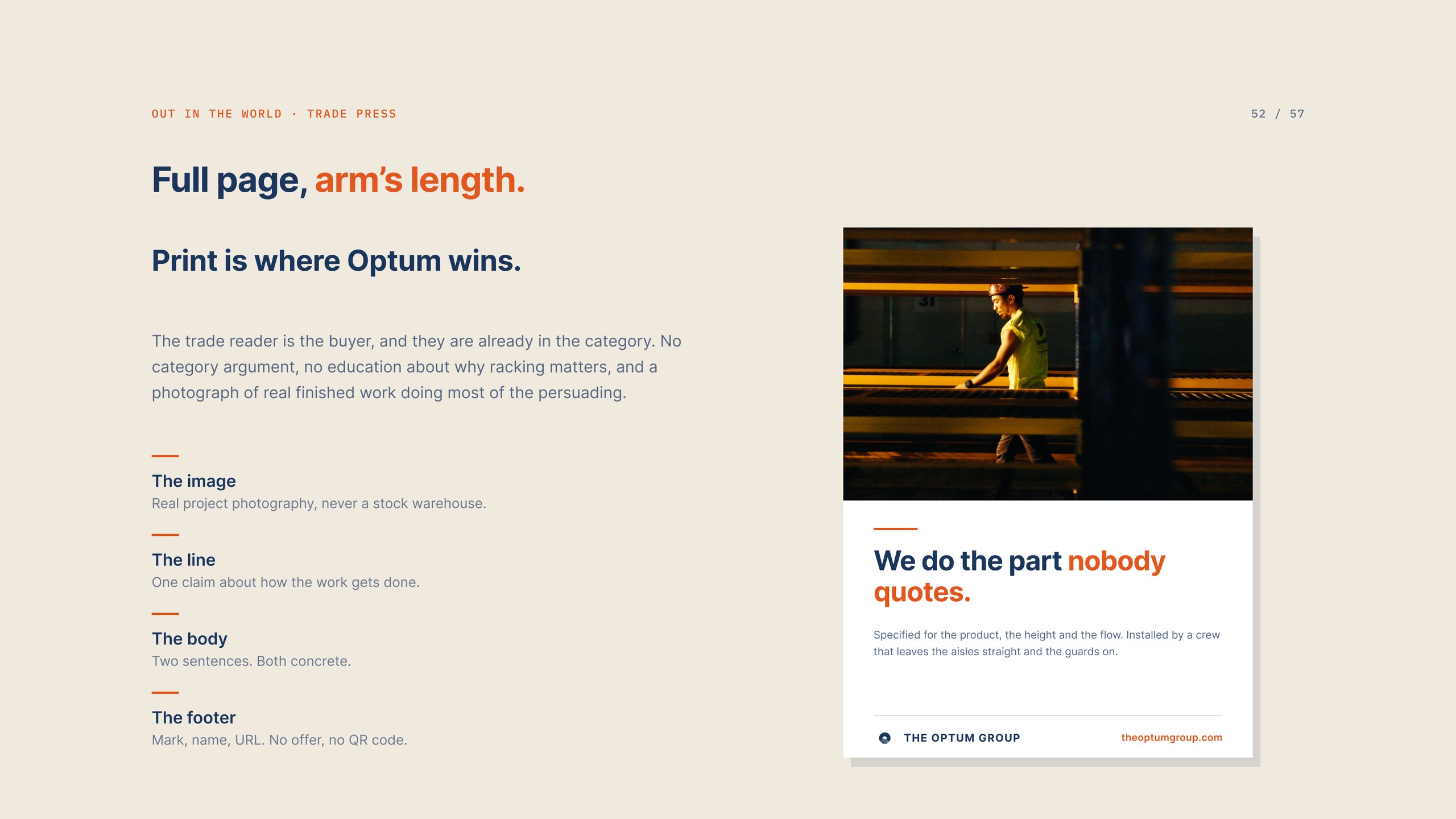
Trade print. One line, one photograph, and no category argument.
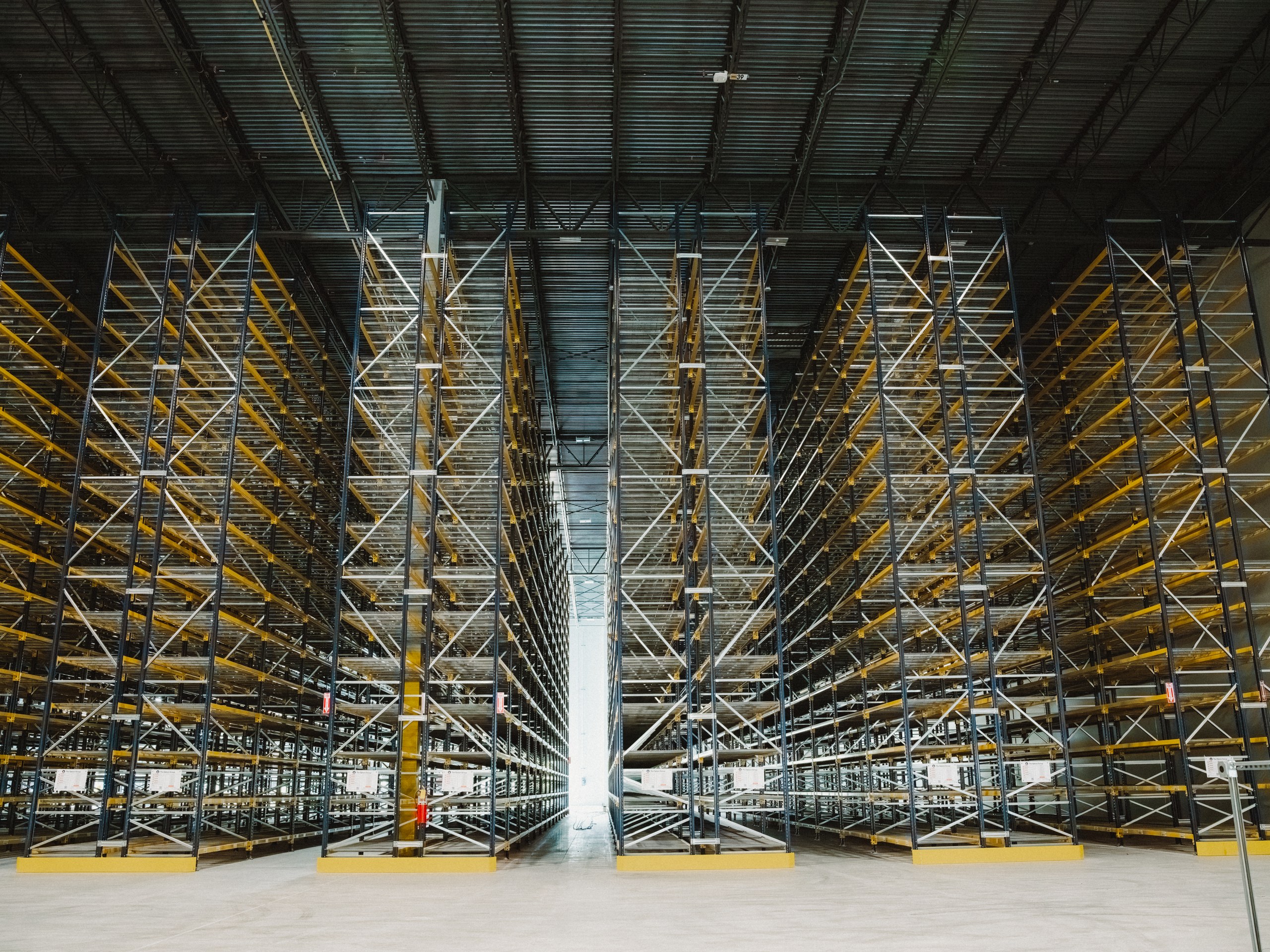
The finished job is the portfolio. Everything else is a description of it.
Questions
A brand and messaging guideline document covering positioning, brand story, five value pillars, taglines, boilerplate, key messages, voice and vocabulary. A documented visual system covering the mark, colour, type, the editorial grid and ten rotating post layouts. Photography direction and a library of real project imagery. A forty post social content bank with captions, loaded into the Good Word client portal for approval. Web and print direction, and video cut from the install footage. The engagement runs twelve months.
It is a standing client rule and we agree with it. No published post uses a generated image in any form, including backgrounds and texture. An early ten page campaign mockup suite was built on generated warehouse photography, and it was retired for exactly this reason. It survives only as art direction reference. The replacement is forty four real frames from three shoots.
Yes. Good Word Agency is a creative agency in Arlington, Texas working across Dallas, Fort Worth and the wider metroplex, with clients in industrial, healthcare, nonprofit and public sector work. Warehouse racking, material handling and construction supply suit the way we work: teach one decision at a time, photograph the real thing, and keep every claim concrete enough to defend on a job site.
The Optum guidelines reached version 0.3 across roughly three months of research, writing and design, running alongside the first forty social posts. A brand and messaging system on its own usually takes six to ten weeks depending on how much research and photography it needs. Our pricing page carries starting figures for branding, video, web and social engagements.